Apartments to fill Portobello High Street gap tooth
May 9 2022
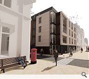
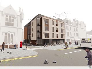
Unassuming storefronts at 120-124 Portobello High Street are to be swept aside in favour of a four-storey apartment block under new plans by Block Nine Architects.
Standing alongside the Baronial style Portobello Police Station the existing site is to be cleared in favour of a car-free new build more in keeping with its context.
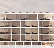
Delivering 11 apartments above two ground floor commercial units the build will employ a combination of natural sandstone, dark and buff brick, corten steel, render and zinc.
In their design statement Block Nine wrote: "While the floor levels to not align with the traditional high floor to floor heights of traditional buildings the proposals tie in through continuity of use of the same natural stone material to the front facade and similar window proportions and rhythm as the neighbouring building. Through this approach the two adjoining buildings have a similar language and create a natural flow to the streetscape of the high street."
Turning the corner into Ramsey Place angled windows will be employed to prevent overlooking of the police station.

A feature will be made out of angled windows to the side elevation through the use of perforated corten steel
|
8 Comments
This is a bold contemporary interpretation of the High Street tenament it adjoins. Good response to the gap site and does well not to compete with Bryce's police station next door
Huge improvement on the 2 units that are there now.
Cue the outcry from the Porty locals that these 2 shops are part of the town's history.
I doubt CEC will have the guts to see it through tho.
In any case, I suspect the corner exists not for contextual reasons but used as an artifice to express the two masonry walls as floating planes. Oh! They are not actually floating? Is that white 'pole' on the corner really holding something up? And so on and so on and it all begins to unravel. Maybe that's what you mean by the clichéd 'bold contemporary'
Nice render though reminds me of a Georgio Grassi drawing.
Post your comments
Back to May 2022
Like us on Facebook
Become a fan and share


But... that shop level ceiling height is an issue. The cost of squeezing three floors of apartments out of a space that should only allow two is that the commercial space below becomes unviable due to poor flexibility of fit-out. eg. No space for an AHU extract duct, nor a sub-ceiling than can easily delineate tenant liabilities. Quite likely its use will be restricted if appropriate sound separation can't be achieved due to the first floor depth allowed. It risks designing an empty shop unit because so many more flexible units are available.
Nevertheless, a welcome intensification and habitation of the high street.