Newsletter - Links - Advertise - Contact Us - Privacy
 

Watt Brothers department store lined up for hotel conversion

April 25 2022

Watt Brothers department store lined up for hotel conversion

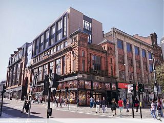
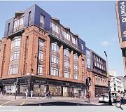
A disused department store in Glasgow has been lined up for a hotel makeover while retaining an element of retail use. Both north and south wings of the former Watt Brothers Building on Sauchiehall Street are subject to the partial change of use, with a rooftop extension connecting both elements above Sauchiehall Lane.

Applicant Silverfern proposes to retain the basement, ground and mezzanine floors of the north block fronting Sachiehall and Hope Street for commercial use. The south block meanwhile will house front of house services at street level while the upper floors of both elements are turned over to hotel use.

Planning consent is being sought in advance of an operator signing up with Silferfern explaining: "Achieving a detailed planning consent de-risks the project as far as a potential end-user and makes the decision to commit purely financial.

"The retail use to Sauchiehall Street, whilst important from a use and streetscape point of view, is a secondary concern. Filling retail space in city centres is challenging at present, although it is hoped thatthis will become easier as we enter the post-Covid era. What is certain is that the smaller retail space will be far more attractive to the market than the current premises."

To boost the number of bedrooms possible double and triple-height extensions are planned, bringing the massing of both elements into alignment. Clad in polished granite and bronze metal rainscreen with bronze fritted glass the extensions will sit on top of the remodelled B-listed properties below, including the infill of a connecting link bridge.

This is justified on the grounds that a minimum number of bedrooms are needed to cover the costs of altering and extending the listed building.

The roofscape is conceived as two distinct extensions, linked by a central element and common materials

13 Comments

ugh
#1 Posted by ugh on 25 Apr 2022 at 15:15 PM
Looks horrendous.
dear oh dear
#2 Posted by dear oh dear on 25 Apr 2022 at 16:20 PM
Dreadful. Is anyone involved in this proposal willing to argue that what is proposed is a worthy addition to this fine building and the city centre of Glasgow?
Puke!
#3 Posted by Puke! on 25 Apr 2022 at 16:45 PM
Horrific! Surely the planners will boot this out?
The idea of a hotel is alright, but the proposed extension is completely unsympathetic to the historic building.
MV
#4 Posted by MV on 25 Apr 2022 at 17:04 PM
This isn't design. It's not architecture. Is Silverfern a project management consultancy? It does look like something a PM would design? Bad, right?
town planner
#5 Posted by town planner on 25 Apr 2022 at 19:46 PM
No problem with upward extensions to some old buildings, but this one ain't great.
Andrew Kean
#6 Posted by Andrew Kean on 25 Apr 2022 at 19:47 PM
Note the point about Sauchiehall St frontage. It suggests that the views of shoppers are if no importance only their clients profits. Kick this out planners. How about turning tge whole city centre into hotels. Its heading that way .
Whispering Andy
#7 Posted by Whispering Andy on 26 Apr 2022 at 10:37 AM
Shout it from the blue (!?!) rooftops..........that it honking!
Bannister Rechflet
#8 Posted by Bannister Rechflet on 26 Apr 2022 at 13:06 PM
No. 4 MV - Sorry mate, unfortunately this IS architecture as we know it. It may be 'commercial', but it is still 'architecture' - and crap architecture at that, ultimately designed by guys in suits and dressed up by architects.

Silverfern really ought to consider here employing top notch architects such as Norr and get them to use a well-versed Hub 'one size fits all' approach because if ever this building needs a 'deus ex machina' artifice then this is it presented on a plate.

Genius Loci, my arse.
Fat Bloke on Tour
#9 Posted by Fat Bloke on Tour on 27 Apr 2022 at 17:56 PM
Bath Street End = Filler at best but has some merits.

Sauchiehall Street End = Honking / seems to hate its surroundings.
Neil Paterson
#10 Posted by Neil Paterson on 28 Apr 2022 at 10:43 AM
Shocking.

How can anyone working on that think it looks good?
SneckieMun
#11 Posted by SneckieMun on 28 Apr 2022 at 12:31 PM
"We already have a design from a retail park we did in the 90's, cool if we just plonk it on top of this building?"
STOG
#12 Posted by STOG on 28 Apr 2022 at 19:05 PM
Looks Great - but have they got a CGI of the finished building when they have taken the stacked site portacabins off the roof?
A Curious Girl
#13 Posted by A Curious Girl on 5 May 2022 at 14:15 PM
Douglas McConville strikes again! It looks like he actually did design this. There's no other reason for such poor quality architecture.

Post your comments


All comments are pre-moderated and
must obey our house rules.


Back to April 2022

Search News
Subscribe to Urban Realm Magazine
Features & Reports
For more information from the industry visit our Features & Reports section.