Geography and geometry meet at Stirling's Campus Central
March 15 2022
Page\Park Architects have completed a redevelopment of the University of Stirling's historic estate with three key interventions transforming the Campus Central environment.
Inspired by the geography of the Carse of Stirling river valley the project conceives a revitalised University Library and MacRobert Arts Centre enclosing the pedestrianised Queens Court, following relocation of a bus terminus, and refurbished study space.
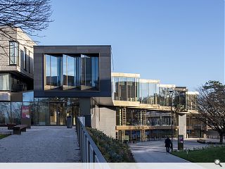
A fully accessible triangular extension leads the changes, responding to adjacent late-Modernist buildings and a high-pressure water main crossing the Queen's Court gardens to the south to establish a new front door to the MacRobert Arts Centre.
Detailing the marriage of geography and geometry in this loch-side extension the architects wrote: "The resultant footprint and section make the most of the remaining wedge shape whilst working with the existing levels, tucking under the University Library’s flipped ziggurat form at the lower two storeys and cantilevering out at the top storey to maximise the usable floor area over three levels.
"Drawing upon the expressive structures of the original late-Modernist buildings, the new extension has been designed to offer a flexible form, with a wide-spanning exposed in-situ concrete frame to the lower levels rising to meet an articulated glulam and CLT roof structure.
"Dramatic top-lit voids are conceived in the spirit of gulleys or chasms, characteristic of river formation, bringing daylight deep into the plan. A sculpted feature staircase serves as a distinctive focal point connecting the floors, supplemented by a new lift."
Separately a glazed atrium created in the late 1990s has been fully refurbished to make better use of the original steel-frame structure dating from the 1970s to open up the volume, improve ventilation and maximise views and light across Airthrey Loch to the Ochil Hills.
Further interventions include the removal of glazed screen shopfronts in favour of retractable shutters and uniform signage while permitting an enlarged cafe to be introduced.
|
|
11 Comments
Also, just to agree with the comment above, it's a lovely campus.
There is a lot to be said for the avoiding having a obvious style and, instead, focusing on quality and integrity.
Sure there is the odd miss along the way, but, by and large, a very strong portfolio of work over the years.
Good detailing but very flat.
Seems to be lacking in scale / height -- design by slices is just so Scotland 1970.
The feature staircase is just not that -- It needed to be opened up with an atrium vibe to show itself off.
No good and even less good that the report on the building just repeats the PR guff without any real comment or questioning.
On another level before and after shots would have been useful.
Post your comments
Back to March 2022
Like us on Facebook
Become a fan and share


As an aside, Stirling Uni campus generally must have one of the most beautiful sites in Scotland, a much more relaxing learning environment than Glasgow/Edinburgh/Aberdeen. Long may it last.