Newsletter - Links - Advertise - Contact Us - Privacy
 

Gateway tower promises to arrest the decay of Sauchiehall Street

July 13 2021

Gateway tower promises to arrest the decay of Sauchiehall Street

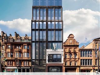
ADP Architecture has firmed up plans for a major co-living development at 520 Sauchiehall Street, Glasgow, on behalf of Consensus Capital Partners.

Supporting the recent Avenue development a statement of intent outlines the opportunity to deliver 87 studios and one-bedroom apartments for rent above a ground floor commercial unit at the long-term vacant site stretching to Renfrew Street at the rear.

Working with heritage assets facade retention will be undertaken to B-listed buildings at either end to preserve the character and appearance of the city centre conservation area after reuse of the existing structures were considered economically unviable.

Picking up on the Dental Hospital, Tay House and The Beresford Hotel as height markers a 13-storey tower is proposed to reactivate this segment of the street with new commercial activity and increased footfall. While apartments will be small the applicant counters that this will enable rents to be kept low, with generous communal spaces offsetting a lack of private space, including on-site co-working spaces to provide tenants with facilities to work from home.

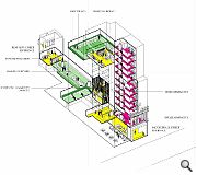
The high-density approach will see a high-rise frontage erected at Sauchiehall Street accessible via a retained facade from which a generous foyer and access core can be reached with a north-facing shared courtyard opening out beyond a nine-storey setback. Beneath all of this will lie an underground service level spanning the full depth of the site.

In an accompanying design statement, ADP wrote of the Sauchiehall Street frontage: "The giant scale of the 1st floor ‘piano noble’ is respected by setting back the 2nd floor in and introducing duplex apartments to exploit the large scale openings. The original tripartite arrangement of glazing is re-introduced with wide vertical mullions and deep reveals. At 3rd floor level the existing façade gives way to a new-build concrete frame with glazing recessed and solid panels introduced to form a back-drop to the Harmony statue."

A similar approach is to be taken on Renfrew Street where a basement level is to be reimagined as a new entrance and tiered social space with a quirky sandstone bust of Beethoven (removed for safekeeping), set to keep watch one more once reinstated.

Street elevations will take the form of a robust vertical precast concrete frame inset by deeply recessed bronze openings.  

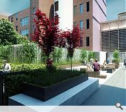
A central amenity deck will provide valuable outdoor amenity space for tenants
Stacked accommodation will open up the inaccessible interior as inhabitable space

27 Comments

EM0
#1 Posted by EM0 on 13 Jul 2021 at 10:08 AM
A good proposal for a tricky sight I think! Now please someone do something with the bottom half and gap site, such an embarrassing eyesore!!
Jaded
#2 Posted by Jaded on 13 Jul 2021 at 10:24 AM
Love it. Really stylish.
James Hepburn
#3 Posted by James Hepburn on 13 Jul 2021 at 11:30 AM
Commendable design for a difficult site. I take it the architect isn't from Scotland as its doesn't look mundane.
Basil Spent
#4 Posted by Basil Spent on 13 Jul 2021 at 11:46 AM
Return of the Single End?... albeit now you can sit in the corridor on your laptop whilst you work from home.
Hamish Ashcroft
#5 Posted by Hamish Ashcroft on 13 Jul 2021 at 14:08 PM
Really good proposal I think. Maybe slightly taller than I would like but on the whole great looking building
Roddy_
#6 Posted by Roddy_ on 13 Jul 2021 at 15:23 PM
Ah… the old chestnut of trying to make the uppermost storeys fade into the sky in the visuals. Why would you do that?..
Well perhaps because the scale and modulation of the thing is all wrong, perhaps because the designers and developers know instinctively-as most reasonable observers do -that far from being a foil to the elegant and iconic Charing Cross and Albany Mansions, it offers up a bulky, blank gable and it is this form that will become the back canvass we will eventually read their principal elevations against. It is clear to anyone that can get one eye open that the thing is far from harmonious in what is a rather delightful row of buildings – it is abundantly clear that the scale of any proposal is (or should be) established by the datum of the Mansions and Albany Chambers roofline – not by the Beresford, not the adjacent parade of shops (with Boots and the Garage) and most definitely not by Newton House across the road.
There are plenty other sites that could happily absorb this kind of development and height. This looks like over-development and yet another example of the progressive erosion of the Central Conservation Area’s character.
Dulnain
#7 Posted by Dulnain on 13 Jul 2021 at 15:51 PM
Is it a cloud? No it’s a further couple of storeys or so! Agree with comments made by Roddy, totally out of place in this location. The three quarter views would be not very pleasant!
town planner
#8 Posted by town planner on 13 Jul 2021 at 16:06 PM
I think this looks fantastic from the images displayed, and no issue with the height and location.
modernish
#9 Posted by modernish on 13 Jul 2021 at 16:20 PM
Jings, just have a look at the plans on the planinng portal!
Single aspect and undoubtedly grim little spaces. Surely there is more to life than sleeping and working?! These proposals are ideal for worker robots but a truly depressing reflection of where our society is contemplating going towards. Even the bloody indoor communal space is given over to work. I know that function, spirit or hope aren't material planning considerations but for goodness sake we don't need or deserve this level of crushing thought control in physical form.
CMcneil
#10 Posted by CMcneil on 13 Jul 2021 at 16:28 PM
What a wonderful use of a derelict site. I really hope this gets approved and brings some life to Glasgow city centre.
Mick
#11 Posted by Mick on 13 Jul 2021 at 17:08 PM
I’m not an architect and I do love modern, bold architectural buildings. But is there not such a thing as respect to the surrounding buildings? At least a conversation with what’s already there. I’m not against it per se but I’d like reasonable critique of what’s good and interesting about it. Any takers?
Hamish Ashcroft
#12 Posted by Hamish Ashcroft on 13 Jul 2021 at 21:00 PM
Really good proposal I think. Maybe slightly taller than I would like but on the whole great looking building
Ex architect
#13 Posted by Ex architect on 14 Jul 2021 at 11:33 AM
Surprised that nobody has mentioned the urban similarity with Mr. Dunlop in Bath St. And its incongruity within the fabric. You don't need visuals. It's there.
Brian Donnelly
#14 Posted by Brian Donnelly on 14 Jul 2021 at 11:55 AM
# Apex City in Bath Street? I love that project, brilliant views over Glasgow, and this one too. "incongruity with the fabric" really? Well done ADP
Ex architect
#15 Posted by Ex architect on 14 Jul 2021 at 13:01 PM
Brian,
As you will no doubt be aware, Bath St has been discussed and aired endlessly here. I think that both these meh buildings (one built) are just on the wrong sites when it's really all just about profit for the developer. Trouble is, the city has to live with these structures for a longish time. I also can't help but think they reflect the designer's ego more than anything else.
Brilliant views over Glasgow? I suggest the flagpole in Queens Park.
ACH
#16 Posted by ACH on 14 Jul 2021 at 13:11 PM
Looks like student housing in disguise.
Brian Donnelly
#17 Posted by Brian Donnelly on 14 Jul 2021 at 14:03 PM
#15 flagepole in Queens Park, eh? an ex architect and a smart *rse. About profit for a developer? why on earth would a developer take on a project unless for profit, it's no wonder you're an ex architect. Still despite it all. Both great projects. Well done again ADP
Neil C
#18 Posted by Neil C on 14 Jul 2021 at 14:14 PM
# 14 Apex City used to be Bewley's Hotel. I was on the Urban Design Panel when it came in for planning. Controversial then but it has become part of the city fabric. I love it too and think it is accepted "usually" a great addition to the city and an excellent value hotel. Friends have stayed there many times. This addition to Sauchiehall Street will also be a great addition, in my view
Brian Donnelly
#19 Posted by Brian Donnelly on 14 Jul 2021 at 14:27 PM
#18 by Mr Dunlop I take it the Apex/Bewleys is a project by Professor Alan Dunlop? That would explain the #15 green eye comment. Love it even more now.
STW
#20 Posted by STW on 14 Jul 2021 at 14:47 PM
I like this design... just not in this location. I know it's directly across from 457 but that's a building that's also out of scale for the area, we should be learning from the mistakes of the past now trying to make shinier version of them.
It'd be right at home down nearer the financial district and without the listed architecture as part of the scheme.
Enlightened
#21 Posted by Enlightened on 14 Jul 2021 at 23:22 PM
Take a look the adjacent post about fixing the "broken tooth" in Morningside, Edinburgh. That proposal blends in quite well with its surroundings, even though very bland, yet it gets really slated.
This Glasgow proposal hardly blends in at all with what are lovely buildings around it, yet seems to get a lot of approval and praise. I am not against modern facades, but I think the scheme looks overpowering and apart from perhaps the lower storey clashes with the current streetscape. Red
sandstone, for a start, would be a step in the right direction and shapes to complement the other buildings would be good and, dare I say it, a reduction in height. Apparently it is to arrest the decay in the area, so some people would accept virtually anything out of concern. But really I must ask, is this the best you can do?

Matt
#22 Posted by Matt on 15 Jul 2021 at 08:15 AM
Lovely facade, although what the hell is going on with the upper floors?
Gordon
#23 Posted by Gordon on 16 Jul 2021 at 16:00 PM
This is the equivalent of augmenting granny's beautiful china teapot collection with a e’Longhi Dedica EC685.M manual espresso maker; superb machine and beautiful with it. But of course this misses the point. And like an unbelievable number of comments above this proposal is just "invalid". Towns and townscapes, made from a rich history of urban life create a texture that we collectively recognise and love, will be trashed in an instant if left to visually illiterate architects and their developer pals. If they get this through they'll be fitting extensions to their back pockets. A truly shameful low point in Glasgow architectural proposals.
Brian Donnelly
#24 Posted by Brian Donnelly on 16 Jul 2021 at 18:37 PM
#23 I'm liking this project more and more with each vacuous comment posted on here.
Ben
#25 Posted by Ben on 16 Jul 2021 at 18:56 PM
#21 whilst this proposal isn't perfect, I'd take it any day over the other project you are referring to which looks like a cheap design from Barratt Homes circa 1990
Gordon
#26 Posted by Gordon on 16 Jul 2021 at 19:08 PM
Hey #24.....adding your own vacuous comment is cheating!
town planner
#27 Posted by town planner on 17 Jul 2021 at 08:41 AM
Not sure if there is a right or a wrong answer to some of these questions, which is part of the absurdity about some folk tearing strips off each at times!
I personally love the contrast this new development would have with the older buildings, (in terms of height/design/materials) I find it exciting and visually stimulating to look at different architectural styles from different eras (assuming the building quality is decent). Always loved in NY the contrast of St Patrick's cathedral with the skyscrapers around it. Bit of a difference in scale here to say the least, but similar idea, I particularly like how it looks with the old stone statues retained next to the modern cladding.

@21 You mention the Morningside development, and sum it up well yourself, sadly it looks like a "very bland" building proposed. It seems like frequently we can't or won't build buildings to the quality our ancestors did, but equally are careful not to offend representatives of some of the posters views here, so end up with a half-way house (excuse the pun) that satisfies no-one. I personally would prefer we avoid the bland option given the choice!

Post your comments


All comments are pre-moderated and
must obey our house rules.


Back to July 2021

Search News
Subscribe to Urban Realm Magazine
Features & Reports
For more information from the industry visit our Features & Reports section.