Newsletter - Links - Advertise - Contact Us - Privacy
 

Mid-market Milton homes to form a courtyard gateway

July 6 2021

Mid-market Milton homes to form a courtyard gateway

Glasgow Housing Association is heading proposals to create 48 homes for mid-market rent at Ashgill Road, Milton.

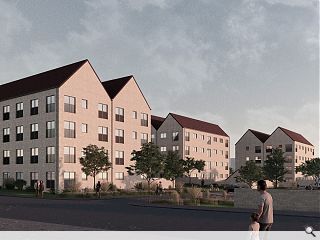
Rising on the site of the organisations own local office the brownfield build will rise at the junction with Colston Road. Collective Architecture has been brought on board to design the project, conceiving a gateway concept of three similar blocks with attached cycle and bin stores enclosed by sheltering brick boundary walls.

Outlining the proposed design the architects wrote: "The final proposed design capitalises on the site location and prominence creating a strong key gateway. The building position and sheltering walls define and protect a series of amenity and private garden spaces and the site is permeable with a series of linked attractive safe spaces."

The staggered blocks will be set back from an established tree line to form a small amenity space with all blocks formed from a mix of blonde and grey brick under terracotta roof tiles. 

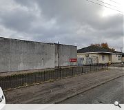
An unsightly office and depot will make way for the build
Sheltering continuous walls enclose private amenity and gardens

7 Comments

James Hepburn
#1 Posted by James Hepburn on 6 Jul 2021 at 13:03 PM
They look just dreadful.
Jimbob Tanktop
#2 Posted by Jimbob Tanktop on 6 Jul 2021 at 14:44 PM
#1 Completely agree. They'll fit right in
Ben
#3 Posted by Ben on 6 Jul 2021 at 14:58 PM
These look decent enough, whilst they won't win any design prizes they look fine for a site in Milton, big improvement on what is there.
spike
#4 Posted by spike on 6 Jul 2021 at 15:07 PM
Looks like a version of 1960's council housing except taller
yuck
#5 Posted by yuck on 6 Jul 2021 at 15:12 PM
Yuck, these are absolutely dreadful.
Major FAIL from Collective on this one.
Fat Bloke on Tour
#6 Posted by Fat Bloke on Tour on 6 Jul 2021 at 15:35 PM
Terrible design -- looks like a 90's refurb of a 60's shambles.

The detailing is brutally bad.
The GHA need a boot up the erse.
Not even filler.
modernish
#7 Posted by modernish on 6 Jul 2021 at 16:24 PM
An unsightly office and depot will make way for some equally, and somehow more visually offensive, unsightly housing.
To be fair the office and depot are GHA's. If they cared how unsightly they were they could have spruced them up years ago.

Post your comments


All comments are pre-moderated and
must obey our house rules.


Back to July 2021

Search News
Subscribe to Urban Realm Magazine
Features & Reports
For more information from the industry visit our Features & Reports section.