Newsletter - Links - Advertise - Contact Us - Privacy
 

Longstanding Broomielaw gap-site to host apart-hotel

March 18 2021

Longstanding Broomielaw gap-site to host apart-hotel

A long-standing gap-site on Glasgow's riverfront could be plugged by a new hotel development led by Mosaic Architecture & Design.

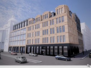
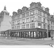
A proposal of application notice has been filed by HMH One Clyde for The Broomielaw Hotel at the junction with Oswald Street, combining conversion of the B-listed Oswald Chambers and construction of a new-build element on a gap site adjoining the A-listed neoclassical ClydePort building.

This would deliver a new city centre apart-hotel topping out at six stories to match the datum of adjoining properties. Outlining their indicative approach Mosaic wrote: "The proposed design has been further developed to evolve the classical language of the adjacent properties by adopting the established rhythms and datums. The facade presents a 2-3-2 vertical rhythm subdivided by horizontal elements which are set out to align with the datums of Oswald Chambers.

"The recessed upper floors are allowed to be more expressive vertical elements in a lighter material in reference to the expressed dormers and triumphant dome of the surrounding roofscape."

Feedback on the proposals is invited through to 24 March.

The development would establish a continuous frontage on this section of the Broomielaw

8 Comments

spike
#1 Posted by spike on 18 Mar 2021 at 11:27 AM
Hope this goes ahead
David
#2 Posted by David on 18 Mar 2021 at 11:39 AM
Really nice solution, well done to the design team!
The Gambler of Greenock
#3 Posted by The Gambler of Greenock on 18 Mar 2021 at 12:06 PM
That is one gap site that has been urgently needing filled for a long time, this scheme looks good. Someone wanted to turn it into a car park a few years ago glad that was rejected. The Clyde Port Authority building is one of the nicest in the area, whatever is built next to it needs to complement it well.

One of the things I would change about this new building might be the shape of the black dormer windows at the top, they are a bit blocky and simplistic, they don't match well with the old intricate design on the right.

People in the past seemed to add intricacy to their buildings, everything now is blocky simple shapes.
7yrsatuni
#4 Posted by 7yrsatuni on 18 Mar 2021 at 12:21 PM
No....has the Waterfront bar closed!
MV
#5 Posted by MV on 18 Mar 2021 at 12:56 PM
This is an awful image of a scheme that might actually be ok.
Gee
#6 Posted by Gee on 18 Mar 2021 at 14:55 PM
I always liked seeing the rear of the building next to it, but I suppose that's not a reason to prevent all future development.
Limiting Factor
#7 Posted by Limiting Factor on 18 Mar 2021 at 16:00 PM
Has anyone looked at the extension? Top floor looks ok, the rest however looks like they spent 30 seconds on it in sketchup. They note a 2/3/2 vertical rhythm - that makes 7 (I checked my sums twice), but I'm counting 1/3/1.5. This is more school band practice than a classical rhythm section.
Gladis Nomajob
#8 Posted by Gladis Nomajob on 21 Mar 2021 at 17:52 PM
I like the treatment to the vertical extension on the Oswald street elevation but that gap site infill not only feels like it's trying to be different for the sake of it but a bit of a rushed effort.
Will be fun for someone when they try to sort all the floor levels with the existing building to keep it accessible.

Post your comments


All comments are pre-moderated and
must obey our house rules.


Back to March 2021

Search News
Subscribe to Urban Realm Magazine
Features & Reports
For more information from the industry visit our Features & Reports section.