Newsletter - Links - Advertise - Contact Us - Privacy
 

Collegelands masterplan comes of age as a new public space

March 10 2021

Collegelands masterplan comes of age as a new public space

The next phase of Glasgow's Collegelands development has taken a significant step forward with the submission of plans by Vastint Hospitality for 221 car-free rental homes and 6,000sq/m of office space just days after plans were submitted for 219 apartments across the road.

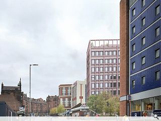
Prepared by 3DReid the mixed-use development constitutes four separate buildings on a 1.1ha brownfield site, led by an eight-storey office block adjacent to the Moxy Hotel and a further three stepped residential blocks which together frame enhanced public space.

Each building will be set upon a ground floor plinth to frame public spaces and serve as a visual divide between public and private space. Use of a modular construction system dictates regular grid fenestration with anodised aluminium coping and panels adding visual interest.

A landscape plan led by LDA will introduce residents courtyards and gardens with ground-floor activation coming in the form of a lounge and gym, cafe and co-worker space to help connect an upgraded Station Square to a revitalised Havannah Square. Together with a public art programme these spaces will invite pedestrians away from the 'fast lane' of the High Street into a slower-paced environment.

Setting out their approach the architects wrote: "By pulling the office building back, a notable deviation from the masterplan, we allow the potential for a larger civic space to be created spanning between High Street Station and Duke Street.

"The massing of the office provides an appropriate civic presence to this key gateway into the city. The office will act as a marker within the wider city-scape, highlighting High Street as an important destination within Glasgow."

Building on the established Page\Park masterplan the buildings reference the red brick and pale sandstone of a surviving goodsyard wall on Duke Street with a mix of red brick and pre-cast concrete.

Residential elements respond to the planned Get Living development to the south of High Street Station, helping to reposition the underutilised railway station as an active travel hub.  

A set-back office block will frame a soon to be revitalised High Street Station
Havannah Square will be remodelled as a new public space for the city

Individual buildings will step up in height reading from west to eas
Landscaping and public art will encourage people to relax just yards from the hustle and bustle of High Street

LDA Design will oversee a series of new routes and public spaces connecting to Havannah Street
Residential blocks will be linked by a colonnade at ground level to provide covered connections between residents lounges and shared amenities

9 Comments

Roddy_
#1 Posted by Roddy_ on 10 Mar 2021 at 15:59 PM
Layering awfulness on the already banal. That office block next to the Moxy - I mean - are they kidding? The interstitial blocks look like 60's over-clads. Designs as bleak as the sky in the visuals.
Charlie_
#2 Posted by Charlie_ on 10 Mar 2021 at 16:08 PM
I feel disorientated just looking at that overhead plan - what a dogs dinner of a lay out
monkey9000
#3 Posted by monkey9000 on 10 Mar 2021 at 16:57 PM
Good grief, Warsaw 1962 here we come! Illustrating there may be/are other point blocks in the vicinity does not justify the creation of more if the urban street design is not considered.
Fat Bloke on Tour
#4 Posted by Fat Bloke on Tour on 10 Mar 2021 at 17:20 PM
Filler -- low rent filler at that but needs must.

Much better if they at least aligned the High Street frontage with the Moxy next door.

Also more trees -- Burnbank Gardens shows us the power of trees and foliage.

High Street has been ruined by the Blackfriars Road flats -- the best that can be hoped for is the passage of time and very selective earthquake during the summer holidays.

Hopefully the College Street site will generate something better
Fat Bloke on Tour
#5 Posted by Fat Bloke on Tour on 10 Mar 2021 at 17:23 PM
Also some innovation with High Street Station would not go amiss.

Huge hole in the Eastern streetscape -- if its replacement is another hobbit warren entrance then a huge opportunity will have been missed.
Fat Bloke on Tour
#6 Posted by Fat Bloke on Tour on 10 Mar 2021 at 18:00 PM
Wonder how much the site went for?

Compare and contrast with the money saved by not putting in proper parking provision.

In civilised countries -- the rest of Europe they would have spent money on some underground parking.

More posh flats for students plus more business for the various surrounding parking providers.

Very low rent.
Sue Pearman
#7 Posted by Sue Pearman on 11 Mar 2021 at 11:17 AM
Another proposal looking to further push up the height onto the High Street. Personally I think, at least onto the street frontage, there is a strong argument for maintaining something closer to what would have been the historic street datum. What happens behind is less important.
Fat Bloke on Tour
#8 Posted by Fat Bloke on Tour on 11 Mar 2021 at 16:15 PM
Stepped rooflines -- not very appealing if your high flat overlooks a low roof space.

Surely some efforts could be made to use them for public realm?

Not all -- just some.
Better than looking on a ever growing collection of poorly maintained services and dead seagulls.
Enlightened
#9 Posted by Enlightened on 11 Mar 2021 at 19:23 PM
I like the layout, the front building being set back from the High Street and the landscaping. The heights seem okay, but this front building looks dreadful and doesn't complement the neighbours Moxy and Collegelands. It's very 1960s graph paper looking. Far superior is the posting of 1/3/21 "Apartment bid..... historic High Street" which looks sleek and with the bronze detailing does look good with red-coloured neighbours.

Post your comments


All comments are pre-moderated and
must obey our house rules.


Back to March 2021

Search News
Subscribe to Urban Realm Magazine
Features & Reports
For more information from the industry visit our Features & Reports section.