Station Alphabet communicates a new railway architectural language
December 14 2020
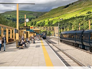
3DReid Architects have shared their entry in a Network Rail design competition to pave the way for a new generation of community-oriented British railway stations.
Updating an off the shelf approach, most recently deployed at Inverness Airport, the initiative seeks to evolve station design with a new architectural language to help unify the network and encourage complementary uses such as the popular Inn at Corrour Station.
In response, 3DReid have come up with Station Alphabet, a modular timber design with sufficient flexibility for local variations in style and accommodation.
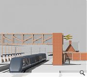
Conceived as a three-dimensional interpretation of the 'double arrow' railway logo first developed in the 1960s the design centres on repeatable 3m modules which can be left open or infilled with bracing elements following the same overarching geometry.
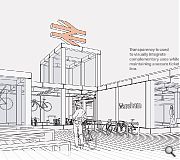
Individual units can serve as welfare accommodation for staff or passenger amenity with the option to link up multiple modules using engineered timber for longer spans which could accommodate alternate uses such as bicycle repair shops and cafes.
Such spaces could aid a reorientation of stations away from the tracks towards surrounding settlements as the face of an arrivals courtyard, dispensing with the car parks and taxi ranks which typify current approaches.
Scalable between small and medium-sized stations the design could be rolled out as a simple windbreak wall and lamp standards at its most basic through to larger configurations incorporating station buildings and a footbridge.
|
|
8 Comments
With so many sites across the UK, I guess its difficult to find a concept that will be appropriate everywhere. However, using the network rail logo for the concept is... work experience level of thought? I look forward to seeing the proposals of the 5 shortlisted practices.
A previous practice I worked in had two standard figures - 'Victorian balloon-seller' and 'group of sitting children' that appeared in everything. Bizarre. And seagulls, always seagulls.
Post your comments
Back to December 2020
Like us on Facebook
Become a fan and share


