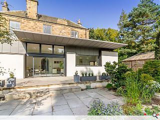
Eskbank extension folds contemporary living behind Victorian walls
October 8 2020
A traditional Victorian villa in Eskbank, Midlothian, has been given a striking makeover at the hands of Capital A Architecture.
A contemporary addition was specified by the owners Nigel and Sue Evans to replace an outmoded existing extension that improves connections with the family home and maximises utility of the rear garden.
Retaining the original external walls the facades have been given a rendered skin with feature window seats inserted into the deep-set masonry walls. Interior walls meanwhile were stripped out and the raised floor levels dropped to rationalise the floorplan and establish a consistent level throughout.
Níall Hedderman, director of Capital A, commented: “A central element of the design is the cantilever roof which provides shelter from rain and shade from summer sunshine. This element also gives the rear elevation a long, horizontal emphasis.”
The extension is differentiated from the cut stone of the main villa through the use of black and grey zinc, employed sparingly to cap the walls and frame windows.
The junction between the main house and the garden room is marked by an existing stone archway beneath the main stairs, portions of which have been exposed where quality allows.
Work began on the project in January 2020 with an overall construction cost of £200k plus VAT.
|
|
3 Comments
@#1 - And that's what you take from this? Get a life.
If you are going to have a matching floor, ceiling, inside outside grid .. it should line up. Looking at this is painful, it's going to age awfully.
Post your comments
Back to October 2020
Like us on Facebook
Become a fan and share


