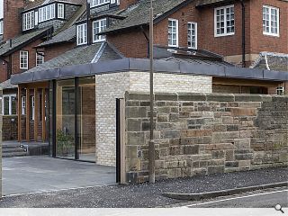
Arts & Crafts movement revisited with Edinburgh garden room
May 8 2020
Oliver Chapman Architects have drawn inspiration from the Arts & Crafts movement with the delivery of a garden room extension in Trinity, Edinburgh, which emphasises craftsmanship above all else.
Flitch House picks up on the styling of the B-listed parent home through a natural palette of exposed brick, Douglas Fir and oxidised copper to deliver a warm and inviting space.
Dominated by an engineered roof structure of Flitch beams, slender steel ribbons sandwiched between thick timbers to allow greater spans to be achieved, the technique provides sufficient strength for the roof to be lited up at the edges and so preserve views across the Firth of Forth.
This technique also allows for the roof to be thickened, maximising thermal performance and enabling a roof light to be inserted where the roof steps back from the house.
Internally the extension takes the form of a series of terraces with bespoke seating, steps and storage marking each threshold with a unifying warm pewter floor of Architop micro-concrete blurring the transition to a Caithness stone external terrace.
In a statement, the architect wrote: "While the early Arts & Craft movement was a reaction against the technological advances of the industrial revolution, Flitch House combines our clients' appreciation for craft and natural materials with their desire for a 'smart home', including wireless lighting and automated blinds. This is Arts & Crafts without the bell pull."
Photography by Angus Bremner

The offset walls of dining and living areas shelter an area for the sofa and return to enclose a bookcase
|
4 Comments
#1 Posted by Art Vandelay on 8 May 2020 at 11:37 AM
Ooooooft!
#2 Posted by mick on 8 May 2020 at 14:28 PM
How unusual ! Both the architecture and the written comments devoid of BS.
Well done OCA.
Well done OCA.
#3 Posted by SAndals on 11 May 2020 at 10:52 AM
Really like that - quiet exterior but looks like lovely, well considered and well detailed spaces internally.
#4 Posted by David on 12 May 2020 at 15:40 PM
This looks really classy, inside and out. But why that colour of brick? Seems to be at odds with everything else.
Post your comments
Read previous: Vital repairs to secure Stirling Station future
Back to May 2020
Like us on Facebook
Become a fan and share
News Archive
Search News
Features & Reports
For more information from the industry visit our Features & Reports section.


