Newsletter - Links - Advertise - Contact Us - Privacy
 

Buchanan Galleries air rights expansion back in contention

April 3 2020

Buchanan Galleries air rights expansion back in contention

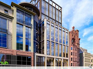
A significant expansion of Glasgow’s Buchanan Galleries shopping centre is again on the cards with the submission of updated pre-crisis plans for a major mixed office and retail development by Michael Laird Architects.

The south extension is being led by Landsec and will see vertical infill development over an open-air rail cutting sandwiched between Buchanan Street and Queen Street Station.

Incorporating a new subway entrance from Dundas Square the build will deliver a complex engineering solution devised by Arup to retain ventilation when decking over the railway line while permitting light to the north elevation of the A-listed Dundas House.

An integral part of the work will see Dundas Square upgraded to provide a public space more befitting of the redeveloped Queen Street Station, serving as a unified entrance to the new offices, subway and main-line rail services.

In their design statement the architects noted: “Fundamentally there are two elevations; Buchanan St and Dundas St. The elevational treatment to Buchanan Street has a natural hierarchy whilst the retail façades and entrances will be of a high quality with the aim of attracting premium retailers.

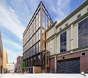
“The Dundas Street elevation has to incorporate the Subway entrance and travellator, tunnel ventilation and service access, and requires careful consideration. The office is entered via an internal stair that rises over the Subway entrance to a reception space.”

Arranged over 11 floors the building will provide a combined 13,240sq/ftof retail space and 141,750sq/ft of office accommodation upon completion.
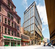
A metal grid will oversail the stone facade
Challenging topography combined with the mix of uses necessitates multiple nested entrances on different levels

13 Comments

Sue Pearman
#1 Posted by Sue Pearman on 3 Apr 2020 at 11:58 AM
Yikes I feel sorry for the lovely red sandstone building that this completely dwarfs...it's completely oversized for Buchanan Street and the negative impact on direct light into both streets will be terrible.
pooka
#2 Posted by pooka on 3 Apr 2020 at 12:01 PM
There are rumours going around that developers are quickly shoving potentially contentious developments into Planning just now while committees can't meet, as there's going to be far less scrutiny, in the hope some planners will be able to pass them under delegated powers...it'll certainly be interesting to see what monsters we're left with at the end of this...
StyleCouncil
#3 Posted by StyleCouncil on 3 Apr 2020 at 12:34 PM
A new level of over-scaled banal.

Nathan Right
#4 Posted by Nathan Right on 3 Apr 2020 at 12:52 PM
Grossly over-developed. About double the size it should be and with no context as regards its surroundings. Disappointed that ML put their name to this.
Charlie_
#5 Posted by Charlie_ on 3 Apr 2020 at 13:39 PM
I'd have prefered greater mix of use but the massing seems like a nice response to a tricky site and its great to see the integration of the subway. Overscaled? We're not in Wick here, this is sited between the busiest street outside London & Scotland's third busiest train station, anything less would be gross underdevelopment.
Charlie the Arch
#6 Posted by Charlie the Arch on 3 Apr 2020 at 20:42 PM
#5 the proposal would be about as inappropriate in Wick as it would be on our great city's historic shopping street, to which it has no reference in scale or character. The proposal would certainly be more appropriate in Docklands London or any other major downtown area devoid of a clear sense of context and place.
Charlie_
#7 Posted by Charlie_ on 4 Apr 2020 at 16:51 PM
@6, here's three references to context right off the bat 1) facade picks up & joins the roofline of the buildings on either side of it - the taller set backs won't be visible from directly below on buchanan street 2) the materials reference the new station it faces to the rear as well as the proposed bloc hotel at the bottom of dundas street 3) from sites further away where the roofline will be visible - say from west regent street or the lighthouse- it'll almost exactly mirror the west nile street office directly to the west, both in height and style. I mean yes: i'd prefer it referenced the beautiful ornate facades of nearby sandstone beauties instead but that doesnt seem to be among our options in 2020.
David Prowse
#8 Posted by David Prowse on 5 Apr 2020 at 19:49 PM
I don't see the problem. It's only 4 storeys taller than everything else.
Damp Proof Membrane
#9 Posted by Damp Proof Membrane on 6 Apr 2020 at 11:00 AM
Don't mind the height. But the elevational treatment is lower than basic. The relationship with the existing red sandstone building to the south really needs more work. It can do what it likes against the Galleries to the north. Also, what's to stop all the retailers just boarding up the glazing with the internal fit-outs, as they probably will. And aye, good to see integration of the subway, though the public realm in Dundas Street still looks appalling?
Nuff sed
#10 Posted by Nuff sed on 6 Apr 2020 at 11:40 AM
Urban infill on Buchanan St.
Think GK&C's BOAC building
And then look at this.
- Symptomatic of the globalised neutering of Glasgow
Sue Pearman
#11 Posted by Sue Pearman on 6 Apr 2020 at 12:24 PM
I've just noticed they're not following the street line on Dundas Street. Ok this street has suffered heavily from the poorly designed goods entrance to Buchanan Galleries, but to eat into the street and remove the public realm with 10 storeys of floorspace given to the developer is really compromising way too far. I have great faith in our Planning department and hopefully this will not just be pushed through, as suggested above, without being reined back to something more reasonable.
David
#12 Posted by David on 6 Apr 2020 at 15:03 PM
That rear elevation external area round the corner next to the BG goods entrance will be a grim, disgusting place at best.
David
#13 Posted by David on 7 Apr 2020 at 12:14 PM
That rear elevation external area round the corner next to the BG goods entrance will be a grim, disgusting place at best.

Post your comments


All comments are pre-moderated and
must obey our house rules.


Back to April 2020

Search News
Subscribe to Urban Realm Magazine
Features & Reports
For more information from the industry visit our Features & Reports section.