Newsletter - Links - Advertise - Contact Us - Privacy
 

Hassell detail University of Glasgow business school

November 29 2019

Hassell detail University of Glasgow business school

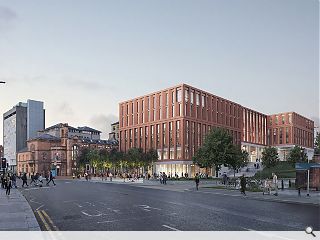
The University of Glasgow has progressed plans for a new business school in addition to a post-graduate teaching hub to serve as a southern gateway to the broader Western Campus masterplan.

Situated on the site of the former Western Infirmary the 11,500sq/m facility will sit behind a reconstituted stone articulated frame with bronze aluminium and glazing.

Internally the design seeks to foster interactions by aligning teaching and research spaces around a central atrium and collaboration space within three separate ‘stacks’ with the zones between opened up as lightwells.

In a design statement, Hassell wrote: “The building will become a key anchor of the new Gillmorehill expansion and will serve as part of the gateway to the campus. This requires a building façade that is both civic but restrained in its nature.
 
“The proposed facade is broken into three clear ideas, which allow the building to respond to its is context and topography on the podium level. The stepped boxes break the overall building mass up as an expression of the internal functions.”
 
To engender a more human scale a change of material, tone and texture have been specified for the stepped ground floor podium with a series of staggered boxes stacked above.

Facade changes between each stack seek to impart greater dynamism to the building as a whole

11 Comments

monkey9000
#1 Posted by monkey9000 on 29 Nov 2019 at 10:27 AM
Might as well of kept the Western Infirmary building, this looks pure boggin' !
Charlie_
#2 Posted by Charlie_ on 29 Nov 2019 at 10:33 AM
I actually quite like the building itself but those set backs really seem excessive.
Graeme McCormick
#3 Posted by Graeme McCormick on 29 Nov 2019 at 11:23 AM
Can’t you just feel the inspiration oozing out this building? No? I thought so!
Partick Bateman
#4 Posted by Partick Bateman on 29 Nov 2019 at 13:32 PM
I'd say it's an improvement on previous images I'd seen, I prefer the facade materials.
#3 Set backs usually annoy me but it does expose the entrance to the International college building which had been hidden before.
The big problem is the whole area still stinks of $h!te. Wonder if they'll do anything about the pump station as there're a few really good development opportunities across the road.
Donnie
#5 Posted by Donnie on 29 Nov 2019 at 13:42 PM
This looks like the existing 1970s Adam Smith building! It'd be slightly better if the facade was red sandstone (or similar) to match the surrounding area.
Pleasantfield
#6 Posted by Pleasantfield on 29 Nov 2019 at 13:43 PM
Can today's architects not design anything other than boxes and rightangles. Utterly uninspiring.
Max
#7 Posted by Max on 29 Nov 2019 at 19:19 PM
This is terrible and will only look worse with age. It doesn't respond at all to the grand buildings nearby, and I agree with #1 that this is not a lot better than the Infirmary it replaced.
Inahuf
#8 Posted by Inahuf on 29 Nov 2019 at 23:13 PM
Looks like a Department Store in a provincial town. Odd
Ex-Gratia
#9 Posted by Ex-Gratia on 30 Nov 2019 at 09:33 AM
Architects/ Developers and clients need to push back against GCC’s insistence that all new Glasgow buildings require to be the same ie Bland , heavy vertical proportions with either a red brick are blond stone finish . The planners / drs are to blame for this mundane banality. Enough is enough modern cities require diverse and varied urban forms that stimulate curiosity and interest . The city is being starved of this .
Gandalf the Pink
#10 Posted by Gandalf the Pink on 3 Dec 2019 at 14:48 PM
I quite like it...
Damp Proof Membrane
#11 Posted by Damp Proof Membrane on 4 Dec 2019 at 10:05 AM
If the reddish material is recon stone, I'd hope the white plinth material is also recon stone - though I'm not sure the shadow gap detail between the plinth and main elevation above is going to weather well - feel like it might be filthy and damp if the water isn't cast off properly.

Post your comments


All comments are pre-moderated and
must obey our house rules.


Back to November 2019

Search News
Subscribe to Urban Realm Magazine
Features & Reports
For more information from the industry visit our Features & Reports section.