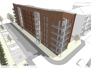
Planners dismiss Dennistoun development concerns to award consent for 36 flats
September 30 2019
An application by the Home Group to build 36 flats for mid-market rent on brownfield land at Kennyhill Square, Dennistoun, is being recommended for approval with planners dismissing concerns about views, traffic and massing.
First submitted last year by Grant Murray Architects the plans were subsequently amended to address these concerns by introducing a landscape buffer, removing white render and adding balconies. Parking spaces have also been reduced from 36 to 16 to help promote public transport usage.
In a comment, the council wrote: “The design is now more simplistic and uses facing brick rather than white render. The design is a modern interpretation of the tenement form which surrounds the locale.
“… while the form is undoubtedly modern, strong design cues have also been taken to reflect the architectural characteristics of the neighbouring Victorian tenements. The heavy reliance on masonry elements and the colour & character of this masonry have been carefully considered to add weight and to reflect the red sandstone that is so dominant in the surrounding area.”
The plans were on the receiving end of 25 separate objections including criticism from Paul Sweeney MSP, councillor Kim Long and a petition from Dennistoun Community Council signed by 65 residents.
6 Comments
After all, these 'pov' renders exude the classic lets try and 'pull the wool'.
It looks like it has been designed by someone with absolutely no skill, or ability, or care for what they are doing.
The roofline is all over the place.
The entrance 'towers' are very clumsily done and very incongruous with the rest of the design.
The composition of the balconies, including the set out of the railings, is very shabby and does not look as if any thought has gone into the arrangement.
All that is before you even get onto the quality of the visual, which is really pretty embarrassing- white blob cars with no wheels and the sketch up 'pretend sketch' setting.
Really very poor in just about every way.
"So so bad. It looks like it has been designed by someone with absolutely no skill, or ability, or care for what they are doing."
Yeah, that is a graduate from the Glasgow schools of architecture for you. Shocking.
Post your comments
Back to September 2019
Like us on Facebook
Become a fan and share


