New Forth Bridge visitor hub plans emerge
September 12 2019
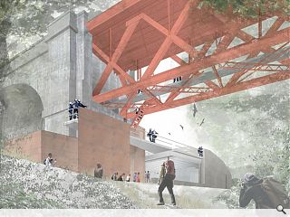
Network Rail has come forward with fresh plans to build a Forth Bridge visitor centre as the hub of a new 1.6km path network connecting to Dalmeny Station and a viewing platform on the bridge structure itself.
The Forth Bridge Walk Reception Centre has been conceived by WT Architecture, Arup and The Paul Hogarth Company to capitalise on the tourism potential of the famous rail link by repurposing a disused depot.
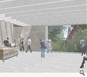
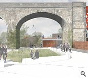
The planned reception hub has been conceived as a ‘solid, ground-hugging structure’ topped by green roofs, establishing a robust presence at the foot of a run of stone arches leading up to the iconic bridge with visitors arriving at an entrance sculpted from concrete and Corten screens.
Describing this approach in an outline design statement the architects wrote: “The building is overtly contemporary while echoing the defensive organic structures on escarpments, islands and hilltops around the Firth of Forth as well as those of the gun emplacements immediately adjacent.
“The new building reinforces the defensive edge of this escarpment using a rising rampart-like parapet as the access to the bridge itself. A more vertical two-storey inner core also communicates the purpose of the building of getting people up to and down from the bridge. To the east the building’s walls are more open and welcoming, allowing visitors and light to flow in and out.”
A network of steel gantries will provide direct access to the bridge structure itself with those undertaking the vertiginous climb rewarded by two distinct viewing platforms at the top of the south cantilever.
|
|
7 Comments
Image 1 has Run-DMC on the platform, a lost West Highland Way camper, and a peeping-tom in the bottom right bushes. Image 2 has some excellent ‘floaters’ and inconsistent perspective on the coffee cart, while Image 3 is strangely devoid of skateboarding neds and Buckfast connoisseurs.
Still it’s a long way from when we used to do this on the drawing board, when for some reason every image that left our office featured a Victorian balloon-seller.
Good to see the ubiquitous seagulls are present though.
Pity the drawings don't really convey the Architects aspirations, but the examples of materials the etc. in the D&A do illustrate the overall feel. And so I have faith.
Just get it built - as they say.
You can tell it's a quiet day in the office when the trolls have nothing better to do than citicise the quality of renders. Do they realise most projects have a limited budgt that they'd rather spend on design / delivery than keeping CGI monkeys in business?
However the figures that get dropped onto renders can sometimes spoil such good work, for the sake of a few more minutes spent sizing & positioning.
Post your comments
Back to September 2019
Like us on Facebook
Become a fan and share


