Newsletter - Links - Advertise - Contact Us - Privacy
 

Masonry monolith to rise from secluded Edinburgh workshop

August 22 2019

Masonry monolith to rise from secluded Edinburgh workshop

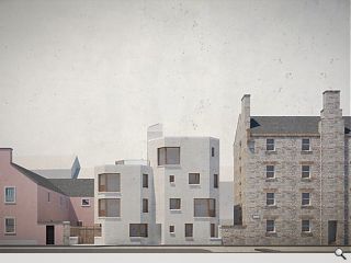
Newly formed Fraser / Livingstone Architects have revealed their first residential proposal within their home city with plans for a sensitive geometric addition to Edinburgh’s Southside.

Newly filed plans drawn up for Simon Court call for the delicate insertion of contemporary homes on the site of a hidden workshop, currently residing behind a tall boundary wall.

In a statement the practice wrote: “Working on behalf of Seven Hills Property Limited, Simon Court proposes an intimate, contemporary urban form, bringing activity and new homes to the centre of Edinburgh. The new building has been conceived to slip into the tight surrounding city fabric, reflecting and respecting the integrity of its neighbours without threatening their amenity.

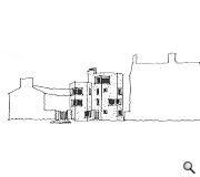
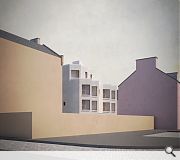
“The proposals include the demolition of an existing single storey workshop, removing the tall boundary that walls-in the site to allow light into the neighbours, and setting the building back from the boundary, to form a wee, shared and landscaped entrance court – Simon Court – visible but protected from the street.

“The building’s form is then modelled, to avoid overlooking, to exploit views out to trees and buildings along the street, to grab the sun and to form useful rooms. There will be six apartments, the rear ground floor one with a skinny garden court and the double top-floor one with a glorious south-facing terrace. It will be formed in brick, but with a lime slaister-coat dragged across, to form a simple masonry monolith that will sit well in this stone city."

Fraser / Livingstone Architects launched at the start of the year with a restaurant overlooking the Water of Leith being among their first projects.

An exsiting boundary wall will be removed to open up light and views
Facades have been carefully modelled to avoid overlooking

22 Comments

Gob_Bluth
#1 Posted by Gob_Bluth on 23 Aug 2019 at 11:31 AM
May as well have been dropped in from outer space.
Sensitiove Geometric
#2 Posted by Sensitiove Geometric on 23 Aug 2019 at 12:04 PM
It "slips" sensitively into the space like a machine gun bunker on the Berlin wall, giving a 180 degree killing angle for the soldiers occupying it
Walt Disney
#3 Posted by Walt Disney on 23 Aug 2019 at 12:16 PM
I think it is particularly appropriate that on the 75th anniversary of D-Day we pay homage to the structures of the Atlantic Wall.

The king has no clothes on.
John Glenday
#4 Posted by John Glenday on 23 Aug 2019 at 14:38 PM
Any attempt to break free of the sandstone box and zinc roof blandishment that straitjacket's thinking in Edinburgh can only be a positive. There are too many cowering fearties from this Glaswegian's perspective!
boaby wan
#5 Posted by boaby wan on 23 Aug 2019 at 15:52 PM
just saying something is "sensitive" and "delicate" does not make it so.
It looks like an interesting scheme why ruin it with archi-waffle?
Cadmonkey
#6 Posted by Cadmonkey on 23 Aug 2019 at 16:43 PM
UR - Can you add a link to the planning application please?
UR
#7 Posted by UR on 23 Aug 2019 at 17:02 PM
I don't think the application has been processed quite yet, address is 3 Simon Square
Stylecouncil
#8 Posted by Stylecouncil on 23 Aug 2019 at 20:57 PM
Is it UR’s opinion that this is a ‘sensitive addition’? Is UR now offering up architectural critique, or perhaps just giving old pals a leg up.
Dropped from outer space indeed #1, specifically planet Peter Barber. He has zero appreciation of context either...
The text is utter pretentious guff. There is nothing ‘glorious’ about the rear terrace or its outlook onto the arse end of a Tesco Metro and charity shops... i could go on.
Malcolm Fraser
#9 Posted by Malcolm Fraser on 23 Aug 2019 at 21:39 PM
Guys, does this industry frustrate you? Does it enrage you that someone thinks they can get away with caring? I’ve failed, but I - we - are still trying. Might I feel the more you sneer the better we must be doing? And is your anonymity not shameful? Be brave and tell us who you are and what you are doing that you think is better. Ahm aye happy for the discussion - to “waffle” even (Planning do ask us to describe what we propose)
What a non architect sees
#10 Posted by What a non architect sees on 24 Aug 2019 at 12:25 PM
It enrages most people that ugly stuff like this is passed for being 'caring' or 'interesting'. There's nothing interesting about it: it looks like a couple of part built lift shafts with random holes in it. And in 3/4 years there will be standard modern building water staining down the front of it and folk will look at it wondering where the entrance to the car park or public loo is. The buildings to either side will look fine. Happily in three or so decades it can be demo'd and returned to Moon Base Alpha.
hmn
#11 Posted by hmn on 26 Aug 2019 at 09:31 AM
I like it. So long as it is carefully detailed I don't see there being an issue with water/staining etc, #10. Much nicer than the miserable brute of a tenement to the right of it.
boaby wan
#12 Posted by boaby wan on 26 Aug 2019 at 10:04 AM
Good to know Malcolm Fraser is in the good old "you're not allowed to comment if you haven't done a better scheme on the same site" crowd.
Well done for not addressing any of the critique and going for the point scoring Malc...
Would be nice to hear exactly what you think is "sensitive" or "delicate" here? Surely a monolith is the opposite of delicate?
Could it be your description is a bit detached from the final design solution?
Nairn's Bairn
#13 Posted by Nairn's Bairn on 26 Aug 2019 at 13:36 PM
This is an oft-overlooked area of Edinburgh, just slightly off the tourist trail and a bit less 'obvious' as far as Edinburgh architectural attractions go, but it has some beautifully simple stone tenements, rendered traditional blocks and classic shopfronts (many currently not trading, sadly) lumped around some once-grand educational and civic buildings.

There are also more recent brick-clad flats and some faceless commercial chunks that are simply not nice to look at. Whether this will complement the former or be part of the latter remains to be seen. It’s nice to see the building stepped back from the street, and down towards the handsome rendered block to the north. The functional shape offers views down the street and therefore perhaps spares the flats immediately opposite, but does result in a defensive pill-box aesthetic that others here have alluded to. As with many projects its success will likely come down to the quality of finish and external works – at least it’s interesting!

To be honest the most annoying thing about the proposal is the affectedly earthy and vernacular wording of the supporting statement.
Nairn's Bairn
#14 Posted by Nairn's Bairn on 26 Aug 2019 at 13:51 PM
Regarding #9’s comment on anonymity, it is certainly true that many don’t seek publicity (strange concept I know) or raise their head above the parapet for a variety of reasons, and surely that can be respected?

Many find the pew more comfortable than the pulpit.

read it again
#15 Posted by read it again on 26 Aug 2019 at 14:42 PM
#12 It is UR who referred archi-waffled the scheme as 'sensitive' and 'delicate'. F\L's description is appropriate to the proposal, which appears to be a unique addition to a street comprised of tenements and anonymous housing development. It is brutal but so is the setting. There is at least some ambition here in trying to create views and prevent overlooking. Unless you would you prefer an identikit solution? There's clearly never enough of those.
boaby wan
#16 Posted by boaby wan on 26 Aug 2019 at 16:44 PM
@15 apologies there - I wasn't passing comment on the scheme.
This looks like an interesting design and as you say, at least there is some ambition here
Common Decency
#17 Posted by Common Decency on 26 Aug 2019 at 17:23 PM
#16 Your apology should be to F/L.
John Glenday
#18 Posted by John Glenday on 26 Aug 2019 at 17:32 PM
I think the word sensitive can be mischaracterised as being subservient. There are ways of being sympathetic beyond being shorter, plainer and less visible. Surely it’s possible to be sensitive while also advancing design, materials and form?
Maginot aye
#19 Posted by Maginot aye on 26 Aug 2019 at 19:57 PM
#2, #3 are you familiar with the street? The two tenements to the north are far more imposing, and quite reminiscent of giant defensive structures in their own right. I think the drawings shown here may do a disservice to the project. The 2D expression of the design would probably sit better with more context.
boaby wan
#20 Posted by boaby wan on 26 Aug 2019 at 20:57 PM
@17 - you are of course correct (although I still maintain that it is not a precursor of architectural critique to have designed an alternative scheme before passing comment)
@John, you are the writer here and I don't disagree, but I'm not sure what your definition of sympathetic is in this instance, I would have said this was a confident addition?
Similarly, is a delicate monolith not an oxymoron?
CADMonkey
#21 Posted by CADMonkey on 27 Aug 2019 at 12:16 PM
A few observations...
It looks a bit squidgy and forced into the site with the design driven by compliance with planning guidance rather than aesthetic architectural considerations.
Why is the creator releasing these images into the public realm prior to an application being lodged and then complaining about it receiving criticism?
What is wrong with anonymous criticism?
Why should I feel ashamed?
Besides, I am not anonymous - I Am Cadmonkey!
John Glenday
#22 Posted by John Glenday on 27 Aug 2019 at 15:30 PM
@20 The semantics could definitely be more sensitive!

Post your comments


All comments are pre-moderated and
must obey our house rules.


Back to August 2019

Search News
Subscribe to Urban Realm Magazine
Features & Reports
For more information from the industry visit our Features & Reports section.