Newsletter - Links - Advertise - Contact Us - Privacy
 

Foster & Partners detail Haymarket proposals

June 12 2019

Foster & Partners detail Haymarket proposals

Foster & partners have brought forward their plans for a major mixed-use scheme at Haymarket in Edinburgh following the abandonment of a prior scheme by Richard Murphy Architects.

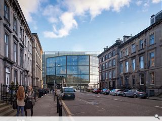
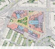
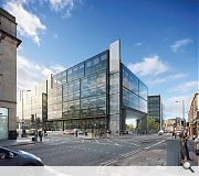
Acting on behalf of new owners QMile Group and M&G Real Estate the practice seeks to replace the ‘void’ formed by the present gap-site with five new buildings grouped around a large public square at the heart of the site.

These will offer active street frontages with building heights dipping towards the south to maximise natural light within the while deferring to the colonies of Walker Terrace.

Articulating this approach the architects wrote: “The proposals are formed around the key idea of making a new place in Edinburgh. This is achieved by simply forming the void that is the current empty site into a positive addition to the public realm by structuring its edges with new buildings and entrances to make a positive space: one that can add to the urbanity of the city and become an amenity for the local area as well as the city at large.

“The buildings are designed to be simple and calm, to offer elevations that work on the scale of the streets around the site with maximum ground floor use and activation to be as positive an addition to the streetscape as possible.”

The accommodation mix will include twin office blocks conjoined by a shared atrium space as well as hotels with the central square providing a space for events such as markets with landscape architecture proposals being developed around the idea of forming a ‘natural amphitheatre’.

A public events space will be situated at the heart of the plan
Surrounding streets will be met with active frontages

24 Comments

The Flâneur
#1 Posted by The Flâneur on 12 Jun 2019 at 12:26 PM
Oh dear. What a fantastic site and how enormously underwhelming. The view down Grosvenor Street to the ‘could be anywhere’ reductivist glass lump says it all really. Must do better, or, bring back the Richard Murphy scheme...
basho
#2 Posted by basho on 12 Jun 2019 at 12:45 PM
The Richard Murphy scheme was far more imaginative and interesting. The elevation that faces onto Grosvenor Street is particularly poor.
edinannan
#3 Posted by edinannan on 12 Jun 2019 at 12:55 PM
Oh my, the RM scheme (even though it was curtailed by Planners from the original version with a 7* hotel) was so much more interesting. This version is truly ugly. It makes me think of the St James Centre as was. In thirty years could this be a similarly hated building?
Trombe Wall
#4 Posted by Trombe Wall on 12 Jun 2019 at 12:58 PM
I do agree with the approach, in terms of creating some much lacking public realm, this is a real plus. However, I'm in agreement that the elevation isn't particularly specific to Edinburgh. These developments are all about looking modern though, typically.
Pleasantfield
#5 Posted by Pleasantfield on 12 Jun 2019 at 12:59 PM
Its a total winner for window cleaning companies....and not much else
Even the adjacent hotel got it more correct than this. Form ok. Height ok. Finishes and elevations ...NO.
Clarinda
#6 Posted by Clarinda on 12 Jun 2019 at 13:26 PM
The uninspiring modern architecture strikes again.

This is just awful and quite frankly looks like it belongs in a business park on the outskirts of town, not in an architecturally significant city centre such as Edinburgh.

As such a prominent site we really must do better than this. No care is given to its surroundings and whilst I understand its hard to mix old and new, modern architecture can be striking and something more eye-catching must be constructed here - not a square looking glass metal box.

I agree with the comments above, the Richard Murphy scheme was significantly better and had some interesting design features. If you don't want to do something new just revert back to that.
Clarinda
#7 Posted by Clarinda on 12 Jun 2019 at 13:33 PM
The uninspiring modern architecture strikes again. I agree with the comments above, the Richard Murphy scheme was significantly better and had some interesting design features. If you don't want to do something new just revert back to that.

This is just awful and quite frankly looks like it belongs in a business park on the outskirts of town, not in an architecturally significant city centre.

As such a prominent site we really must do better than this. No care is given to its surroundings and whilst I understand its hard to mix old and new, modern architecture can be striking and something more eye-catching must be constructed here - not a square looking glass metal box.

TepidMouse
#8 Posted by TepidMouse on 12 Jun 2019 at 13:54 PM
Awful awful. Terrible low rise glass boxes alongside even more hotels. Why no residential? This town is no longer fit for locals, but appears to be all about cramming in as many tourists as possible. It’s time for a rethink on Edinburgh, we cannot just keep piling in more and more tourists while the whole feel of the town loses its identity. The only hope is that the airport will soon have its wings clipped due to carbon footprint reduction because this cannot go on.
david leaf
#9 Posted by david leaf on 12 Jun 2019 at 14:13 PM
Not for me...... it would have been nice to see a design that respected its neighbours, and the use of robust materials..... this design will soon look outdated.
boaby wan
#10 Posted by boaby wan on 12 Jun 2019 at 14:36 PM
"natural amphitheatre"?
Natural - Nope
Amphitheatre - Nope
I love the guff these mega practices get away with when they are putting faceless carp into cities
Neil McAllister
#11 Posted by Neil McAllister on 12 Jun 2019 at 15:22 PM
Seriously?

Surely Foster can do better than that! They know how to do well articulated tall buildings (I know this isn't very tall but it is much taller than the surroundings). They've done much better work for Quartermile.

I'm not sure that I liked the Richard Murphy scheme but it was so much better than this.
Hootenannie
#12 Posted by Hootenannie on 12 Jun 2019 at 16:08 PM
Cultural misappropriation - tick
Burolandschaft - tick
Nandos, Starbucks, Cafe Nero, whatever - tick
How douce.
I would love to be a fly on the wall in the offices of the Cockburn Association or Edinburgh World Heritage right now.
Abercorn
#13 Posted by Abercorn on 12 Jun 2019 at 17:33 PM
What a huge disappointment - bland architecture and a triangular central bit left over falls well short of placemaking - this important site on the edge of the World Heritage Site deserves much more
Andrew
#14 Posted by Andrew on 12 Jun 2019 at 19:56 PM
Local resident. This is a real let down.
Matt
#15 Posted by Matt on 13 Jun 2019 at 07:34 AM
Its a pity large sites such as this, new ‘urban quarters’, are penned by one practice, especially one with such a bland corporate brandchiteture. A blend of more crafted, site responsive buildings would be far more appropriate, with a collective of firms working under one master plan.
This feels uber lazy.
Shambles
#16 Posted by Shambles on 13 Jun 2019 at 10:48 AM
@Matt - Agreed. Just take a look at the Barcode area of Oslo to see what happens when (god forbid) different architecture firms work together...
Juliet Wilson
#17 Posted by Juliet Wilson on 13 Jun 2019 at 13:52 PM
This is hideous and totally fails to respect the character of the surrounding area, particularly the colony flats. The provision of a public space is to be applauded but other than that it is horrible and will overly dominate the area. Also I wouldn't be entirely convinced that this would be appropriate for the site in terms of load bearing. My understanding is that the previous proposal was turned down because it risked collapsing the land onto the underlying railway tunnels.
A Fan
#18 Posted by A Fan on 13 Jun 2019 at 14:40 PM
#17 - Just as well there's a structural engineer on the project who is responsible for designing the foundations!

It's unlikely the foundations will bear on any ground above the tunnels, most likely you'd see the substructure bridging over the tunnel to a row of piles either side.
Neil McAllister
#19 Posted by Neil McAllister on 13 Jun 2019 at 17:11 PM
#18 - in fact I believe the previous contract put the piles in and other strengthening works - I assume this is just building onto that now that the risk of the groundworks has been dealt with by the previous owner.
Cadmonkey
#20 Posted by Cadmonkey on 14 Jun 2019 at 10:31 AM
For Starters....I’m a bit worried that none of the bars and restaurants (presumably the orange pink units on plan) have any WCs.
Walt Disney
#21 Posted by Walt Disney on 14 Jun 2019 at 11:15 AM
#18 Correct. I walked past the site pretty much every day when they were doing the work. The amount of concrete and steel that was buried under ground was insane. They'd have been cheaped piling it with £1 coins.

I do love it though when I read comments like #17. I honestly believe the general public thinks that construction is run by complete cowboys.
Matt
#22 Posted by Matt on 14 Jun 2019 at 12:05 PM
#17 Juliets observation re-colonies is bang on however... the relationship to the southern boundary is urban planning madness.
Stephen
#23 Posted by Stephen on 16 Jun 2019 at 10:51 AM
Very disappointing indeed, and while the new urban space in the centre is welcome have the architects reckoned with the unpleasant wind tunnel that may be created?
Roger Taylor
#24 Posted by Roger Taylor on 26 Jun 2019 at 14:25 PM
This is designed by Phillipa Forrester from Robot Wars and not Fosters !?

Post your comments


All comments are pre-moderated and
must obey our house rules.


Back to June 2019

Search News
Subscribe to Urban Realm Magazine
Features & Reports
For more information from the industry visit our Features & Reports section.