Newsletter - Links - Advertise - Contact Us - Privacy
 

Contentious Dundee office block nears completion

May 1 2019

Contentious Dundee office block nears completion

A contentious Dundee office block endorsed by V&A architect Kengo Kuma following a public backlash is nearing completion.

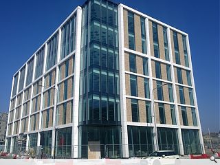
The Earl Grey Building is the first sight to greet visitors to the city travelling by rail and will include twin ground floor retail/restaurant units and a reception space with five floors of office accommodation stacked above.

Designed by Cooper Cromar Architects the build will offer 58,000sq/ft of floorspace behind an envelope of masonry cladding and glazed curtain walling in an attempt to form a restrained gateway to the V&A itself.

The waterfront build is the first phase of a wider masterplan for ‘site 6’ that will ultimately comprise three additional blocks including a hotel and homes.

The project stands to the west of Slessor Gardens, a planned riverfront park.
 

17 Comments

mick
#1 Posted by mick on 1 May 2019 at 11:36 AM
On the subject of this example of questionable urban insertion I think you do it a service by citing it as contentious. It would be more appropriate to cite it as crap.
Anti Keyboard Design Warrior League
#2 Posted by Anti Keyboard Design Warrior League on 1 May 2019 at 11:59 AM
Looks Good
wonky
#3 Posted by wonky on 1 May 2019 at 12:40 PM
Can just visualise the design process: 'Dave what you thinking?' 'Nothing Tom'. 'Corporate usually means those white vertical columns doesn't it?'
'Yeah, like you get with radiators?' 'Aye, them...they're all the rage right now.'
'What about buff brick- can we put that in as well?'
'I don't see why not- there's mo rule to say there can't be'
'And if there is a rule we can be dangerous and break them.'
'And we could have lots of tinted glass!'
'Oh yeah...the corporate types love that!'
'Let's put all of that into the 3D visualization software and see what it generates...'
Five minutes later:
'So that's it?'
'Yeah.'
'That will do.'
Steve Jobs
#4 Posted by Steve Jobs on 1 May 2019 at 13:20 PM
Whilst its a lump of a building I don't think its quite as bad as has been made out. Would be good to see it in context next to the V&A
Trombe Wall
#5 Posted by Trombe Wall on 1 May 2019 at 13:25 PM
Vacuous & Anonymous
Gandalf the Pink
#6 Posted by Gandalf the Pink on 1 May 2019 at 14:44 PM
#4... You should see it in context to the railway station... Now that is a building one can cite as crap.
mick
#7 Posted by mick on 1 May 2019 at 16:05 PM
Gandalf the Pink..... clearly your definition of crap is !!! deviating from the norm.
StyleCouncil
#8 Posted by StyleCouncil on 1 May 2019 at 17:20 PM
Such a 2d, low rent, stick-on facade on a building that belongs in a business park, not by the V&A. Anybody who considers this ok has no standards...like its architects, Cooper Cromar.
Jonathan
#9 Posted by Jonathan on 2 May 2019 at 09:33 AM
Whilst it is very easy to troll our fellow professionals and type behind a nameless 'title' i dont think this helps our profession, our designs or our planning system.

I do think the building is quite high, and close to the V&A but i'll stick my neck out and say i like it. I was lucky enough to get a tour a few weeks ago inside. Modern office blocks these days have a huge variation in design and style and to simply dismiss this as mud is poor taste.

But as everything in design, beauty is in the eye of the beholder. Maybe some of us just see everything (that isn't designed by our fair hand) as rubbish.
Designer
#10 Posted by Designer on 2 May 2019 at 11:24 AM
I think the facades are reasonably pleasant and that the photo here doesn’t do it justice. One storey too high however.
boaby wan
#11 Posted by boaby wan on 2 May 2019 at 11:45 AM
Stand down Jonathan, I think you might be slightly over-egging the importance of the Urban Realm comments section!
Having said that, do you think it helpful for the profession to laud mediocrity and celebrate failures in the planning system - while using a "real name"?
Fat Bloke on Tour
#12 Posted by Fat Bloke on Tour on 2 May 2019 at 11:58 AM
Its filler -- hopefully it is well built filler and keeps its looks into the future.

regarding its place in the future of Dundee -- it is more important what goes on inside than what it looks like.

A Local Pleb
#13 Posted by A Local Pleb on 2 May 2019 at 13:07 PM
This just reflects what is now generally accepted as the norm for developer led commercial office developments in many parts of the country.
Mediocrity sells so why are developers going to invest in something different if it costs more or is not required.
Indifference to what we as a profession value is disappointing.
Charlie_
#14 Posted by Charlie_ on 2 May 2019 at 20:16 PM
Cooper and cromar need to be made to go away
Zendee
#15 Posted by Zendee on 3 May 2019 at 09:24 AM
Why is it’s contentious? If this was designed as an art gallery then it would be contentious but it not it is designed as an office building. And as an office block this is perfect. A simple and non fussy commercial building which does not distract/ compete visually with the V&A which is the showpiece that everyone comes to see. Over ambitious designs for offices are hard to make work by the developers as the money is often not there. All this development is positive for Dundee and they are lucky to have such an ambitious scheme and investment coming into the waterfront.
Gunga
#16 Posted by Gunga on 3 May 2019 at 14:35 PM
What annoys me most about this building is how materials are used in the facade. Fake brick floating over glass with some aluminium cladding as a lintel, its just awful and reflects a shallow, careless, 'stcik on' approach.
The massing doesn't really upset me, what does is that some consideration of the materials and some careful detailing of them in a belivable way could have made it 100% better for no additional cost.
As it is, its always going to wind me up.
gordon
#17 Posted by gordon on 4 May 2019 at 22:26 PM
This is a typical Cooper Cromar off the shelf boring roll out. these guys have been strong in the office market for some time however they just use the same thing over and over again. No wonder That pop stars have lots to say about it! time these architects learned how to design properly as this is trash!

Post your comments


All comments are pre-moderated and
must obey our house rules.


Back to May 2019

Search News
Subscribe to Urban Realm Magazine
Features & Reports
For more information from the industry visit our Features & Reports section.