Newsletter - Links - Advertise - Contact Us - Privacy
 

Edinburgh terraced housing wins approval

February 25 2019

Edinburgh terraced housing wins approval

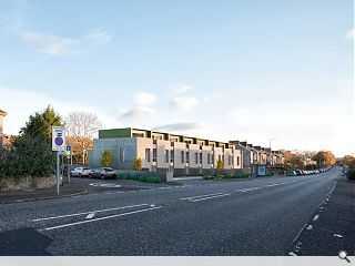
LBA and Wemyss Properties have won the backing of City of Edinburgh Council to proceed with a eight homes at Craigleith Terrace, in line with their Georgian forebears.

Comprising eight properties the scheme replaces a former petrol filling station, creating a contemporary infill development finished in buff traditional clay facing brickwork.

Articulating their design concept LBA wrote: “Each house of the terrace is formed around an ‘L-shaped’ brick wall in its plan, each one overlapping the next, wrapping and protecting the inhabitants and orientating them towards the glazed façade to the rear and out towards the terrace and garden.

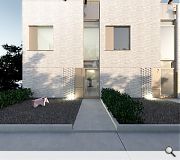
“As the brick wall of each of the houses wraps around onto the front South-East elevation it forms an elegant, slender and simple repeated façade motif for each house, reminiscent of a Georgian terrace.”

A recessed second floor is designed to contrast with the main façade. Finished in vertical metal cladding it aligns with the ridge line of neighbouring homes.

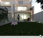
Brick will extend through the rear glazed facade to form individual garden walls
Full-height glazing will address the more private rear facades

7 Comments

CandidMarble
#1 Posted by CandidMarble on 25 Feb 2019 at 13:49 PM
Well, another line of low-rise housing in Edinburgh. To say they look like their Georgian neighbours is laughable, they look like row of garages.
juan de los angeles
#2 Posted by juan de los angeles on 25 Feb 2019 at 14:25 PM
"Reminiscent of a Georgian terrace"...does anyone really see that? Me neither.
Cadmonkey
#3 Posted by Cadmonkey on 25 Feb 2019 at 14:39 PM
An appallingly apologetic design.
Considering this is replacing a PFS I would have expected something a bit more ambitious.
The gardens are miniscule.
The plan doesn't look as if its had any time spent on it.
Windows to suit the elevation rather than function.
And you will have to walk through a neighbours parking space to get to your own front door.
Dreary dreary me.
Elmo
#4 Posted by Elmo on 25 Feb 2019 at 15:02 PM
#2 by not posting the full statement you are twisting the words to suit your agenda!!
Philip
#5 Posted by Philip on 25 Feb 2019 at 17:43 PM
I dont think the images help...but the lack of articulation is a pity. Looks awfully squeezed and mean spirited.
the punderer
#6 Posted by the punderer on 26 Feb 2019 at 08:29 AM
Wemyss by name and we miss by nature!
xrefmylife
#7 Posted by xrefmylife on 26 Feb 2019 at 12:50 PM
Impressive in managing to be less attractive and have substantial less natural light than buildings built hundreds of years ago.

It looks like someone has placed the render into the image and forgotten to scale correctly.

Post your comments


All comments are pre-moderated and
must obey our house rules.


Back to February 2019

Search News
Subscribe to Urban Realm Magazine
Features & Reports
For more information from the industry visit our Features & Reports section.