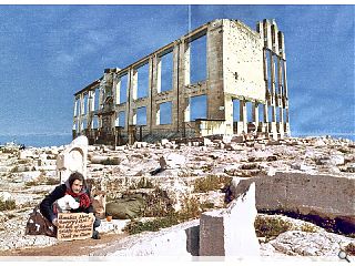
Dystopian depiction of a ruined future Glasgow earns GIA praise
December 4 2018
The Glasgow Institute of Architects have published the winners of this year’s Alexander Thomson scholarship competition, which tasked entrants with imaging what the city might look like in the year 2168.
Peering into his crystal ball Craig Higgins won out with a topical vision of the hollowed husk of Glasgow School of Art standing amidst a shattered landscape populated by beggars.
‘Look Down’ presents a bleak vision of the city 150 years from now in order to raise awareness of contemporary ills, with Higgins advancing the view that the city is not about buildings but the people who inhabit them. He warns that today’s focus on gentrification and conservation risks expanding an underclass of the dispossessed, as architects too often turn a blind eye to the problems around them by fixing their gaze upwards.
Higgins wrote: “We live and practice in a city where we no longer even look at the homeless sleeping around our feet because our eyes are fixated on the bricks and mortar above us. The tenements that were built to alleviate the conditions of the poorest in society are now preserved for the affluent, while today’s poor make do with cheap imitations.
“We forget that the buildings we worship were built for and by the people of Glasgow. We stop dead in our tracks to mourn the loss of a beloved building, and dedicate millions to its restoration, but stride past those in our city who are living in constant need. I hope in 150 years that we as a profession will have learned once again to stop and look down.”
GIA guest judge Toby Patterson praised the work for conveying ‘issues of today through the lens of tomorrow’, adding that ‘science fiction is always really about the present’ and concluding that ‘righteous anger can be turned to positive effect’.
19 Comments
Maybe the PC parade has made you a little sensitive.
Ironically your comment, lacking in a reasoned argument or analysis, is also a great example of 'didactic naffery'
Thank you for your comment. The trade in question is 'Art' hence the moniker.
I am sure UR can confirm to you that I am not a troll, and have consistently commented on work shown over the last 5 years sometimes in a critical way and sometimes positively depending on the subject.
I would say first off, that this is a comments section and not a section for reasoned argument or analysis. That said, I had decided in the comment for brevity as the most appropriate response.
My brief critical comment of 'didactic naffery' for me summed up my response to the artistic offering. It is for the reader then to think about, consider and understand what is meant by this. However, you seem to want to know more. So I'll say:
I used the word 'Didactic', because that is what it is - the work is proseltysing in a grossly simplistic way, in which the viewer is being TOLD to accept what the artist is saying. There is no ambiguity in this work in which the viewer can place themselves and think for themselves. I am excluded from it. That is my first positive criticism.
Secondly, as to 'naffery' my made up collective noun for that which is naff. By this i mean, and here are naff synonyms for arguments sake: unsophisticated, poor, inferior, worthless, in poor taste et al.
Maybe I did find it offensive like #1, in that it takes the image of someone (without permission, or any relationship to the person in question) and collages/juxtaposes them onto a photoshopped image for their own self-virtuous profit. For me, personally, this is taboo, quite simply a no no. A turn-off, however well-meaning the artist may have been.
I could expand further on notions of demagoguery or self-virtue but this is really not the forum to do so and so i would rather leave it at that.
Seeing as you asked... ZZZZZzzzzzzzz
Your argument seems to be purely based on the assumption that the competition brief was to create a piece of art, which it wasn't.
If you look up the GIA's brief for the competition it asks the entrants to create an image, and a supporting statement, to provoke discussion on what narrative will drive the future of the city of Glasgow.
Your response to the piece removes it from the context of the competition in which it was entered, and is therefore pretty naff.
With regard to comment #1 and your addition, people are shown in architectural illustration all the time without permission and purely for the gratification of the architect/architectural proposal. What is it about the person being homeless that makes it distasteful/taboo? I would argue that its your reaction to the sight of that homeless person (description of showing homelessness as 'taboo') that has inspired the entrant's whole argument.
Your attack on
Subtle as a half brick with visuals that let it down badly.
Whatever its failings -- UR has let it down with this article. I would diagnose a bad case of Drymenitis and suggest that the writer should end his "Forger's Gazette" subscription ASAP.
When I saw this competition advertised, I genuinely thought it was an opportunity to generate some really interesting ideas.
However, rather than inspire, they have chosen a negative, sort of adolescent, navel gazing version of the future where everything is terrible.
And then of course the runner-up is the obligatory Star Trek / Blade Runner version of the future.
Such a shame and a missed opportunity.
OK here's a suggestion. Let me fast forward your privileged existence and humbly suggest that you and the artist join for just one evening of your time, any organisation such as the Bethany trust, who'd be glad to have you along for the ride, to offer PRACTICAL assistance to folk on the street in providing hot food, warm clothing, one-to-one human communication with a fellow human being and come back and make a sincere work with integrity about your 'experience' and 'talk' about taboos then.
Otherwise, it's all just clearly CANT.
Post your comments
Back to December 2018
Like us on Facebook
Become a fan and share


