Newsletter - Links - Advertise - Contact Us - Privacy
 

‘Ethereal’ Glasgow hotel to bulk up city centre grid

November 15 2018

‘Ethereal’ Glasgow hotel to bulk up city centre grid

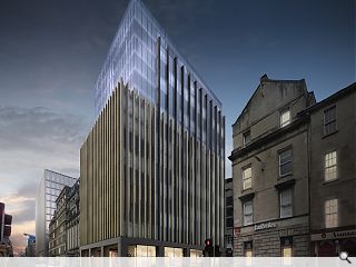
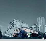
George Capital and 3DReid Architects have filed plans to replace an unprepossessing two storey structure at the junction of West Nile Street and Bath Street in Glasgow city centre with a new hotel build.

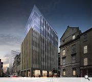
The chosen solution seeks to ‘resolve’ the block by framing adjacent listed buildings with a symmetrical frame with a solid structural grid used to lend solidity to a two storey base element. Vertical fins will help to articulate the facades with upper floors setback behind a simple glazed façade.

In a statement the practice observed: “In relation to the design, the proposal has been designed within the context of the surrounding conservation area. This results in something which is sympathetic to the aesthetics of the surrounding architecture, is considerate of the conservation area and also increases the attractiveness of the site and its surroundings.

“The upper level massing is to be set back from the facade edge, and “dematerialised” in order to separate the solid mass on Bath Street, and West Nile Street from the upper levels of the building. This would result in a simple glass form which would give the building an ethereal top.”

Planners are now considering a demolition application for the Central Conservation Area site.

The new block will strengthen the grid iron structure of the city centre
This rundown corner of the city is poised for dramatic change

14 Comments

MV
#1 Posted by MV on 15 Nov 2018 at 09:25 AM
Well done 3DReid. This looks great and is much more in keeping with a city centre than the existing 2 storey hole. It could probably go higher (given the BHS approval), but looks strong and unfussy.

The only criticism, unless 3DReid can confirm otherwise, what happens to the blue lagoon... and more importantly the iron horse!!?? I'm assuming they'll be the tenants on the ground floor....... ;)

Good effort.
rob
#2 Posted by rob on 15 Nov 2018 at 09:34 AM
Did they just copy and paste the student residences at the top of Bath Street ?
Willison
#3 Posted by Willison on 15 Nov 2018 at 09:56 AM
'Ethereal' is a novel way of describing architecture so insubstantial that it will be demolished in twenty years time.
Asimov
#4 Posted by Asimov on 15 Nov 2018 at 10:30 AM
Wow. Rare opportunity to really like the filler. Junk food gone - check. Bookies gone - check. Prehistoric, fag & urine smelling pub gone - check. Just go ahead, shift this town from XIX to XXI century. Well done 3DReid!
Fat Bloke on Tour
#5 Posted by Fat Bloke on Tour on 15 Nov 2018 at 10:32 AM
Looks very undercooked -- needs a couple of iterations before it is even half way ready.

Currently it is in Plook on a plinth territory.

Plinth: Far too heavy -- looks like a concrete fetishist's wet dream.
Plook: The Bath St. facade is far too fussy and complex in comparison to its Victorian neighbours. Needs to better mimic their pace and consistency.

Currently stands out like a sore thumb.
Not even filler in its current form.

Good to see the continuing demand for new hotel rooms in Glesga but not at any aesthetic cost.
Concrete Fetishist
#6 Posted by Concrete Fetishist on 15 Nov 2018 at 13:33 PM
Ooof! That plinth. Oo-er missus.
Billy
#7 Posted by Billy on 16 Nov 2018 at 01:35 AM
Well it should give some height to the skyline given its elevation and the buildings that are there are not particularly interesting.
Fat Bloke on Tour
#8 Posted by Fat Bloke on Tour on 16 Nov 2018 at 09:52 AM
Not really a case of what it replaces -- the big issue is how does it interact with its Victorian neighbours specifically right next door?

The current design is terrible in this respect -- far too fussy and overpowering compared to the Victorian quality close by.

Consequently big fail and needs to be rejected.
Billy
#9 Posted by Billy on 16 Nov 2018 at 11:10 AM
Can see in the picture a tall building in the background. Is that the intended replacement for Bhs? Does anyone know if there is any movement on that site and the Tradeston one ? I have given up on Candleriggs. Guess that gap site will see me out. They would be better just putting a big sign up saying ‘ never to be developed ‘. Has any other city centre had a gap site for so long? Too much dithering...oh it’s too high...it’s too dense...it’s too bold ....Just build it! Or we will stiill have this dead space in another 20 years.
Asimov
#10 Posted by Asimov on 16 Nov 2018 at 11:10 AM
#8 Bloke, there's a history of disrespecting neighborhood buildings in Glasgow for more than half a centennary. Either we're hostages of this rot and left-to-rot victorian ruins or use every opportunity to go forward. This proposal is not bad, at least covers the eyesore on its back. I'm passing this place twice a day and trust me - it desperately cries of any improvement. And disappearance of these two smelly ned-attractors (chippy and pub) is a bless. Give normal people a reason to come back to city centre again :)
Fat Bloke on Tour
#11 Posted by Fat Bloke on Tour on 16 Nov 2018 at 12:43 PM
Have to disagree -- the proposed design is too fussy, heavy and complex for its context.

Overpowers its neighbours when it should be supporting and developing their strengths.
Charlie_
#12 Posted by Charlie_ on 16 Nov 2018 at 12:53 PM
Of all the adjectives I might use to criticizevthis 'fussy' and 'overly complex' would be among the very last. Seems pretty obvious this does make some attempt to respect its neighbours both in the choice of blonde sandstone and vertical emphasis of the facade which is more than most Glasgow proposals deign to do.
Columbo
#13 Posted by Columbo on 16 Nov 2018 at 13:43 PM
#12
fBOT (the clue is in the name) is in all probability a random word generator from a lexicon of about 12 words and phrases: fussy, tries too hard, terrible, big fail, stands out like a sore thumb, not even filler, undercooked etc. etc. ZZZZZzzzzzzzzzzzzzzz

- And here was me even beginning to think that the author could very well be that other wallah's wee brother, Kevin 'not got a clue wot I'm talking about' McCloud.

Well, either that or the Hon Man from the Sunday Post has found a new vocation in life.... the search goes on.
Fat Bloke on Tour
#14 Posted by Fat Bloke on Tour on 16 Nov 2018 at 14:48 PM
#12

It might make an attempt to respect its neighbours but if that is the case then it is a very poor attempt.

Sticks out like a sore thumd -- far too many vertical elements that are a tick box effort at best.

Post your comments


All comments are pre-moderated and
must obey our house rules.


Back to November 2018

Search News
Subscribe to Urban Realm Magazine
Features & Reports
For more information from the industry visit our Features & Reports section.