Newsletter - Links - Advertise - Contact Us - Privacy
 

Vastint unveil ‘town square’ Merchant City hotel

November 13 2018

Vastint unveil ‘town square’ Merchant City hotel

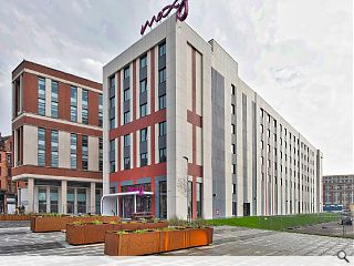
Vastint Hospitality, the property arm of IKEA, have completed work on a 181-bed hotel on Glasgow’s High Street, the latest element of the Collegelands masterplan to be completed.

The Moxy Hotel has been under construction since 2016 by Robertson and includes its own bar, meeting rooms and gym.

A front entrance is set back from the street across a ‘town square’ with new paving, corten steel planters and seating. The main body of the hotel is finished in fibre cement panels.

David Cairns, managing director, Robertson Central East, said: “Working with Vastint, we have been able to create a modern hotel that will prove popular with guests, and the use of modularisation has allowed for quicker construction with no compromise on quality.”

The modular build was built off-site before assembly in-situ and stands next to a student accommodation block delivered by the same team.
 

25 Comments

said no person ever
#1 Posted by said no person ever on 13 Nov 2018 at 10:32 AM
Aweson ..... that looks great
EM0
#2 Posted by EM0 on 13 Nov 2018 at 11:18 AM
Well it is slightly better than all the gap sites along this poor forgotten historic street, however are those awful planters the best they could do at improving the public realm around their building .... a real lack of effort is apparent!
Fat Bloke on Tour
#3 Posted by Fat Bloke on Tour on 13 Nov 2018 at 11:23 AM
Poor -- really poor.
The associated student block shames it.
Low rent 70's Scandi tripe -- the design was phoned in.
Hopefully the planned southern "ghost" block hides it well.
James Hepburn
#4 Posted by James Hepburn on 13 Nov 2018 at 11:33 AM
Just dismal. Utterly dismal.
Neil C
#5 Posted by Neil C on 13 Nov 2018 at 11:57 AM
Positives: It's better than those diabolical buildings a block to the south, and it's better than a gap site.

Negatives: Given the history associated with High Street, this is a shameful effort. Modular off-site construction phoned in with some tacky plant boxes as a token attempt at landscaping. Where are the trees? Where's the respect for the surrounding sandstone architecture? Where's the integration with pedestrian traffic? How have they managed to make this look cheaper than the neighbouring Collegelands student buildings? Why have you forsaken us, Robertson?
Someone has to!
#6 Posted by Someone has to! on 13 Nov 2018 at 12:29 PM
I blame the planners...
Fat Bloke on Tour
#7 Posted by Fat Bloke on Tour on 13 Nov 2018 at 12:37 PM
It is beyond belief that this prominent front rank building is not up to the standards of the buildings it hides.

Schoolboy howlers left, right and centre.
Why so little red in the colour scheme -- sore thumb in amongst all that red sandstone.

Complete dog -- Crufts is missing a champion.
You cant fit quicker than a kwik fit fitter
#8 Posted by You cant fit quicker than a kwik fit fitter on 13 Nov 2018 at 13:39 PM
Builder guy: "the use of modularisation has allowed for quicker construction with no compromise on quality.”

Quicker construction.........lord only knows how long they would have taken if it was traditional! A wee hotel like that should not have a 2 year build programme!

As for the design, its so unremarkable I shall refrain from remarking.
jimbob tanktop
#9 Posted by jimbob tanktop on 13 Nov 2018 at 14:01 PM
Two years? Did they have a workforce of three, using lego?
Charlie_
#10 Posted by Charlie_ on 13 Nov 2018 at 15:24 PM
Looks like a fancified toilet portacabin. Did we lose a war? Just about the worst thing I've ever seen go up in central Glasgow and there's a deep pool of contenders in that division.
wonky
#11 Posted by wonky on 13 Nov 2018 at 16:33 PM
Like the meaning of the Sphinx or the stellar calligraphy of ancient stone circles, for thousands of years the meaning of these signs may go unknown or be simply indecipherable, as will the signification of the Moxy Hotel on the High Street to time-travelling Alien archeologists in the future- what exactly is it? Why did they build it? How can such a manifestation of the apocalypse come into existence? They will never know. We will never know. Its twisted tin shrapnel like form will endure as a sign, much like the Sphinx, as a monument to our cultures belief system- will the Moxy ever be decoded just as the Rosetta stone hieroglyph was decoded by Champollion?
Looking at the windows of the building- why are the windows so surrealistically small? One would assume if a guest put his eye close enough to the window he may be able to see something, as you might spying through a key-hole- but would you want to see the abomination that defaced High Street in the early noughties across the way?
I see also the 'sign' is broken already- what pray does this signify- what omen can we scry from its splintered surface? Are we indeed in the last days of Late Capitalism as Jameson insists- is this what the Moxy Hotel signifies?
Clearly the barbarians of neo-liberal capital have won the culture war & the inscrutable neon nihilism of this carbuncle reveals the stillborn moment when transient Global finance is parturitioned as liveable form from the sterile fellupian tube of the city's council planning department.
What is the difference between an engineer & an architect/ between a draughtsman & an artist- why not just call architecture engineering?
Darren
#12 Posted by Darren on 13 Nov 2018 at 21:02 PM
Profile looks like a prison, just awful when you consider where it is, Glasgows High Street
Patryk Tokarek
#13 Posted by Patryk Tokarek on 14 Nov 2018 at 08:41 AM
Not sure why so many negative comments here, the glass fibre cement panels facade looks great and it fits well into the surrounding buildings
Gringo
#14 Posted by Gringo on 14 Nov 2018 at 10:00 AM
Of all the things to base your design on, the utterly dreadful student residences next door would be very far down my list. This looks like a poor relation of that! Mind bogglingly bad stuff.
Murdur Polis
#15 Posted by Murdur Polis on 14 Nov 2018 at 11:12 AM
#11

I enjoyed your contribution, Wonky. Spot on.

Yes, indeed, among all this short-termism, what will be the cultural reckoning? I'd even go further than your hypothesis, though - why even bother with any attempt to make architecture at all? - I'd argue that in a digital age, where all the sense data that people need is in the form of a few square inches on their phone, that architecture is in fact, redundant.

But there is still a basic question that needs answering - How can a planning system permit such a bleak 1930's Stalinesque development on the High Street, given the 86 page planning guff of http://www.glasgow.gov.uk/CHttpHandler.ashx?id=43009&p=0

Still, what would you expect if, 'The vision for the High Street Area Strategy was guided by the existing national and local strategic framework.' - where I counted no less than 25 planning strategy documents that were referred to. That's NOT a vision, that's a death sentence.

I am left with no option but to conclude that the answer is simple: all is dead here, save stupidity, Tammany Hall and low-flying vested interests.

HOWEVER, on the plus side, and given the context of the nearby Necropolis, at least the structure will be ideal in years to come (when the last customer has checked out) to be converted to one of those Italian-style cemeteries such as the San Cataldo cemetery in Modena.

observation
#16 Posted by observation on 14 Nov 2018 at 12:46 PM
Overservation: will those funky Corten Planters not stain and ruin the High Quality Landscaping in the "Town Square"

it will leave a lovley brown stain

might be worth thinking about
Charlie_
#17 Posted by Charlie_ on 14 Nov 2018 at 13:21 PM
Were you involved in this project, Patryk?
Pleasantfield
#18 Posted by Pleasantfield on 14 Nov 2018 at 17:24 PM
Oh dear oh dear oh dear. No award winners yet again
alibi
#19 Posted by alibi on 14 Nov 2018 at 21:40 PM
I genuinely don't understand how this is allowed, and why there's not greater uproar.

I suspect a big part factor is under-resourced planning departments under great pressure to approve and move on. Desperate stuff.
MV
#20 Posted by MV on 15 Nov 2018 at 10:13 AM
For those who have not seen the building "in the flesh", I urge you to go and take a look. This photo makes it look a thousand times better than it actually is, and I realise that must seem hard to believe.
Between the moxy and the white rendered student res to the south - these are the worst buildings I have ever seen in a city. Ever. Anywhere.
Fat Bloke on Tour
#21 Posted by Fat Bloke on Tour on 15 Nov 2018 at 10:57 AM
Blackfriars Road -- where the revolution will start.

This hotel is bad but it is not that bad.
Do you get a discount if you live in one of those monstrosities?
Paper bags available to anyone leaving?
Wee_Tam
#22 Posted by Wee_Tam on 16 Nov 2018 at 20:49 PM
And they'll build another one of these stunners at the SECC.....yeah spellchecker changed that!
buzzthedog
#23 Posted by buzzthedog on 17 Nov 2018 at 18:15 PM
Wot - 22 comments on a building by IKEA's property arm and no snide references to flat-pack architecture. A 2-year build programme seems pretty good to me, given that I am still trying to assemble the IKEA wardrobe I bought back in 2016.
Dutch
#24 Posted by Dutch on 17 Nov 2018 at 23:03 PM
Buzzthedog, turn the instructions the right way round. you spanner.
buzzthedog
#25 Posted by buzzthedog on 18 Nov 2018 at 20:56 PM
#24. Thank you Dutch, I get it now - so that will explain why the wardrobe is upside down!

Post your comments


All comments are pre-moderated and
must obey our house rules.


Back to November 2018

Search News
Subscribe to Urban Realm Magazine
Features & Reports
For more information from the industry visit our Features & Reports section.