Undulating Edinburgh school draws inspiration from the Pentland Hills
November 8 2018
City of Edinburgh Council has filed plans for a new build primary school for the south east of the city at the intersection of Burdiehouse and Frogston Roads.
Broomhills Primary School has been designed by Holmes Miller Architects to include a nursery and shared space, with each element having its own separate entrance.
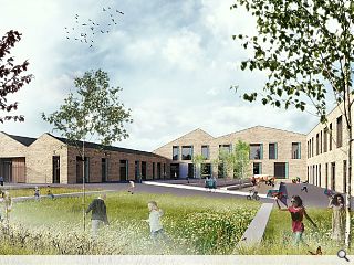
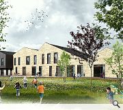
Inspired by the Pentland Hills the chosen form for the school adopts an undulating silhouette with the facade serving as a ‘civic front’ to newly formed parkland.
In a statement the architects remarked: “The undulating quality of the Pentlands was a great source of inspiration for the design of the building. The Pentland Hills form an area of high ground which rises above the surrounding landscape. The highest summits and peaks (Scald Law, West Kip, East Cairn Hill and West Cairn Hill) appear to merge into each other creating this undulating effect at the top of the hills.
“The design of the façade echoes the silhouette created by the summits and by simply extruding this profile the rest of the building is formed. This school façade acts as the civic front to the new park as well as a reflection of the landscape beyond.”
Utilising a dark grey zinc or zinc-effect roof with a facade dominated by buff brick and precast concrete panels the school seeks to defer to neighbouring residential development whilst emphasising its own civic nature.
10 Comments
I have to ask - Complexity? Where? Lack of scale? Where? Planned inconsistency? Where?
I do wonder what FBoT's actual background is. Journalism? Or, maybe he'd be more at home with the Taliban.
My only non-expert comment would be the school-run that the school would generate as I wouldn't want to live next to the school gates, unless the majority of pupils will be walking to school and back (which would be no bad thing)
Even then, I'm sure all that will have been considered.
All in all, a good decent high-quality proposal.
Because that is what they have got.
Post your comments
Back to November 2018
Like us on Facebook
Become a fan and share


Just what is it today with the Shed 7 design vibe?
Then there is the complexity that is not needed, the lack of scale and the forced / phony / faux attempt at history through planned inconsistency.
File under poorly executed dross.