Newsletter - Links - Advertise - Contact Us - Privacy
 

‘Sensitive’ proposal seeks to overcome Dunkeld gap-site impasse

October 26 2018

‘Sensitive’ proposal seeks to overcome Dunkeld gap-site impasse

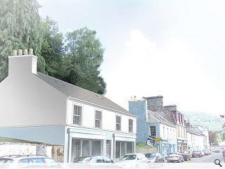
Robin Baker Architects are set to rejuvenate the Perthshire town of Dunkeld with plans to create a mixed retail and residential build within the conservation area.

Plans submitted to Perth & Kinross Council call for the creation of two shop units with a four-bedroom flat above on a long disused parcel of land opposite the B-listed Royal Dunkeld Hotel.

Outlining the vision the architects wrote: “Much care has been taken to respect the scale and proportions of the existing two storey buildings along Atholl Street, and to be sensitive to the historic area by proposing similar materials and detailing of the street facades and shop fronts.

“Further design development and details can be provided to meet the required high standard and we request that the council engage in discussion towards this objective instead of placing a blanket ban on any development and refusing a request to meet to discuss the development.”

String courses and eaves mouldings have been specified in stone to respect the current character of Atholl Street.

7 Comments

mick
#1 Posted by mick on 26 Oct 2018 at 15:56 PM
Oh Really....how unimaginative and of course the planners will love it !!
rankbadyin
#2 Posted by rankbadyin on 29 Oct 2018 at 11:53 AM
Architect decides to respect street scape with new design; architect promptly eaten alive by other architects.
boaby wan
#3 Posted by boaby wan on 29 Oct 2018 at 12:17 PM
Good luck getting the local authority on board for this one!
Looks like the architect is trying to get something built. not overloading the site, not altering the streetscape and not using bold materials/massing.
Guaranteed that Pkc will refuse it.
CADMonkey
#4 Posted by CADMonkey on 29 Oct 2018 at 14:09 PM
I think the problem with this kind of thing is that the "architect" from the outset puts the project in a design straightjacket. What results is a building that yes fits into the context so well you cant see it (pat on the head to visualizer), but the plan form is so poor it wouldn't get through 1st year (I've had a look). But hey....if that is what the client wants - feed it to them.
The planners will most likely lap this up, but the costly structural engineering works probably will put it down.
boaby wan
#5 Posted by boaby wan on 29 Oct 2018 at 15:35 PM
when the conservation officer puts a comment like this on his assessment of the previous scheme "The proposed traditional detailing, including the small chimney stack and single can, and the precast concrete moulding, emulates the neighbouring historic buildings, but cannot match their intrinsic quality and character."
I think you are on a hiding to nothing!
Nairn's Bairn
#6 Posted by Nairn's Bairn on 30 Oct 2018 at 11:39 AM
There's nothing wrong with respecting the street - that looks fine. The first floor windows could be moved further from the gables to lend it some solidity but other than that it should be an attractive addition.

I agree with CADMonkey that the plan has resulted in some oddly-shaped first floor rooms though - no excuse for that in a new-build.
Willothewisp
#7 Posted by Willothewisp on 30 Oct 2018 at 16:59 PM
Architect in non-white box (aka sugar cube) design solution! Shock awe, horror! Why no icon? Surely Dunkeld needs an icon?

Post your comments


All comments are pre-moderated and
must obey our house rules.


Back to October 2018

Search News
Subscribe to Urban Realm Magazine
Features & Reports
For more information from the industry visit our Features & Reports section.