Old Town hotel shows its true face
October 18 2018
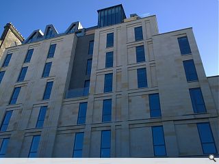
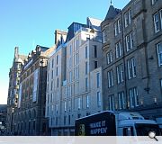
A £20m hotel in Edinburgh’s Old Town has been unwrapped for the first time, showcasing the latest addition to the UNESCO World Heritage site.
The eight storey hotel is being delivered by jmarchitects on a prominent Market Street site, overlooking Waverley Station and sits behind a sandstone skin below a striking zinc and glass lounge and roof terrace.
Rod Duncan, director at jmarchitects, said: “This site has lain empty and derelict for nearly five decades and we are delighted that the public can finally see what we have achieved in remarkable surroundings. It is through a rigorous analysis of this historic fabric that we believe the design has developed to be truly respectful to its context. We are looking forward to seeing the hotel’s doors open in the near future.”
Developed by The EDI Group for the Carlton Hotel Collection work is now proceeding apace on the interiors, designed by FG Stijl, with a view to marrying the strong heritage of the area with modern day requirements.
29 Comments
Sticks out like a sore thumb.
A severe case of trying too hard.
Simpler would have been better.
Edinburgh needs to remove a layer or two of overpaid navel gazing faffers and brown tape. Let’s start with WH.
Despite a few fussy details I think this responds to its setting relatively successfully. It’s certainly a more appropriately executed development than the horror that is Advocates Close or Premier Inn World further down market street.
Maybe the rain screen at the top is a wee bit fussy though and I've got a fiver on a big green streak developing on the east gable where it meets the stone.
I'm less sure about the dormer silhouettes (though they do again offer interest) but hey, I guess the designer had to let fly his creative juices somewhere.
On post #3 above regarding positivity of comments, to reiterate what has been said previously:
As the projects featured in the pages of UR are the most notable in Scotland, there is an expectation that the buildings are designed and built to a high standard. Most of the schemes have large budgets and are by national practices. Accordingly the bar is set high. A lot of projects slip by without comment, either because they’re uninteresting or just perfectly fine. Quite a few surpass the high levels of design expected and do get applauded accordingly (which is nice). And most will have resulted in happy clients, healthy fees and satisfaction all round.
But some are just plain bad and deserve to be called out as such. We don’t need the emperor’s new clothes here, and a back-slapping circle of architects telling each other how great we are does little for the profession.
The architecture world is a strange one – we rank ourselves amongst doctors and lawyers as professionals worthy of respect, but there is little accountability for bad design. Yes, you can measure leaking roofs, undersized rooms or overheated spaces, but ugliness is difficult to quantify (and indeed, subjective). A forum like this gives an opportunity to express opinions, both positive and negative, and when you get a raft of contributors all saying something is hideous, well it’s not nice to hear but sometimes negative criticism can be healthy. It will be the only time architects will get that sort of feedback – the rest of the time they exist in a professional cloud-cuckoo-land.
“A poor doctor can kill one patient, and he’ll be struck off.
A poor architect can kill a whole street, and other architects will laud him for his daring experiment.”
Colour might work in the context of 100 years of weathering but today it stands out -- shouting look at me -- when it doesn't need to.
Material quality = Good.
Low level detailing = Good.
Metal sheeting = Will allow future generations to date the design down to the month.
Start with the basics -- why the gap and what was there before?
Auld Reekie = Full engagement with instant rebuttal to any criticism.
West Central Scotland = Tumbleweed.
A parable for Modern day Scotland?
Ultimately people will have different opinions however I think this has been a great solution for the site and much better than the derelict space it was. I understand the sandstone looks very bright compared to its neighboring buildings but they were once that colour and the building will weather over time.
Same issue as the GU library -- it tries to mimic the skyline of a city in one building.
It surrounded by some medieval and post medieval tosh but at least they are true to themselves and offer some level of consistency. Unfortunately the weakest building in the district is its western neighbour and the new build then tries to overcompensate its untidiness with an even more complex form.
The Auld Reekie OT design vibe comes from the clash of individual styles at the building level -- not within an individual building itself.
This lesson seems to have been lost on the folk working up the new design.
I don't see any resemblance at all, care to explain?
On the face of it it looks like the facade has been value engineered, either that or too much medling from planning...
If they could it would have been with a simpler, more consistent central element with a roof that follows the rules of its eastern neighbour -- slate and no jazz influence.
That would mean saving the contrast element to aid the transition / integration with the existing buildings.
Transition would be set back to allow for the details that are already in place. The turret on the western building is particulary tricky given its prominence.
I’d love to see some of the buildings you’ve designed in historically sensitive and complex sites.
Personally I think this is a great addition to the city. The stone will weather in time but anyone who has ever built anything in Edinburgh will know you don’t have much in the way of what kind of stone you get to use.
Post your comments
Back to October 2018
Like us on Facebook
Become a fan and share


