Newsletter - Links - Advertise - Contact Us - Privacy
 

Lockerbie tenants given first glimpse of new ‘house’ architecture

October 18 2018

Lockerbie tenants given first glimpse of new ‘house’ architecture

Cunninghame Housing Association are to deliver 45 new homes for social rent on the former Lockerbie Academy site on Glasgow Road, Lockerbie, following the completion of demolition works.

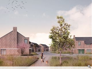
Plans filed with Dumfries & Galloway Council by Collective Architecture detail formation of a shared surface crescent fronted by semi-detached homes, terraces and cottage flats.

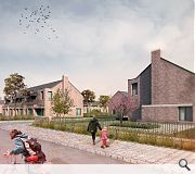
In a statement the architects explained: “Elevations look to utilise a series of repeating architectural elements, namely projecting bays, dormer windows, chimneys and projecting eaves. The combination of these elements looks to form a recognisable ‘house’ architecture which respects the local context. Dormers are used to street elevations to create distinct corners and provide a rhythm to longer elevations.

“The new houses can be read as restrained buildings, with strong horizontally proportioned walls / bays and roofs to main elevations, counterbalanced by vertically proportioned windows within dormers. The horizontality of the elevations is further emphasised by long, horizontal windows below the eaves to the first floor.

Respecting the predominant character of Locharbriggs sandstone and slate these properties will be finished in red facing brick with fibre cement slate.

A shared level surface public realm will be employed

14 Comments

Graeme McCormick
#1 Posted by Graeme McCormick on 18 Oct 2018 at 14:21 PM
These look rather nice. But I'm not convinced that Cottage flats are the way to go. A trip round several of similar new developments seems to indicate that the gardens in these properties tend to be less well cared for than terraced housing. That may well be considered a sweeping statement but it's just what I see. Is it that much cheaper to build cottage flats than terraced as the footprint doesn't look less?
Fat Bloke on Tour
#2 Posted by Fat Bloke on Tour on 18 Oct 2018 at 16:34 PM
Very fussy design. Trying to hard to make a statement that doesn't need to be made.

Complicated form means complicated build means inflated costs means organised theft from the working class.
boaby wan
#3 Posted by boaby wan on 18 Oct 2018 at 16:45 PM
"Respecting the predominant character of Locharbriggs sandstone and slate these properties will be finished in red facing brick with fibre cement slate."
They've somehow confused respecting for ignoring.
the end
#4 Posted by the end on 18 Oct 2018 at 18:35 PM
#2 and there was me thinking, this isn't bad. Quite 'human' even. But then again, what do I know, apparently its very fussy design etc. etc. trying hard to make a statement etc. etc. and then some idiotic simplistic mechanistic homily.
Do you EVER have anything to say that is positive, meaningful or constructive? EVER?
rant over.

buzzthedog
#5 Posted by buzzthedog on 18 Oct 2018 at 21:07 PM
#4. You are quite right - this is not at all bad. Indeed it is rather good, and FBoT (#2) is beginning to get on everybody's nerves!
StyleCouncil
#6 Posted by StyleCouncil on 18 Oct 2018 at 21:39 PM
Looks good. Confident use of materials and form. Like the 'garden city' feel...
Adam
#7 Posted by Adam on 19 Oct 2018 at 09:41 AM
#2. God forbid they design social housing that someone might be proud to live in. What an awful idea that would be.
Fat Bloke on Tour
#8 Posted by Fat Bloke on Tour on 19 Oct 2018 at 10:43 AM
Will the complexity aid or hinder the use of the building in the future?

I fear the complexity will generate costs that future residents / social housing group will not be able to support.

I applaud some of the detail but other elements have white elephant written all over them.
Artisan2
#9 Posted by Artisan2 on 19 Oct 2018 at 10:44 AM
"A shared level surface public realm will be employed". Curious caption for an image showing a raised roadside footway. Before any more shared surfaces are designed, pedestrians deserve more consideration, including blind and partially sighted people who may find the lack of physical edges confusing.
Or are we all to be invited to cycle on the pavement?
Fat Bloke on Tour
#10 Posted by Fat Bloke on Tour on 19 Oct 2018 at 11:00 AM
"A shared surface public realm" -- words to strike fear into any rational thinking individual.

Trendy wendy design techno-babble that sets up an unfair fight -- cars vs pedestrians.

Libertarian nonsense at its finest.
Pavements -- the nanny state at its worst.
Showbiz Sam
#11 Posted by Showbiz Sam on 19 Oct 2018 at 11:22 AM
#8 Sorry FBoT, but i suspect you don't know the difference between the words complicated and complex. Your comments on the second post use 'complicated' yet by #8 comment you've moved onto 'complex'. What is it you can't understand in the architecture? To me the elemental parts are entirely readable and therefore understandable. For me, your comment in #10 is just absolute petty nitpicking pish.
Looking at the above two images, there is a strong enough sense that this is a 'human' environment that has been created and will mature with age.
The individual architects' design foibles are neither here nor there. It's the overall 'feel' that is of importance as StyleCouncil pointed out re Ebenezer Howard.
Fat Bloke on Tour
#12 Posted by Fat Bloke on Tour on 19 Oct 2018 at 11:53 AM
Complexity in the context of modern social / public sector building design soon leads to complications in use.

The concept of a tolerance stack also comes into play -- individually OK but system-wide fail.

The design is fussy -- it has some nice touches but overall it is trying to hard to make a statement where none is needed.

Regarding the "shared surface public realm" -- this concept has been a bit of a slow burner but if it has reached Lockerbie the idea is gaining traction and entering the mainstream. I think it is a very dangerous concept and it needs a stake driven through its heart.

The idea might be radical -- think Nick Clegg / yellow Book Liberalism -- but it is in no way progressive.
Inahuf
#13 Posted by Inahuf on 19 Oct 2018 at 11:54 AM
#2 the real theft here is in the lack of a masterplanning for this released site and the adjacent new school which means there’s extra roads needing built, the housing is in one long circuitous cul-de-sac, and blocks present their backs to the public realm causing privacy issues for residents and reducing the nature of the Main Street. A more coordinated approach could have saved a load of tarmac, helped the area and left more gardens for folk to enjoy.
Muttley
#14 Posted by Muttley on 22 Oct 2018 at 09:38 AM
I like the realism in the renders, particularly the dog having a crap in the middle of the footpath in the first view.

Post your comments


All comments are pre-moderated and
must obey our house rules.


Back to October 2018

Search News
Subscribe to Urban Realm Magazine
Features & Reports
For more information from the industry visit our Features & Reports section.