Greenock Health Centre to address lagging wellbeing indicators
October 2 2018
NHS Greater Glasgow & Clyde are progressing plans for a £17m health centre in Greenock with the aim of addressing persistent negative health indicators within the town and wider Inverclyde region.
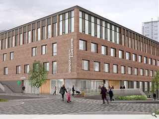
Designs drawn up by Hoskins Architects have already been approved for the build which will bring a multidisciplinary approach to health care by drawing together GP practices alongside a panoply of associated services including podiatrists, dentists and nursing care.
The four storey build has been designed to respond to the scale of nearby tenements, helping to define the surrounding street network using an L-plan block which also leaves room for a surrounding sunken garden.
While sandstone predominates in surrounding buildings budget constraints precluded its use here, guiding the selection of brick as a suitably robust alternative with a change in colour and texture at ground level to distinguish the street level experience.
Outlining their materials approach the architects wrote: “The design references the ‘walls’ of the town; the long runs of tenements and warehouses whose form was determined by the topography of the town. The new centre has been conceived as a robust wall to the street that opens up on the uppermost level towards the light and views and above the restrictions of the standard room types.
The area around the north-east corner has been recessed to signify the entrance to the building with a ‘special’ column picked out to open up the entrance plaza area.”
Land formerly occupied by the Wellington Academy has been earmarked for the build, which will replace a 40-year-old existing facility on Duncan Street.
4 Comments
=-(
Post your comments
Back to October 2018
Like us on Facebook
Become a fan and share


Another design where the lowest working looks like a hobbit sanctuary. The weight of the brick above seems to press down on the entrance level in the first image.
Windows very small and adds to the weight and the drabness.
Hopefully it will have a longer working life than its predecessor -- 40 years suggests either a lack of care and attention as seems to be the norm in the public sector or it was sub standard the day it was built.