Newsletter - Links - Advertise - Contact Us - Privacy
 

West end flats proposal meets resistance

September 26 2018

West end flats proposal meets resistance

A bid to build twelve flats on the site of a café at North Claremont Street in Glasgow’s west end has sparked some resistance from those who already live in the area, fearful of the proposed shift in scale.

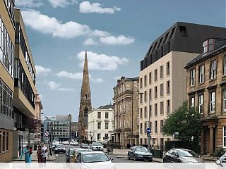
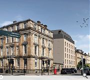
Under the plans a single storey restaurant, stub of a four-storey tenement which once filled the plot, will be swept away in favour of a seven-storey sandstone and zinc block topped by a mansard roof.

A number of critics have already lodged their objections however, pointing to everything from the loss of hedgehog habitat to the scale and design of the new build in an effort to head-off the proposed plans.

One nearby resident, mary Murphy, wrote: “The design, increased size, massing and materiality of the proposed development will be detrimental to the character and setting of the beautiful, historical listed buildings of Royal Crescent and Terrace and does not in any way enhance the character of the Park Conservation area. It is a modern carbuncle!”

It is understood that the ground floor unit previously served as a pub in the 19th century.

A large mansard roof tops the proposed design

9 Comments

David Blaine
#1 Posted by David Blaine on 26 Sep 2018 at 16:34 PM
Oh right. I've got it. The top two floors don't exist as you won't even notice them. I'll just get back in my box then. Sorry.
Charlie_
#2 Posted by Charlie_ on 26 Sep 2018 at 21:07 PM
The final part of the objection was reported elsewhere - parking. These groups always add that on last like an after thought to their real concerns like aesthetics, the integrity of nearby tunnels, the well being of nesting birds, etc. Same story, different day, nobody wants anything built anywhere because they think they might have to park 15 yards further from their front door.
Total Hypocrites
#3 Posted by Total Hypocrites on 27 Sep 2018 at 08:24 AM
I think Charlie hits the nail on the head ...... total bunch of NIMBY
David
#4 Posted by David on 27 Sep 2018 at 09:36 AM
It's clear from the CGI views that this scheme is 1 storey too high. As a result the double storey roof portion is very overbearing. It should be a single storey portion, but as it stands is
a clear sign of overdevelopment. Apart from that it's a solid enough scheme, albeit a bit meh...
Henry Hedgehog
#5 Posted by Henry Hedgehog on 27 Sep 2018 at 09:41 AM
I, for one, think this is a smashing idea. For far too long the voices of the Glasgow Hedgehog Society have been misrepresented, it’s about time we embraced something new. I mean that mansard, I barely even noticed it at first. Onward.
Rem Koolbag
#6 Posted by Rem Koolbag on 27 Sep 2018 at 10:01 AM
I would hardly call this site the west end.
What I would call it is a city centre site. In this case, how on earth can residents expect to live in a city and object to a new building on the basis of height and, as pointed out above, parking?
City living is, or should be, about density. Nothing will change, indeed atrophy, if a city is constrained to 3 storeys plus a roof with some parking underneath.
Pathetic.
And we end up with a gimped sheme like this by trying to pander to these people by adding 2 storeys in zinc to look like a roof then come off as unprofessional when the result is the above.
Do are a fine practice with a good portfolio - let them design the correct building.
CadMonkey
#7 Posted by CadMonkey on 27 Sep 2018 at 10:23 AM
Lets be honest, it looks like a converted office.
And why are there fake brick infilled windows on the gables? That just looks weird, adding to the impression it is a conversion.
(note prominent gables are buff brick, not stone)
Fat Bloke on Tour
#8 Posted by Fat Bloke on Tour on 27 Sep 2018 at 10:43 AM
Developer getting a bit greedy with the design and layout -- 7 storeys is pushing it a bit and the ground level looks like a hobbit sanctuary.

Consequently pretty poor design fronting up to a bit of 60's office nonsense across the road. however the design is poor and needs a bit of improving.
boaby wan
#9 Posted by boaby wan on 27 Sep 2018 at 12:16 PM
the 3d views really show this up, proportions are all over the place in the streetscape, really not a positive contribution to context

Post your comments


All comments are pre-moderated and
must obey our house rules.


Back to September 2018

Search News
Subscribe to Urban Realm Magazine
Features & Reports
For more information from the industry visit our Features & Reports section.