Apartments plug last Royal Mile gap site
September 12 2018
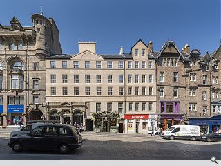
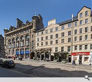
Unicorn Properties have completed an unusual development of 13 apartments at 123 High Street on Edinburgh’s Royal Mile by carefully constructing a four storey new build addition atop the remains of three listed stone buildings, including the B-listed Mitre Bar.
Sitting on top of a concrete deck the timber extension presented a number of particular challenges, not least the complexity of the plumbing to avoid weakening joists unnecessarily and resulting in the use of pipework specified by Rehau.
Designed by JM Architects the £3.2m infill build sits on the northern side of the High Street within the heart of the UNESCO World Heritage Site, employing a sympathetic sandstone façade to satisfy these demands.
Belying its historic appearance all homes will benefit from oak flooring and the latest appliances.
A formal opening for the project is anticipated by autumn 2018.
32 Comments
There needs to be a serious discussion about this.
Immediately adjacent to, and visible from, the Royal Mile we have the dogs breakfast that is Premier Inn World (with boak inducing red cladding bit) and the architecturally banal New Street development, both opposite our learned friends at CEC planning. Meanwhile we have this WH brown nosing, time-warp infill.
Both equally tragic.
There are those that will argue for something modern (an approach which often gets criticism from the public), and those that will argue for vernacular character (an approach often criticised by architects, labelling such buildings as 'pastiche' - look at the mauling Ian Begg gets for the Radisson, though the public love it).
This is somewhere in between, and while it may not offer something new, it will weather in quite nicely and as long as it doesn't offend the eye as you meander down the Royal Mile then it will have succeeded.
We obviously need to avoid watering down the quality of the street architecture, but in this case the building replaces a relatively modern, poor quality, single storey, flat-roofed and decaying infill building. On balance the quality has been upped so let's all be thankful to the architects and authorities for doing a good job. It's not an eyesore - hooray!
This proposal appears to have ignored the historical fues, and sailed a 2018 pastiche over a historic close and tried to unify 2 historic pubs. The upper level mock Georgian (whatever it is??) facade clumsily linking them solely to up the GIFA for commercial greed frankly does (or should) offend any architectural eye.
A clever contemporary development would have been miles better!
The Pontificals at WH and HES subversives will be lighting a smug, postcoital ciggie
When there was a space, it meant a bit of visual interest and variation of scale but this just fills the footprint and adds a bit of bland sandstone, disappointing that something like this can sail through planning
The facade isn't my cup of tea. Its a self concious and apologetic, but that's where ECC planning will lead you, and I suspect that the developer, faced with diminishing profit and escalating delivery issues, would have suggested that JM take the path of least resistance. I think everyone gets too hung up on 'style' and fashion, rather than just doing something that is good quality and appropriate. Got to say one of my least favourite buildings on the High Street is the storytelling centre. Looks like a community centre in Airdrie.
Most architects get the reality of their client’s requirement to generate economically viable developments Walt…and their struggle with planning in Edinburgh due to the spectre of WH and HES. It is no less worthwhile to point out the tragedy of having to build mock Georgian in 2018 and that we have to put up with the nonsense that is WH.
In the likely event of WH and HES demanding that the citizens of the UNESCO WHS should adorn breeches, cravats and silk waist coats, there should be similar criticism.
And by the way the Planning Permission shows the windows all lining up, so what went wrong with the setting out?
And another thing, what was the £750k of Heritage Lottery Funding mentioned in the Planning report used for?
It may be a rebuild of a 'pastiche' Cadmonkey, but much of the High Street could be called a pastiche to varying degrees. At least this has some sort of historical precedent in that it has rebuilt what went before (with some mild simplification). This is fine; it could have been awful.
People should save their indignant rage for where it's deserved (see 'Golden Turd' etc)..
Its a fair discussion, but I'm with Cadmonkey on this one. Even if this approach is just a one-off, taking the logic of the proposal ad absurdum, that it's good/fine to replace what was there once upon a time, we would be endlessly reproducing the past ad infinitum. This begs the obvious question - is what we are doing even if its just an expedient one-off in anyway AUTHENTIC? - here's a clue - does anybody write like Wordsworth NOW? Nope.
I enjoyed the discussion though.
See also the 'why rebuild a pastiche, lets do something current' campaign at Glasgow School of Art. Sometimes there is an argument for maintaining/recreating history, even if it means a lost opportunity for a starchitect to build whatever style is currently hot. And that, quite frankly, is not always a huge loss to the world.
Indignant rage is deservedly dished out to all forms of lazy, inappropriate, talentless guff whether it be a golden turd, bland copycat brick resi scheme or this museum piece.
Nairn's Bairn evidently didn't say that - you're putting words in their mouth. You make a fair point re: the Scottish Parliament but that is an exceptional building for a whole number of reasons. However, there are many more poor quality modern buildings on the Royal Mile and frankly, it doesn't need any more eroding the character of the place further. The modern building at Crichton's Close, the G&V hotel and probably, on balance, the Storytelling Centre are jarringly out of place and add absolutely nothing.
I do wonder how many of the commentators here actually live in Edinburgh and have to put up with these poor quality, modern replacements?
Yes, this modern building may be a pastiche, but given the choice between something which at least makes an effort to fit in with its surroundings or another soulless, identikit box which adds nothing of quality and sticks out like a sore thumb, (solely to satisfy a narrow 'modernity trumps everything' attitude), then developments like this should win every time.
Of course, The other well-trodden corollary of the pastiche route is that you inevitably end up with Poundbury and the work of Quinlan Terry et al. 18th century buildings with lay-in suspended ceilings etc. where architecture is reduced to stage set design.
In the pastiche world of Disney, the whole philosophy of aesthetics and the artful poetry of Architecture as construction is reduced to nought. - just like that. Nah - don't fancy it. Seems such a pointless pursuit to me.
No doubt this'll continue before it disappears aff the page.
The Scottish Parliament, while just within the WHS boundary and the Old Town Conservation Area, stands on its own site and replaced the dull Scottish & Newcastle offices. It’s certainly the less characterful end of the Royal Mile – photo opportunities are limited, and tourists scarce. The context is a little different, and the brief called for something iconic – a recognisable representation of the new Scottish Government. Whether the resulting effort achieved that divides opinion (presumably you’re a fan), but whatever one thinks, down there it intrudes less on the historical centre.
If you were to insert those finishes and shapes, or anything like it, into this gap site there would be a detrimental impact in the streetscape. I know it’s deeply uncool to say so, but in this situation give me Ian Begg’s Radisson over Allan Murray’s Missoni any day. Call the Royal Mile a theme park if you like – perhaps that’s exactly what it is. And it’s a successful one too. There’s more going on here than what architects deem authentic (though obviously that’s of paramount importance).
Your boresome predictability when it comes to anything that doesn't meet your dogmatic modernist theology is exhausting to witness.
The Scottish Parliament comes across best from the air. To the pavement-bound citizen, the building, with its bleak concrete façade, disjointed silhouette, bolted-on bamboo features and shopping centre entrance canopy offers little to enjoy. At best it’s ‘challenging’, at worst it looks like a part-finished Romanian housing block.
Put ‘Edinburgh’ into Google Images and you’ll get pages and pages of a variety of streets and views from all over the city, but no Parliament. There’s a reason for this - it’s an unphotogenic brute of a thing.
Thinking about it, Hogwarts might have been pretty cool.
Actually, it is more artifice than pastiche, but didn't want to say.
Are you sure you meant theology?
For streets like Princes Street, where the historic character has essentially been lost, I think a bolder approach is warranted.
Post your comments
Back to September 2018
Like us on Facebook
Become a fan and share


