Newsletter - Links - Advertise - Contact Us - Privacy
 

Contemporary infill to complete Inverness street

July 20 2018

Contemporary infill to complete Inverness street

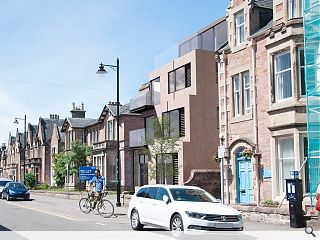
A disused Inverness office block has been earmarked for 16 serviced apartments as part of a redevelopment and extension spearheaded by HRI Munro Architecture.

The project will see conversion of the B-listed Ross House on Ardross Street to form eight serviced apartments, with a further eight being built in an adjoining build to ‘complete the street’.

Outlining their approach the architects noted: “The overall mass relates directly to available site width, the requirement for a deep plan, elevational and façade modifications, mid plan articulation and set back detailing to mark common stair and lift zone and a setback top floor with contrasting materials and large glazed area to further minimize its impact.

“We believe there is an opportunity here for a carefully designed contemporary building; a 21st century contribution to Ardross Street, infilling its only gap site and thus completing the street.”

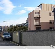
Finished in sandstone cladding below a zinc clad upper level the scheme includes stairwell fins, glazed balconies and louvres to windows.

The project will plug the last remaining gap site on Ardross Street

3 Comments

rankbadyin
#1 Posted by rankbadyin on 20 Jul 2018 at 12:16 PM
Personal tastes aside credit should be given where its due; the new building makes a good effort at respecting the frontage and height of the street, and the facade isn't screaming for attention like an e number addled 4 year old.
Graeme McCormick
#2 Posted by Graeme McCormick on 20 Jul 2018 at 14:27 PM
Does it have to be so boxy? That surely is not the overarching Statement of early 21st century design
Donnie
#3 Posted by Donnie on 25 Jul 2018 at 13:41 PM
My initial reaction was of pleasant surprise but when you look at the view from the rear it reveals the main aim of the brief = pack as many flats in as possible. Its a small site and 16 flats is far too many... and it shows. The top floor is neatly hidden in the front elevation visualisation but I would imagine its quite noticeable from other viewpoints and out of character from the rest of the street. Reduce the scale by removing the top level and at the back and you'll have a nice scheme... basically stop being so greedy!

Post your comments


All comments are pre-moderated and
must obey our house rules.


Back to July 2018

Search News
Subscribe to Urban Realm Magazine
Features & Reports
For more information from the industry visit our Features & Reports section.