Newsletter - Links - Advertise - Contact Us - Privacy
 

Network Rail visualises Queen Street Station improvements

July 11 2018

Network Rail visualises Queen Street Station improvements

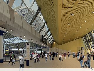
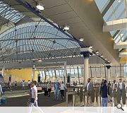
Network Rail has issued a fresh batch of visualisations to inform rail users of what awaits them following completion of a major reimagining of Glasgow's Queen Street Station.

Part of the Edinburgh Glasgow Improvement Programme the project will see the vaulting roof of the city centre terminus take centerstage above an enlarged concourse and platform area, enabling passengers to spill out directly onto George Square.

Jenna Clark, Network Rail Project Manager, said: “Using these latest computer-generated images, passengers at Glasgow Queen Street and the surrounding community can start to visualise how much bigger and brighter their improved station will be, but the Victorian train shed roof remains a key part of the structure and will be visible throughout the enhanced station.”

Network Rail estimates that 75% of the demolition work has already been completed, clearing the way for foundation work for a BDP-designed extension to accommodate eight-carriage trains and expanded retail upon completion in spring 2020.

The vaulted roof commands views of George Square for the first time since the construction of Consort House in the 1970s

14 Comments

A Local Pleb
#1 Posted by A Local Pleb on 11 Jul 2018 at 14:13 PM
I hope the interiors will maintain a high quality finish and not succumb to the cheap corporate branded stuff we see in so many Scotrail stations.
Pablo
#2 Posted by Pablo on 11 Jul 2018 at 14:29 PM
They thought about releasing another external visualisation as well, but decided it was easier just to ask people to imagine Tesco Silverburn.
Bored
#3 Posted by Bored on 11 Jul 2018 at 17:00 PM
Aw please stop reminding us about this....no improvement upon what was already there.
Graeme McCormick
#4 Posted by Graeme McCormick on 11 Jul 2018 at 17:47 PM
Will the concourse be enclosed and warm like Continental termini in winter?
gaypawel
#5 Posted by gaypawel on 11 Jul 2018 at 18:46 PM
@ post #1, obviously it will be the same as others. Have you been to the Oriam at heriot watt, the ceiling will be similar to that i think.
Jaded 'n aw
#6 Posted by Jaded 'n aw on 11 Jul 2018 at 19:42 PM
Erm..this improvement seems to only show a tenth of the travelling public..never seen it that quiet.
Everyone else using flying cars?
Sad
#7 Posted by Sad on 11 Jul 2018 at 19:55 PM
What a waste of opportunity. This is light years in functionality behind the continental terminals. For example Google Salzburg Hbf. Or at least check Munich or Frankfurt Hbf concourse. This is bland, empty, univiting and pointless waste of space. Leaving train the first thing you'll see is the nazi fortification called Clydebank Office across the street. So cheap, so dull. So Glasgow.
Neoliberalism
#8 Posted by Neoliberalism on 12 Jul 2018 at 11:29 AM
@#5 - At least Oriam is on a par with the materials you expect from sport training facilities and full size indoor football pitches. I think it does an excellent job with a limited palette, and when you compare like for like with other countries national sports training grounds, it stands up.

This however should be of a different order of civic stature, which is why its so disappointing that it's so miserly and unambitious. Its not even brave enough to be properly cheap.
Darren
#9 Posted by Darren on 12 Jul 2018 at 11:48 AM
Is this not really scaled back from the original drawings and artwork we were first shown. It's so bland and dull. The connection between the Victorian train shed and the new extension is just awful. Will it stand the test of time, I very much doubt it. Typical Glasgow right now
Hilloch
#10 Posted by Hilloch on 12 Jul 2018 at 13:30 PM
To those disparaging the design - and I agree with you - a reminder that this did not require Planning permission, the designers had a free reign. This is due to it being on Network Rail owned land (I recall). Pretty shameful set of circumstances given it's frontage onto George Sq
Billy
#11 Posted by Billy on 13 Jul 2018 at 01:34 AM
Not feeling the love for the new extension. The beautiful arch looks as those it will not be visible from the Square. The supermarket like frontage just leaves me cold. This is an oppurtunity to get it right after the horrendous extensions of the past at this site. And where are the retail outlets and eateries?
Stephen
#12 Posted by Stephen on 16 Jul 2018 at 13:47 PM
The blandness very much in line with Haymarket (Edinburgh), but also an improvement of sorts.
Simon
#13 Posted by Simon on 18 Jul 2018 at 11:47 AM
It's a real shame they aren't using that facade they uncovered on the side of hotel. They could have done something similar with Haymarket, incorporating the new and the old well - even if it was only on one side.
Gavin Millar
#14 Posted by Gavin Millar on 14 Sep 2018 at 23:24 PM
How ugly - I was in Glasgow last Saturday for the first time in ages - after the initial shock of seeing the old frontage no longer there, to see the hemisphere of the original station made me hopeful it would be left to speak for itself like they've done at Lime Street in Liverpool, I was not convinced this would be the case and regrettably I have seen the video which turned my stomach - the interior is bland but the exterior is again out of sync with the surroundings and jars the eye to loathe the tedious design of infallible cheapness and dullness. A missed opportunity to say less is more, when in fact more of this type of design says more and more about less and less.

Post your comments


All comments are pre-moderated and
must obey our house rules.


Back to July 2018

Search News
Subscribe to Urban Realm Magazine
Features & Reports
For more information from the industry visit our Features & Reports section.