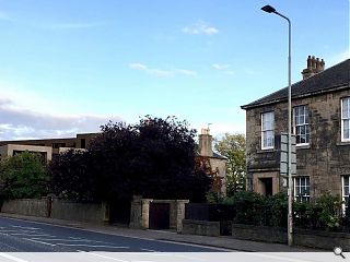
Edinburgh villa in the firing line for apartment project
June 11 2018
Morgan McDonnell Architecture have teamed up with Square and Crescent to propose the demolition of an existing villa on Edinburgh’s Corstorphine Road, for replacement with 20 apartments.
Occupying a wedge-shaped site bounded by the Water of Leith the development will build out the plot with a ‘pocket of green amenity’ at the street edge to break up its massing, with primary frontages pulled back from the street to align with neighbouring villas.
Finished in a sandstone skin to the front elevation with brick to the rear with bronze finished panels used to accentuate the ‘rhythm of openings’. A setback penthouse level would be clad in vertical timber
signals a starting point to the rhythm of building facades noted above.”
The south-facing façade over the Water of Leith with living spaces and balconies with tree planting helping to form a consistent river frontage.
4 Comments
#2 Posted by You cant fit quicker than a kwik fit fitter on 13 Jun 2018 at 09:39 AM
You can understand why they have tried their hardest to hide that monstrosity in the attached image.
Looks awful today, the mind boggles as to how bad it will look in 15 years time!
Looks awful today, the mind boggles as to how bad it will look in 15 years time!
#3 Posted by Cadmonkey on 13 Jun 2018 at 11:30 AM
Where is the integrated Affordable Housing part of the proposal?
Or is integration not desirable in private residential overdevelopments in Murrayfield?
(Hand the council a piecemeal commuted sum to build affordable homes in Stenhouse instead?)
Or is integration not desirable in private residential overdevelopments in Murrayfield?
(Hand the council a piecemeal commuted sum to build affordable homes in Stenhouse instead?)
#4 Posted by Philip on 13 Jun 2018 at 12:58 PM
Premierinn-chitecture.
Post your comments
Read previous: Renfrewshire Council progress Dargavel Village plans
Back to June 2018
Like us on Facebook
Become a fan and share
News Archive
Search News
Features & Reports
For more information from the industry visit our Features & Reports section.


Interesting that they have lined the W.O.L with a long tall block, completely at odds with the urban grain which has a consistent pattern of building to the front with south facing amenity to the rear.
This scheme, blocky, brown and architecturally bland beyond belief is ridiculously over-dense. It fills the entire site with build, only providing a miserable north facing 'pocket of green amenity’?!
Apart from that is great…