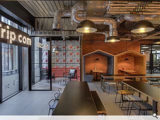
‘Wacky’ Edinburgh call centre dials up quirkiness
April 24 2018
Online travel agency Trip.com has unveiled its unconventional Edinburgh HQ, a 13,000sq/ft office space which seeks to upend perceptions of what a call centre should be.The interior space seeks to bring fun and excitement to the workplace by way of ‘wacky’ interiors in an effort to attract and retain staff. This includes a ‘biophilic’ design approach complete with a set-piece overhead planting feature playing host to 600 plants, all in the aid of reducing work related stress.
Lead designer on the project, Jordan McCaffery Partner of HK Surveying and Design, said: “With the war for talent becoming increasingly challenging, office design plays a crucial role in gaining a competitive advantage.
“While the raw industrial style has dominated the contemporary workplace in recent years, we wanted to challenge the traditional approach by adding a twist. From taxidermy that lines the training rooms’ walls to large rotating propeller blades and playful wallpapers, there isn’t a single corner of this office space that hasn’t been thoroughly considered. While the moustache and galactical themed meeting rooms contribute to the desired fun and exciting atmosphere of the office, incorporating biophilic design into the built environment aims to reduce stress-related illness and redress the diminished connection to nature.”
Jim Scott, joint MD of fit-out specialists Scotwood Interiors, added: “So many aspects of it introduced a fun twist on tradition including a huge variety of wacky wall and floor coverings. From breakout areas to the meeting and training rooms to the open plan space, every room and area is different, with quirky features telling you that you are not in a conventional work environment.”
Furniture, sourced locally from Bureau, includes ply-edge desk details and graphite tops as well as black leather lounge chairs. A lactation and wellness room is also offered to support employees returning from maternity leave.
|
|
5 Comments
#2 Posted by michella stachan on 24 Apr 2018 at 16:50 PM
i like it
although the wall paper on the left hand side of the second picture looks a bit ........ wacky
although the wall paper on the left hand side of the second picture looks a bit ........ wacky
#3 Posted by Robert on 24 Apr 2018 at 18:55 PM
By "wacky" they presumably mean they've spent too much time on Instagram and Pinterest and are rolling out every fit-out cliche from the last 5 years. The 'defurb' vibe, exposed services, raw finishes, critall style glazing, eclectic furnishings, light bulb signage, it is all there.
#4 Posted by StyleCouncil on 25 Apr 2018 at 06:47 AM
Wacky/Naff... it’s a fine line. Looks like a fairly standard, cliche riddled interior fit out to me.
#5 Posted by Walt Disney on 25 Apr 2018 at 16:36 PM
Pass the beard wax
Post your comments
Read previous: Dunfermline design charette invites town centre visions
Back to April 2018
Like us on Facebook
Become a fan and share
News Archive
Search News
Features & Reports
For more information from the industry visit our Features & Reports section.


Wacky.