£1m Isle of Lewis Museum extension to break new ground
March 2 2018
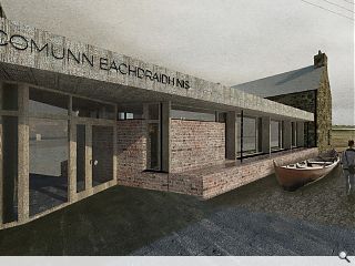
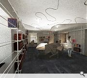
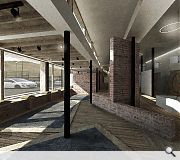
A £1m reconfiguration of the Sgoil Chrois Museum and archive on the Isle of Lewis is set to swing into action within the next fortnight, with Bard Ailteir Architects sensitively updating the historic Victorian school building to provide flexible open plan accommodation.Working with the existing horseshoe structure main contractor Neil Mackay & Co will make careful incisions into the existing fabric where required, alongside targeted demolition, to allow creation of modernized interior spaces specified by museum owners Comunn Eachdraidh Nis.
New additions have been designed to be subservient to the existing fabric with volumes kept below that of the former school buildings.
Project architect Ruairidh Moir, commented: "It has been a great privilege to be involved in this very exciting and transformative project for Comunn Eachdraidh Nis. We feel that the project as envisaged will be of huge benefit to the wider community, and also secure the former Sgoil Chrois building for future generations."
Sgoil Chrois occupies the former Cross Primary School which was converted by the Comunn Eachdraidh to form a museum in 2011.
|
|
9 Comments
#1 Posted by Dr P on 2 Mar 2018 at 10:58 AM
Looks like a nice project for Lewis, good work. Not a fan of the sandstorm photoshopping tho!
#2 Posted by Ghost on 2 Mar 2018 at 12:30 PM
Looks a bit of a dog's dinner to me.
The plan looks a bit all over the shop, with the squiffy walls, exposed structure, and and a lot of superfluous junctions.
The material pallette is too busy for me too- trying to cram everything into such a small space. The whole thing needs to calm-the-fuck-down.
External treatment is similar, with no clear architectural language, and oodles of junctions, which don't sit too happily with the existing building, or even themselves in places.
I think it looks a bit ill proportioned externally too, quite clunky, and a bit of a poundshop Richard Murphy knockoff?
The visuals are also a bit grim as the first poster says- they've obviously seen the trend for more 'painterly' visualisations as opposed to going for photorealism, and tried to mimic them, but have done quite a bad job really. Ramping up the noise filter in PS does not a good image make.
There are some strange detail choices- bookshelves in front of windows, a wonky ceiling with curly-wurly lines, rugs/ carpet samples on the floor.....
I could go on, but that's probably enough.
#3 Posted by ho hum! on 2 Mar 2018 at 13:15 PM
Dr P - you couldn't just have let a complimentary comment ... had to finish it on a negative! So typical of this UR forum.
#4 Posted by Jon on 2 Mar 2018 at 14:33 PM
Well done Ruaridh - a rising star in Scottish architecture, and nice to see an interesting design for a brief that chides so much with your own design ethos.
Look forward to seeing this completed!
Look forward to seeing this completed!
#5 Posted by Tommy T on 2 Mar 2018 at 18:38 PM
Seems a bit of a mismatch, too much going on with the old stone buildings, red brick, concrete strip across the top and wood around the entrance. Using the same stonework as the buildings instead of red brick would be an easier on the eye link between the two buildings. The internals are a bit too explosive as well.
#6 Posted by Coinneach Odhar on 3 Mar 2018 at 00:05 AM
'flexible open plan accommodation'
- more like an obstacle course if the visual is anything to go by. A sure-fire case of over-designed artifice instead of architecture.
- more like an obstacle course if the visual is anything to go by. A sure-fire case of over-designed artifice instead of architecture.
#7 Posted by CM on 3 Mar 2018 at 10:44 AM
look forward to seeing this progress...good luck with the project Ruairidh
#8 Posted by Dr P on 6 Mar 2018 at 14:09 PM
ho hum!- Better to have something positive about someones design work than to say nothing about it and use the forum to comment on other people opinions. I wish Ruairidh all the best with the build and I'm looking forward to seeing it finished...
#9 Posted by Miralles on 7 Mar 2018 at 11:25 AM
Haw. Gimme my table back!
Post your comments
Read previous: Stobhill Hospital wards off capacity constraints
Back to March 2018
Like us on Facebook
Become a fan and share
News Archive
Search News
Features & Reports
For more information from the industry visit our Features & Reports section.


