Arresting vision laid out for former Glasgow Police HQ
January 18 2018
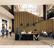
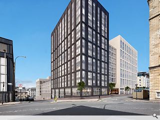
Haus have fleshed out their Glasgow build to rent vision courtesy of an application for full planning permission to build a £105m residential complex on the site of the former Strathclyde Police headquarters.Financed by Apache Capital and Moda Living Holland Park will create a ‘hidden garden’ within the heart of the city, wrapped by 433 flats in eight distinct ‘volumes’ rising up to 17 storeys in height above basement parking and street front commercial units.
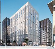
Taking their cue from the ‘grid-iron’ road plan of the central conservation area Haus has applied a classical architectural language of a base, middle and roof with gridded elevations and a particular emphasis on how each building meets the ground to fully engage with the streetscape.
In their design justification Haus wrote: “On each of the corners of the site, aligned with Glasgow vernacular architecture, our proposals have a taller nodal building, which has a strong vertical emphasis. The tallest elements, in diametrically opposing corners are encased in dark metal finish drawing connotations of Glasgow’s industrialized past. The secondary corners are in pale stone finish.”
A materials palette of dark metal for the taller elements and pale stone for secondary corners with recessed, horizontal brick buildings signaling entrances to the central garden.

Ancillary spaces will include reception areas, a gym, cinema, lounge and rooftop terraces for the use of residents and visitors.
|
17 Comments
#1 Posted by monkey9000 on 18 Jan 2018 at 11:53 AM
Snore
#2 Posted by Lobey Dosser on 18 Jan 2018 at 14:50 PM
In their design justification Haus wrote: “blah blah blah - there are tall bits with corners......blah blah blah"
Looks like typical (sh1t)Haus design.
Looks like typical (sh1t)Haus design.
#3 Posted by StyleCouncil on 18 Jan 2018 at 15:13 PM
No need for those trees....
#4 Posted by Philip on 18 Jan 2018 at 16:31 PM
God this is dull....and completely lack in finesse.
#5 Posted by Graeme McCormick on 18 Jan 2018 at 20:59 PM
It takes me back to the Sixties when I received a plastic building set with wall panels just like those in the illustration. The Site offers an opportunity to do slightly smaller and sloping 21st century version of Blythswood Square. Sadly whats proposed will not stamd the test of time. Pitty the Old High School buildings could not be part of a really imaginative campus
#6 Posted by Jaded on 19 Jan 2018 at 07:33 AM
I don't understand the complaints. This is a solid city block. It will breathe life into this part of the centre. The materials look good. The design is solid, thankfully sparing us any barcode windows or other modern tropes.
I only wish they'd gone taller.
I only wish they'd gone taller.
#7 Posted by monkey9000 on 19 Jan 2018 at 10:37 AM
@No 6 Jaded
"materials look good"... really? Cheap curtain walling and stick on metal panels are good materials?
Bears a similarity to cheap Premier Inn's we have seen popping up around the country.
"materials look good"... really? Cheap curtain walling and stick on metal panels are good materials?
Bears a similarity to cheap Premier Inn's we have seen popping up around the country.
#8 Posted by Liz on 19 Jan 2018 at 12:36 PM
Re Graeme's post, I think I had these building bricks too in the late 1950s - they had metal posts which you slid the bricks on to but can't remember what they were called. Can anyone? Perhaps this is the way forward for modern buildings (only joking)!
#9 Posted by A Local Pleb on 19 Jan 2018 at 13:00 PM
Is the estimated cost not a bit light, risk is what is already a basic design gets stripped down even more when tenders are returned?
#10 Posted by Gordon on 19 Jan 2018 at 13:33 PM
Missed opportunity....replacing junk with Anywheresville mediocrity
#11 Posted by Charlie_ on 19 Jan 2018 at 15:24 PM
Ah well, the complainers can rest easy: like every other Glesga proposal worth talking about it'll stall for years then quietly disappear, eventually being superceded by a consultation process and pre-ap for a fresh proposal which goes nowhere.
#12 Posted by MV on 19 Jan 2018 at 15:59 PM
Haus were so close to getting away with the UR comment abuse. So close. The 8th of January news article ghosted by as everyone awoke from their Christmas and New Year hibernation. The question is - who decided to “flesh out the story”? The German firm or UR?
For me, it doesn’t look that bad. It is a relief that they realised that Glasgow had a grid pattern though... just think of what could have happened had they not looked at a map- great research!!
For me, it doesn’t look that bad. It is a relief that they realised that Glasgow had a grid pattern though... just think of what could have happened had they not looked at a map- great research!!
#13 Posted by Sven on 20 Jan 2018 at 19:52 PM
Am I alone in liking this? Its has no 'Glasgow vernacular architecture' but its simplicity mixed with the different facades and heights makes it good.
#14 Posted by MV on 21 Jan 2018 at 13:20 PM
Sven, I think it looks fine. It is certainly a game changer in terms of this area of Glasgow. My only concern is the materials. Dark metal sounds dodgy. There are a variety of materials used in the nearby buildings to take cues from - dark brick might be a good substitute for the metal - given the nearby Dakota Hotel (although that might be brick slips).
Bring it on.
Bring it on.
#15 Posted by Ross on 22 Jan 2018 at 09:44 AM
@MV
They are real bricks, no slips on Dakota. Except the ones on the inside.
They are real bricks, no slips on Dakota. Except the ones on the inside.
#16 Posted by Terra on 3 Feb 2018 at 21:26 PM
I like it.
#17 Posted by Terra on 3 Feb 2018 at 23:22 PM
I think its great!
Post your comments
Read previous: Purpose-built retirement village proposed for Newton Mearns
Back to January 2018
Like us on Facebook
Become a fan and share
News Archive
Search News
Features & Reports
For more information from the industry visit our Features & Reports section.


