Green light sought for brownfield Partickhill housing
November 27 2017
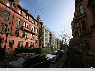
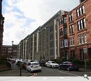
Westpoint Homes, working in partnership with LDA Design and Coltart Earley Architecture, have prepared plans for a 63 flats at the former Middlefield School in Partickhill, Glasgow.This plan calls for completion of the urban block by building out to existing tenement lines with frontages to Hyndland Avenue and Partickhill Road faced in natural blonde sandstone. Two setback upper floors will be clad in pressed metal.
In their design statement the architects wrote: “The rhythm of the large existing tenement proportioned windows will be echoed by similarly proportioned openings, each provided to the front with glazed Juliet balconies, while double height deep punched entrances will combine with the solidly proportioned bay windows to bring rhythm to the elevations.
“On the corner into of Hyndland Avenue and Partickhill Road the corner will be celebrated by a junction of sheer glass as it turns the corner.”
LDA Design will oversee tree planting to the front and rear elevations with a first-floor landscaped amenity deck above ground floor parking opening out onto the interior of the urban block.
14 Comments
#2 Posted by Neil Paterson on 28 Nov 2017 at 10:01 AM
Why is the front facade blonde sandstone? Surely red would be in keeping with the rest of the street? Another design from the 'Skynet' school of architecture.
#3 Posted by Ollieman on 28 Nov 2017 at 10:41 AM
At least the new flats will look out onto attractive buildings!
#4 Posted by Fush And Chups on 28 Nov 2017 at 13:18 PM
I think it's a fairly poor render. It looks a tad overbearing and I believe the finish should be in red sandstone. I'd also like to see how the corner is treated. A little cafe would be nice there.
On a positive note, it's nice to see more housing in the area, and I'm sure these flats will be snapped up by prospective buyers in quick order.
On a positive note, it's nice to see more housing in the area, and I'm sure these flats will be snapped up by prospective buyers in quick order.
#5 Posted by Big Dawg on 28 Nov 2017 at 14:00 PM
In addition to the above comments this is a staggering case of overdevelopment. GCC would have to take leave of their senses (if they have any) to approve this.
#6 Posted by Charlie_ on 28 Nov 2017 at 14:39 PM
In what way is this overdevelopment, big dawg?
#7 Posted by findlay on 29 Nov 2017 at 13:39 PM
why the focus on red sandstone. Up and down the surrounding streets tenements change close to close form red to blonde.
I also expect that sandstone would have been a strong requirement from planning, particularly given the more explicit policy in City Plan 2 regards frontage in Conservation Areas.
At this juncture if anything was to be open for criticism it would be the poor CGI's.
I also expect that sandstone would have been a strong requirement from planning, particularly given the more explicit policy in City Plan 2 regards frontage in Conservation Areas.
At this juncture if anything was to be open for criticism it would be the poor CGI's.
#8 Posted by Big Dawg on 30 Nov 2017 at 13:35 PM
#6 Charlie_ have you looked at the images? If you have would you not consider 2x levels above the line of the existing tenement eaves as more than a little excessive? Given that there is already five levels below the eaves line where the neighboring buildings all have four. This is easier to forgive given the reduced floor to ceiling heights of modern developments but stacking 2x levels above the eaves line set back or not seems excessive.
#9 Posted by lad on 30 Nov 2017 at 15:54 PM
The worst thing in my opinion is the car parking. They ground floor flats are all single aspect and back on to bin stores. They have also created a parking podium that rises with the topography - at the back of the site it is over 2 storeys high. I wouldn't want to have that sitting in my back garden. They haven't properly modelled it (probably on purpose).
The rest of it just looks cheap and nasty. Such miserable rear elevations. Why can't they arrange the flats so that the bathrooms have windows too? All internal. If you are mimicking tenements at least learn from them.
The rest of it just looks cheap and nasty. Such miserable rear elevations. Why can't they arrange the flats so that the bathrooms have windows too? All internal. If you are mimicking tenements at least learn from them.
#10 Posted by Jacks on 1 Dec 2017 at 15:24 PM
LAD, I only counted 2nr single aspect properties which were both 1-beds, both had big windows to all public rooms on the front elevation.
If you looked at the drawings properly, the majority of the ground floor apartments are duplexes and appear to have a main door entrance to themselves. Its only the lounge and kitchen downstairs facing onto the front elevation, with bedrooms etc upstairs running front to back with a private terrace onto the landscape deck.
To me these look pretty special properties, not quite what you describe.
I'd also be keen to understand how you think the podium deck would work if it didn't rise with the building and surrounding topography. Its clear to me from the drawings that the design solution here is following the natural topography of the street.
I'm not commenting/ justifying the merits of the scheme at all, just the fact that incorrect statements, or not reading drawings correctly aren't helpful in having a meaningful discussion.
#11 Posted by dave the detailer on 1 Dec 2017 at 21:44 PM
#10 'special properties' ha ha ha you're having a giraffe?
Mean ceiling heights make it look totally out of place addressing the street!
Mean ceiling heights make it look totally out of place addressing the street!
#12 Posted by Jacks on 4 Dec 2017 at 13:03 PM
dave the detailer,
I was referring to the main door ground floor duplex apartments, private entrance and front garden, private landscape terrace for your flat to the rear - well above average room sizes for a new build plus private parking. Not talking about the architecture here, just the actual product. Not sure where else you would get this in the WestEnd, so yes, i would say this is pretty special.
I was referring to the main door ground floor duplex apartments, private entrance and front garden, private landscape terrace for your flat to the rear - well above average room sizes for a new build plus private parking. Not talking about the architecture here, just the actual product. Not sure where else you would get this in the WestEnd, so yes, i would say this is pretty special.
#13 Posted by dave the detailer on 4 Dec 2017 at 22:04 PM
'Well above average room sizes'...do you live in a 2d world? Ceiling heights as I already mentioned are mean and totally out of keeping with the street, nay neighbourhood. Macmic site at anniesland has townhouses - that's a floor more than your 'special properties.'
#14 Posted by Jacks on 5 Dec 2017 at 16:35 PM
They aren't mine - I live round the corner. Just an opinion. I'm a surveyor so am in and out properties all the time. For new builds, these are well above average. As for the MacMic being a storey more, they may very well be, but its not a comparable product. predominantly due to location.
I'd also bet a fiver that the MacMic townhouses are a similar nett internal size. In essence therefore the more floors the smaller the product actually feels.
As I said in my original post, its not in support of the design. It was simply meant to point out that the original posters comments regards small single aspect flats was not accurate.
As an aside, don't know of any new build properties, particularly flats, that will consistantly deliver 3.0m floor to ceiling heights in proportion to traditional tenements. Notwithstanding anything else other that heating the space.
Post your comments
Read previous: Wilson + Gunn firm up Edinburgh Marina plans
Back to November 2017
Like us on Facebook
Become a fan and share
News Archive
Search News
Features & Reports
For more information from the industry visit our Features & Reports section.


I have no skin in this game but having now read the design statement that is one depressingly ugly elevation and building it out stone does not redeem it. Did someone forget Architecture 101 i.e. commodity, firmness and delight?
This sort of clinical / by the numbers / generated by a machine / designed on Etch-A-Sketch proposal is embarrassing, does our profession a disservice and it depresses me no end that a circa 110 year old Thomas Baird designed ‘B’ listed tenement right next door handles the same problem with so much more flair and warmth.
Therefore: Once more with feeling please!