Candleriggs Quarter goes car free with latest design revisions
November 13 2017
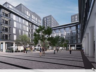
Candleriggs Ltd are seeking a number of design revisions for their recently consented Candleriggs Quarter following approval for the original scheme by Glasgow City Council.Amendments proposed by CDA and Richard Murphy Architects including the omission of a basement car park and the relocation of plant to ground floor level – which will also be given fewer, larger, retail units.
In a statement the developer wrote: “This Section 42 application seeks to vary the consented development to incorporate design revisions to the scheme following a thorough design review of the PRS and PFS blocks and ground floor to address market needs, buildability, management, sustainability and design development.”
Modest changes to the overall massing and height of the development are also proposed including an increase in the floor to ceiling height of apartments to 2.5m, upping the height of both towers by around 1m, together with the ‘stacking’ of flats to rationalise services.
Additional dual aspect apartments will also be offered by relocating the PRS core and omitting a first floor setback.
|
|
13 Comments
#1 Posted by Billy on 13 Nov 2017 at 12:31 PM
At last . This should improve the Trongate and bring more people to live and spend money in this part of the city. Good to see the gap sites filling up....Tradeston, the Govan Graving docks and Queens’ Quay Clydebank. Still a few big sites either side of the Kingston on the north side of the river and the gap sites either side of the Transport museum. Wish they would rid the city of that terrible excuse for a car park east of the St Enoch centre.
#2 Posted by Sir Ano on 13 Nov 2017 at 12:57 PM
Can't wait to see this site developed but for me this isn't the right approach.
#3 Posted by StyleCouncil on 13 Nov 2017 at 13:52 PM
Dissapointing stacked-portacabin architecture.
Looks like its been dragged out from the 1998 vault.
Looks like its been dragged out from the 1998 vault.
#4 Posted by Mulvey on 13 Nov 2017 at 14:07 PM
Chain restaurants as far as the eye can see...
#5 Posted by Jaded on 13 Nov 2017 at 21:16 PM
Fantastic addition to Glasgow. A big chunky build that, despite the scale, will add some decent and potentially interesting urban spaces and squares. This area of town really needs footfall, so hopefully the density of this development supports local business (old and new).
I'm personally quite pleased with how it looks too.
I'm personally quite pleased with how it looks too.
#6 Posted by David on 14 Nov 2017 at 09:16 AM
The view from within the central space is certainly grey. It's also lacking in soul. Maybe it's just the CGI. Let's hope so.
#7 Posted by E=mc2 on 14 Nov 2017 at 14:24 PM
Let the VE commence....
#8 Posted by MV on 14 Nov 2017 at 20:52 PM
#3, I’m assuming that this is exactly what the client was looking for when they brought in the new architects to “assist” the previous architect.
It’s usually the other way around: dull commercial architects scheme, needs design input from small award winning practice, to fluff it up and get it through planning. So this is an amusing change, “here’s the design scheme- now make it look similar enough to fool the masses, but stack them high and sell them cheap (or not so cheap)”.
I’m glad the investments happening and that a great big ugly hole is being filled though.
#9 Posted by Billy on 15 Nov 2017 at 08:40 AM
Would prefer if they ditched the grey. Find this the most depressing colour of all. Given the warmness of the red sandstone in surrounding buildings, I think warmer colours would fit in much better. First impressions count. If I were buying a flat, a warmer welcome would make me more inclined to buy over a cold industrial look. Shades of Autumn would look good in the Winter sun. We have to work with the weather not against it. Greys and blacks make the city look colder and white render does not age well with our weather. Maybe that’s why the older red and blonde sandstone buildings have aged well. Other than the choice of colours I like this.
#10 Posted by Inahuf on 16 Nov 2017 at 05:13 AM
Glad to here they're putting in dual aspect flats, but scared that single aspect had been approved previously as an acceptable living environment for 21st centuary climate? On the flip side, more plant at ground floor has to be a retrograde step for the quality of the public realm.
#11 Posted by Charlie_ on 26 Mar 2018 at 11:48 AM
Seriously, is this *ever* going to start?
#12 Posted by Billy on 26 Mar 2018 at 14:28 PM
Not been to that part of the city for a while. I thought by now they would have at least cleared the site. What is it with this city and getting things done? So slow. And now there is going to be a block demolished in Sauchiehall st because of the recent fire. How long will it take to fill that hole? 20 years? The Selfridges site has been vacant for what seems like an eternity. Gap sites should be earning for the city not lying vacant for decades. Does anyone know what is happening with the Selfridges site? Has it been shelved? And what about Tradeston?
#13 Posted by Billy on 27 Jul 2018 at 06:30 AM
Has work started on this yet? Glasgow knows how to drag its feet. More people living in the city centre generates more money for the city and businesses. I thought getting developments built like this would be a priority. Would like to know who is holding it back and why?
Post your comments
Read previous: Paisley care home and veterans centre completes
Back to November 2017
Like us on Facebook
Become a fan and share
News Archive
Search News
Features & Reports
For more information from the industry visit our Features & Reports section.


