Bennetts Associates prepare amended Citizens Theatre plans
November 2 2017
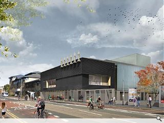
Revised plans have been brought forward by Bennetts Associates for an overdue remodel of Glasgow’s Citizen’s Theatre to in order to remedy the ‘dilapidation and disfunction’ of the venue as it exists currently.Planned works include the creation of a polished metal and textured brick street frontage with neon signage and foyer space, together with a reconfiguaration and refurbishment of the B-listed auditorium and backstage areas.
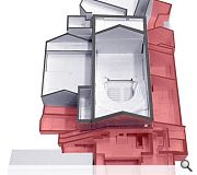
Working with conservation architect Ian Parsons and fire engineers Atelier Ten design team have sought to create more legible connections through the deep plan of the theatre by rationalizing a series of ad-hoc additions which have sprouted over the years.
In a statement Bennetts wrote: “The proposed façade has theatricality and transparency that will reveal glimpses of the auditorium gable and the activity of the foyer. It will make the theatre open and welcoming, and allow it to engage with the street.
“The auditorium will be at the centre of the scheme. The accretions accumulated overtime will be stripped back to reveal the auditorium’s sandstone walls.”
A key move in the overhaul will be to open up public access to the mezzanine level, full height of the fly tower and stage cellar, allowing visitors to appreciate historic stage machinery for the first time.
|
|
13 Comments
#1 Posted by Cameron on 2 Nov 2017 at 15:26 PM
Oh dear.
#2 Posted by David on 2 Nov 2017 at 15:47 PM
I'm sorry, but this revised scheme is just awful. Reduced height, floating statues and significant reduction in glazing. It looks like a ferry terminal. At this point they should do New Laurieston (and Glasgow) a favour and reinstate the old historical facade. What an embarrassment.
#3 Posted by Jimbob Tanktop on 2 Nov 2017 at 18:25 PM
That is...not good.
It's a theatre, supposedly a place of joy but this looks like a crematorium with those statues the souls of the recently incinerated departing for heaven.
The Citizens should serve as a focal point for the entire neighbourhood, but this offers no sense of occasion, no sense of destination, no feeling that this is a place anyone would go to enjoy themselves. It's a suburban Volkswagen dealership.
#4 Posted by Nairn's Bairn on 2 Nov 2017 at 18:33 PM
The building doesn't really say 'theatre' does it? Presumably that's why they've used oversized signage - to avoid people thinking it's the back of a shopping centre.
I always feel it's a shame when architects rely on signage to convey the purpose of a building.
I always feel it's a shame when architects rely on signage to convey the purpose of a building.
#5 Posted by eco-warrior on 2 Nov 2017 at 22:49 PM
No! No! Not black! Not black!
As embarrassing a fad as po-mo.
A pretentious and vacuous frontage.
For God's sake, you are architects, make something!
As embarrassing a fad as po-mo.
A pretentious and vacuous frontage.
For God's sake, you are architects, make something!
#6 Posted by Ross on 3 Nov 2017 at 08:39 AM
Yeah I couldn't put my finger on it, and then I realised that it does look a lot like the Mini Car showrooms. It is pretty dreich and well we are trying to make Gorbals and Laurieston less dreich.
#7 Posted by jonathon on 3 Nov 2017 at 08:52 AM
T K Maxx + 6 (awkwardly) hanging statues
#8 Posted by Billy on 3 Nov 2017 at 10:11 AM
Does not look welcoming. Not keen on black and greys in a city known for grey skies. Loved the original building. If it cannot be restored to its original glory then I think I prefer the proposal prior to this austere look. Not obvious as a theatre. Maybe a comedy and tragedy sculpture /fixture above the entrance would make it more obvious.
#9 Posted by The Flâneur on 3 Nov 2017 at 11:31 AM
I don’t mind the black brick per se as it is certainly dramatic. Though clearly the client body have been forced through financial constraints - probably from grant funders - to go with a more rationalised scheme the reinstatement of John Mossman’s statues on the Gorbals skyline - as they were originally located - is no bad thing.
As for a feature to make it more obvious that it is a theatre that is the fault of the 3D visualisations where one statue has simply been cut and pasted six times. In fact Mossman’s sculptural scheme is more complex and makes it pretty obvious that it is a theatre as there are statues to Shakespeare, Burns, Tragedy, Comedy, Dance and Music i.e. get them back up there and it does what it says on the tin.
Where I’m not so sure is the ‘look mum no hands’ way the statues are held up. The drawings show the statues sitting on cantilevered shelves too thin to visually support them. It would look better if those shelves could be beefed up into more weighty brackets which would look as though they are transferring the weight of all that stone.
#10 Posted by 'Transparent'? on 4 Nov 2017 at 09:29 AM
Enjoying the obligatory squadron of Van Gogh crows together with the 'six' men of the apocalypse.
Q. What'd be the first casualty of a D&B contract?
A. Don't put all your bricks in one basket.
Q. What'd be the first casualty of a D&B contract?
A. Don't put all your bricks in one basket.
#11 Posted by saltpillar on 4 Nov 2017 at 13:52 PM
looks quite average to me....there is a police station at gare du nord in paris that has statues up top.
#12 Posted by A Local Pleb on 6 Nov 2017 at 13:20 PM
I like it despite the usual negative vitriol of the preceding posts.
#13 Posted by scotsguy61 on 6 Nov 2017 at 13:57 PM
Please note that 'floating' statues may or may not be in the position seen on the picture which is for 'illustration purposes only'
Post your comments
Read previous: Leopard sculpture given top spot at Marischal Square
Back to November 2017
Like us on Facebook
Become a fan and share
News Archive
Search News
Features & Reports
For more information from the industry visit our Features & Reports section.


