Princes Square to make a grand entrance with remodel
October 30 2017
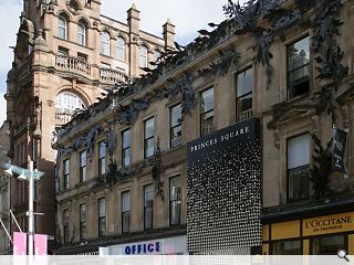
Glasgow’s Princes Square shipping centre is to be given a new front door as part of a number of a comprehensive overhaul of the retail destination by owners Redevco and ThreeSixty Architecture.Designed to ensure the covered mall can ‘flourish again’ the changes focus on its key relationship with Buchanan Street by increasing visibility of its primary entrance point, which currently blends with neighbouring retail frontages, ThreeSixty propose to focus on differentiating one entrance to draw greater footfall.
This will see a metal screen installed inspired by the Peacock sculpture which adorns the entirety of the B-listed façade, with perforations allowing the screen to be back-lit at night.
In a statement the architects wrote: “The three entrances on Buchanan street are lost in the visual richness and further suffocated by being of similar height and adjacent to traditional shopfronts either side.
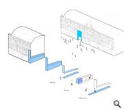
“The concept is for a single object that sits proud of the elevation, starting below the second story windows and falling down towards the entrance. The plane then wraps its way around the complex interfaces and then flows into the entrance corridor accompanying the journey of all the visitors.
“The height of the new intervention creates greater legibility of the entrance but is not so high as to split the regimented Georgian facade.”
ThreeSixty previously remodeled the interior back in 2012.
|
|
12 Comments
#2 Posted by Badbadjustbad on 30 Oct 2017 at 17:09 PM
Agreed with #1. Just awful.
#3 Posted by The Flâneur on 30 Oct 2017 at 17:17 PM
Hear, Hear.
Though this made me laugh:
In a statement the architects wrote: “The three entrances on Buchanan street are lost in the visual richness and further suffocated by being of similar height and adjacent to traditional shopfronts either side.”
Now, ahem, remind me just which firm of architects designed these three entrances?! It wouldn't be a certain ThreeSixty Architecture now would it?
Seriously, please think again because if this goes ahead it is all adding up to a dogs breakfast so less is most definitely more in this scenario...
#4 Posted by Graeme McCormick on 30 Oct 2017 at 18:56 PM
Agree with all the comments. It’s improving the quality of the retail and leisure experience which will improve footfall. Just back from Stockholm where the city is full of thriving shops most of which don’t appear in UK cities. Time to examine why our Nordic cousins do retail so well even with higher taxes .
#5 Posted by E=mc2 on 30 Oct 2017 at 20:53 PM
Like a gawdawful entrance to a tacky 80s nightclub.
#6 Posted by Sgeezus on 30 Oct 2017 at 20:57 PM
But hey, why not go full mental and install airport-style flashing lights on Buchanan St, drawing footfall from both directions? Air raid style power reflectors on top would be great too. Otherwise marching hordes will mix this with yet another pop-up hipster extravaganza vegan bar...
#7 Posted by MV on 30 Oct 2017 at 21:59 PM
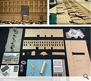
The positive point here is that the team built a model, which is a great way to test both the scale and the visual impact of the proposed intervention. The only negative I can see, is that they didn’t have a good look at the model when it was finished. Adding more “visual interest” isn’t going to help. #3’s less is most definitely more, is most definitely correct...
#8 Posted by flinto on 31 Oct 2017 at 10:03 AM
Just awful ! Does indeed look like a nightclub entrance from the 80's. Please don't.
#9 Posted by Vidal on 31 Oct 2017 at 13:16 PM
Ay-yay-yay! As the fabulous occupier of the shop above, I am most concerned about losing my windows. How am I supposed to complete my creations in the dark, sweetie? The fabulous ladies of Glasgow will be leaving looking like Trump in a gale. When I find out who’s behind this they’re going to get the sharp end of my scissors, darling. Turn your head to the side? - lovely. Going anywhere nice on holiday?
#10 Posted by Neil C on 31 Oct 2017 at 15:07 PM
Personally, I don't think this goes far enough. What about installing a large pink neon arrow pointing towards the entrance? To optimise footfall, you could have similar arrows up and down Buchanan Street pointing towards the Square.
Or they could simply improve the access from Queen Street. Just a thought?
Or they could simply improve the access from Queen Street. Just a thought?
#11 Posted by chris on 1 Nov 2017 at 03:05 AM
how about installing a big intake fan at the back of the entrance that will suck shoppers in when they're walking past, one way to attract people in.
#12 Posted by Dr Nina Baker on 3 Nov 2017 at 19:05 PM
#9, #10, #11 - You made my evening. Hilarious! I cannot believe that blocking out the "richness of the facade", which is presumably the main reason why the building is listed, is any help at all. The reason I dont go in is cos there is nowt in there I want to buy. We aint all designer addicts.
I just hope the Urban Design Panel and Historic Environment Scotland give this proposal the boot it deserves.
I just hope the Urban Design Panel and Historic Environment Scotland give this proposal the boot it deserves.
Post your comments
Read previous: Andrew Black Design expand with new Dundee studio
Back to October 2017
Like us on Facebook
Become a fan and share
News Archive
Search News
Features & Reports
For more information from the industry visit our Features & Reports section.


Stop throwing money at defacing the old facade, get rid of the tacky light walls inside, and consider improving connectivity to Queen St if you want more footfall.