Great Tapestry of Scotland weaves its way to Galashiels
September 21 2017
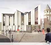
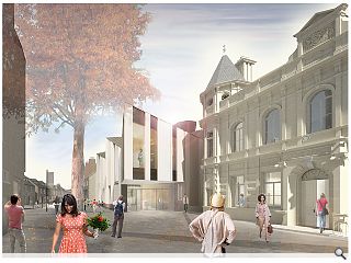
Page\Park Architects have submitted formal plans for the creation of a £6.7m home for the Great Tapestry of Scotland in Galashiels, supplanting an earlier bid to locate the record breaking threads in Tweedbank.Located next to the town’s former Post Office, which will also benefit from an overhaul, the project is expecte4d to serve as a catalyst for Borders tourism drawing visitors along the recently re-opened Borders railway.
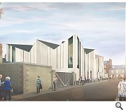
The faceted new build gallery will connect to the B-listed Post Office by way of a glazed link, meeting the street with a ground floor reception area, café, shop and temporary gallery. At its heart would be the 143m long tapestry itself, painstakingly stitched together by 1,000 volunteers.
Councilor Mark Rowley, said: “The submission of the planning application for the Great Tapestry of Scotland visitor centre is the next step towards creating one of the most significant town centre economic development projects to take place in the Scottish Borders in recent years.
“The visitor centre would also be the first stage of a long-term strategy to stimulate investment in the local economy, and it is pleasing that local groups are supportive of this approach.”
Assuming planning permission is granted the visitor centre could be completed by spring 2020.

Galshiel's was chosen to host the tapestry as part of the Scottish Government's 'town centre first' strategy
|
6 Comments
#1 Posted by Graeme McCormick on 21 Sep 2017 at 12:05 PM
maybe the illustrations don't do it justice but can't see how the external design celebrates what's inside and entices people in. Given tapestry is colourful and can have several layers and textures one would have thought the elevations would reflect that in some way
#2 Posted by StyleCouncil on 21 Sep 2017 at 12:12 PM
Crikey….there is hope.
Great looking scheme although I am probably in confused shock at seeing an actual piece of purposeful, considered design on UR, not merely the stacking and skinning of banal (brick) boxes.
Great looking scheme although I am probably in confused shock at seeing an actual piece of purposeful, considered design on UR, not merely the stacking and skinning of banal (brick) boxes.
#3 Posted by Rupert on 21 Sep 2017 at 13:11 PM
A small bit of colour to the elevations would be great
#4 Posted by modernish on 21 Sep 2017 at 15:14 PM
The lady in the centre of the first render sums it up nicely...hands on hips looking at it thinking wtf did we do wrong to deserve this!
#5 Posted by Stephen on 23 Sep 2017 at 11:39 AM
Good design for that key corner site (where Poundland once stood) and good use of the excellent c. 1895 Post Office building. Tesco still have the c. 1900 sandstone council offices 'in stoarge' - perhaps those could be resurrected for the pale merks?
#6 Posted by MV on 27 Sep 2017 at 10:43 AM
I really like the 2 dimensional roof and wall junction detail. This looks like an unresolved scheme, or maybe it is just the illustrations?
Post your comments
Read previous: Cuningar back in the loop with 15 hectare woodland park
Back to September 2017
Like us on Facebook
Become a fan and share
News Archive
Search News
Features & Reports
For more information from the industry visit our Features & Reports section.


