Second wave of Laurieston housing set to break
September 7 2017
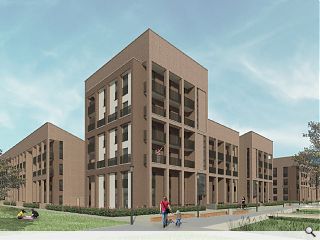
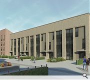
Urban Union has advanced plans to move on-site with a second wave of housing within its Laurieston Living development within the Gorbals district of Glasgow.A total of 173 homes will be delivered in this latest push, contained within a mix of terraces and apartments, arranged along a linear park.
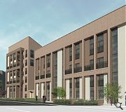
Mark Sneddon of Anderson Bell + Christie Architects said: “A restrained palette of bricks will be used to create a series of carefully detailed facades generating three interesting and well-articulated urban blocks. Phase 2 will also include the exciting first phase of a new linear park, providing quality outdoor space at the heart of the development, in line with the masterplan.”
Planning permission has already been granted for phase 2, which is expected to be delivered in phases from 2018 through to 2021 as part of four phases of work planned through to 2026.
A further 55 homes are already being built in the area on behalf of New Gorbals Housing Association, joining over 300 homes delivered during the projects initial phase.
|
|
20 Comments
#1 Posted by StyleCouncil on 7 Sep 2017 at 11:56 AM
Truly hideous scheme.
#2 Posted by Charlie_ on 7 Sep 2017 at 12:44 PM
2026!?!? Maddening. In 2012 the plan was for the initial masterplan to be finished by now. As Winny Maas observed at a recent '(y)our city centre' talk : 'it seems to me, you are masters here at neglecting urgency'.
#3 Posted by Colin Kirk on 7 Sep 2017 at 12:46 PM
The transformation of Laurieston is amazing. Previously ugly and repressive area of multi-storey blocks has been replaced by a vibrant and people friendly development. When I walked through last summer chatted to some older residents enjoying speaking from their flower potted verandas.
#4 Posted by Sue Pearman on 7 Sep 2017 at 13:25 PM
It is Colin - if it could be continued at the same level of design and build quality it would be good. Alas...I think...
#5 Posted by Big Billy on 7 Sep 2017 at 13:28 PM
I would like to see what an unrestrained facade looks like because this is pretty standard.
#6 Posted by Piacentini on 7 Sep 2017 at 13:42 PM
Together with StyleCouncil's comment, do these images speak of houses or living, or the Sheriff Court?
It's not even the columns/pilasters that's the problem, its the North-Korean-heavy-whole-storey-brick-entablature/pediment that kills it stone dead for me.
Still, when all else fails, just go for the typical authoritarian look, saves you having to design something that has an ounce of humanity to it.
#7 Posted by Charlie_ on 7 Sep 2017 at 13:50 PM
I think the designs look good, personally. There'll people living in them: plantpots, laundry, kids toys on the balconies. They'll be nice.
#8 Posted by The Jamb on 7 Sep 2017 at 14:34 PM
What a catalyst this turns out to be....
good for the area I suppose, relatively speaking, but I must agree with #6 comments
good for the area I suppose, relatively speaking, but I must agree with #6 comments
#9 Posted by RevMonk on 7 Sep 2017 at 14:55 PM
"restrained palette of bricks" = there wasn't enough money for more than one colour.
"a series of carefully detailed facades generating three interesting and well-articulated urban blocks" = we stepped it in and out to make it look more interesting than it is.
"Phase 2 will also include the exciting first phase of a new linear park" = because you're not allowed to call the leftover space spare grun anymore
#10 Posted by lm on 7 Sep 2017 at 16:20 PM
How come !!! ????? so many architects graduating from the Art School and you don't see results .. truly rubbish from ABC and very very very basic stuff, even CGIs are 20 years old
#11 Posted by David on 7 Sep 2017 at 17:00 PM
I think all the commentors here are forgetting what this area was like just 8 years ago? I agree that the scheduling of works has been very very slow, and that the regeneration of the beautiful Victorian buildings on Bridge Street should play a more central role in the New Laurieston masterplan, but progress is being made. An even more ambitious addition would be the reinstatement of Bridge Street overground station and creating an interchange with the underground. As for these blocks, I think the design is actually quite successful, yes they could go further, but its a good next step in the redevelopment of Laurieston. I do hope that sales will exceed expectations and the developer will move up the timescale for the overall redevelopment. Also looking forward to seeing the renovation of the former British Linen Bank going on site.
#12 Posted by Philip on 7 Sep 2017 at 17:24 PM
I don't understand the heavy proportions or the rational behind the confused facade composition.....brutal and very, very brown.
What is a 'linear park'...? Is is architwaddle for long strip of useless landscaped space?
What is a 'linear park'...? Is is architwaddle for long strip of useless landscaped space?
#13 Posted by Alf on 8 Sep 2017 at 09:05 AM
A lot of criticism on here however, I'd be interested to see what other folk would've suggested as an alternative to the current scheme. From what I can see from other schemes 'featured' on UR, there ain't much better out there, which probably says more about the architectural world generally. Or is it budget restraints/main contractor VE-ing everything/clients with no money??
#14 Posted by QMD on 8 Sep 2017 at 09:41 AM
I guess if it works previously, we should just reinvent the wheel and copy-and-paste the template? No risk, as what they said.
#15 Posted by Mies van der Noooo! on 8 Sep 2017 at 10:04 AM
It's just not very good, is it?
Too much arbitrary planar fiddling - is pushing and pulling faces in and out by a brick's depth the new version of pointlessly dividing facades into render and timber cladding from the '90s? It seems from this that indeed it is.
Too much arbitrary planar fiddling - is pushing and pulling faces in and out by a brick's depth the new version of pointlessly dividing facades into render and timber cladding from the '90s? It seems from this that indeed it is.
#16 Posted by StyleCouncil on 8 Sep 2017 at 10:34 AM
#13 Right on Alf..the current crop of emerging projects ain't much better. This project still deserves appropriate criticism based on the poor images presented.
One (of many) issues seems to be the same tendering winning practices punting out tired and muddled schemes...its almost as it they have lost the will to live. If it ain't a re-hash of an earlier scheme, its a cut and paste. Time to pass the baton....
One (of many) issues seems to be the same tendering winning practices punting out tired and muddled schemes...its almost as it they have lost the will to live. If it ain't a re-hash of an earlier scheme, its a cut and paste. Time to pass the baton....
#17 Posted by Dario G on 8 Sep 2017 at 13:39 PM
I really don't think these renders have done this scheme any favours, unless brown formica and weetabix is the look they are going for.
Although, to be fair the comments above are overly negative. The Gorbals and Laurieston have been in constant flux for the last 50 years and this wil hopefully provide some stability.
Re the linear park - I believe this links up with the axis of the south Portland street bridge and will create a pedestrian route to the city centre - I'm not entirely sure why this has drawn so much criticism above.
#18 Posted by Aldous Huxley on 9 Sep 2017 at 11:21 AM
Didn't think we were talking here about graphic images/CGI's, but the language of architecture?
#19 Posted by andy pandy on 12 Sep 2017 at 10:19 AM
UR, usual trolling on this article I see.
Im going on the assumption that the overly critical folk could do a whole lot better then?
Architecture will always have its critics, its comes part and parcel with it, thats fine. But if folk think something is so fundamentally wrong (with no knowledge of budget, client, programme, etc) then lets see what you would do better, upload a link to some sketch options, renders of your own making, then we can see how it should be done.
Fairs fair.
#20 Posted by Rationalist on 12 Sep 2017 at 11:55 AM
andy pandy, I agree that there is a culture of pointless trolling on this site. However, the statement that to be qualified to critique an architectural proposition, you must first have produced a series of sketch options for the site yourself, is absurd (for example, everything ever written by critics in architectural journals).
I think this project exhibits a host of compositional problems and cack-handed bodges of the architects own making. The 'super-grid' language has been employed to try and organise a fundamentally disorganised window set out, which has led to, among other things, all manner of corner-turning problems. ABC used a similar colonnade and entablature language in a recent health centre. There it was used as a screen, separated from the curtain wall elevation behind (in a fairly successful way). The colonnade here is expressed as engaged plasters with extensive areas of infill in places. The regular pilaster set out is only, I would guess, half a brick proud of the infill areas, which themselves contain windows of different sizes, proportions and relationship with the piers (jambs tight to right, or left of piers etc). As such, the super-grid fails to impose order - there are simply far too many conditions within it. I agree with others comments that the entablature feels very heavy, however I think this is compounded by its sparseness in contrast to the confused mess below it.
With regards to how it should be done, see E&C's neighbouring scheme, and to a lesser extend in my opinion, Stallan Brand/RMJM's neighbouring scheme. Both of these examples manage to achieve a regular window set out with surely very similar accommodation to work with.
Post your comments
Read previous: £1.3m Belleisle visitor hub breaks ground
Back to September 2017
Like us on Facebook
Become a fan and share
News Archive
Search News
Features & Reports
For more information from the industry visit our Features & Reports section.


