St Enoch Centre embraces Argyle Street in latest plans
August 21 2017
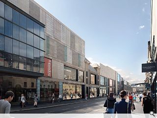
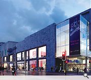
Benoy have tabled finalised plans for the overhaul of the Argyle Street frontage of Glasgow’s St Enoch Centre, including an historic theatre frontage, to offer flexible floorspace attractive to retailers.Designed to improve connectivity between the street and shopping mall behind this will see the introduction of double-height shopfronts clad in bronze anodized aluminium serviced via an existing basement level alongside extensive demolition from 135-153 Argyle Street to make room for three flagship outlets.
Sandwiched inbetween will be the retained façade of the former theatre within which will be inserted a large bay window in reference to a 1930’s billboard display with proposed finishing materials include a slate roof, limestone and metal cladding.
Outlining their concept in a planning statement Benoy wrote: “The design of the new elevation aims to unify the building through the use of three key materials: stone, metal and glass. The proposal creates three flagship stores with simple, clean materials and detailing and clearly divided entrances on ground floor. The proposal also includes a change of first floor level in the central part of the building to match levels to the east and west sides, restoring horizontal order and giving more cohesion to the design.
“The proposal for the theatre section retains its original design with a large modern ‘picture window feature’ on first floor. The pitched roof and new block’s undulation relates to the varied roof line.”
The latest phase of work follows confirmation that Vue Entertainment will open a nine-screen cinema to the east of the current centre.
11 Comments
#2 Posted by JaggyBunnet on 21 Aug 2017 at 12:53 PM
Looks pretty grimy to me. Specifically the top two floors. Are these breeze blocks?
#3 Posted by Charlie_ on 21 Aug 2017 at 13:23 PM
Each new Glasgow scheme seems to be more depressing than the last, at the moment.
#4 Posted by dave-the-detailer on 21 Aug 2017 at 14:03 PM
ooft that proposed elevation drg submitted is a howler...never mind the multiple dimension styles and sizes
#5 Posted by EM on 21 Aug 2017 at 14:56 PM
These buildings look better as they currently are, do not do this St Enoch centre please!!!!
#6 Posted by David on 21 Aug 2017 at 19:44 PM
Everyone commenting here, please write to the council and object to these plans as I intend to do. The current configuration is absolutely fine, the owners of the centre would be better overhauling the southern and eastern ends of the St Enoch Centre. Not pulling down the facade of an irreplaceable historic city centre building.
#7 Posted by Billy on 21 Aug 2017 at 21:29 PM
Agree that they look better as they are just now. Meanwhile the ugly building that was Arnotts remains. That building is crying out for demolition or at least a facelift. What is wrong with Glasgow City Council? Think there is too much deadwood that needs paid off. Get some new blood in there.
#8 Posted by Glen Ferguson on 22 Aug 2017 at 19:22 PM
Yes and no.
It does clean up what is currently there and make use of what wasn't before.
I hate the box design with a Passion. But somehow blends with the rest of the St Enoch Centre in reintroducing this entrance that was shut off years ago!
It does clean up what is currently there and make use of what wasn't before.
I hate the box design with a Passion. But somehow blends with the rest of the St Enoch Centre in reintroducing this entrance that was shut off years ago!
#9 Posted by E=mc2 on 22 Aug 2017 at 19:43 PM
Looks like something Cooper Cromar would have done. Oh wait....
#10 Posted by Ross on 23 Aug 2017 at 10:40 AM
Wow, that is terrible.
The norther facade is oppressive, dull and uninspiring. I hope the council see sense and ask them to return to their Macs (the drawing board is long gone...) and come up with something that isn't going to win a Carbuncle award in 10 years.
The norther facade is oppressive, dull and uninspiring. I hope the council see sense and ask them to return to their Macs (the drawing board is long gone...) and come up with something that isn't going to win a Carbuncle award in 10 years.
#11 Posted by revmonk on 26 Aug 2017 at 17:29 PM
How the **** does that "embrace" argyle st or improve connectivity to the half empty mall!?!?
It adds nothing to street level and, ok while it's not the most interesting historical façade above, at least the existing buildings don't look like some sort of trumpian border wall!!
Bland pish.
It adds nothing to street level and, ok while it's not the most interesting historical façade above, at least the existing buildings don't look like some sort of trumpian border wall!!
Bland pish.
Post your comments
Read previous: Glasgow student build reaches practical completion
Back to August 2017
Like us on Facebook
Become a fan and share
News Archive
Search News
Features & Reports
For more information from the industry visit our Features & Reports section.


Just no, no, no, no! Argyle street does not deserve more faceless bland boxes facing it. What happened to mixed use in our cities!?