Glasgow student build reaches practical completion
August 16 2017
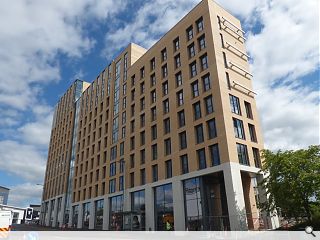
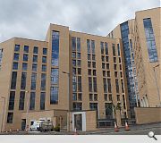
Watkin Jones Group have completed work on a 13 storey development of 441 student flats at North Hanover Street, Glasgow.Incorporating 4,000sq/ft of retail space the Manson Architects designed scheme is finished in facing brick work above a triple height portico finished in pre-cast panels.
The V-shaped block addresses Dobbie’s Loan with a slender tower element before stepping down in height along North Hanover Street, broken by a fully glazed stairwell.
At the building’s base a landscaped courtyard to serve as a breathing space and gathering point for tenants.
Sitting midway between Glasgow Caledonian University and City of Glasgow College the island site aims to be the first element of a broader strategy to reimagine tall buildings in the Townhead area to improve skyline views.
18 Comments
#1 Posted by Wat Kin Hell on 17 Aug 2017 at 09:57 AM
I sentence you to 1 year at north hanover street prison.
#2 Posted by CADMonkey on 17 Aug 2017 at 11:47 AM
Those are huge towel rails on the gable.
What purpose do they actually serve?
What purpose do they actually serve?
#3 Posted by A Local Pleb on 17 Aug 2017 at 13:10 PM
Yet another banal student resi scheme, I wish I could find something endearing to say!
#4 Posted by Dr Feelgood on 17 Aug 2017 at 16:44 PM
Even if this was the 80s it would still look out of date. I don't feel so good
#5 Posted by StyleCouncil on 17 Aug 2017 at 20:39 PM
Clearly no understanding of material let alone massing or proportion. Looks increadible flat and cheap. Crap job when all said and done..and nothing to do with scale, building type or location. Other more skilled architects could have pulled this off.
#6 Posted by BMWsforall on 17 Aug 2017 at 22:39 PM
I think this is marvellous. It's elegant, understated and shows how some meaningful urban fabric could be created in the light industrial hinterland that borders this part of toon. 8/10
#7 Posted by itscooltohate on 18 Aug 2017 at 08:35 AM
I don't understand the vehement criticism being levelled a this scheme to be honest... this is a step-up from other student housing in the city. There is a coherent architectural language and restrained material palette, the windows seem to be a decent size and have not been value-engineered to within an inch of their life, and the facade has a degree of depth which comes about from the punched window openings. I also like that it addresses the street at ground level unlike so many other student housing developments, and whilst maybe overscaled, I don't think the gesture of making a marker on that gushet site on the street that leads to George Square is inappropriate, both looking down to the square, or back up from it. I agree about the rails on the side and would like to know what they're for, and I think the back elevation seems somewhat unconsidered, but then again so do many buildings back elevations, and I'm not sure who came up with this selection of photos which show the back and don't actually show the front of the building. Lastly, if we're going to criticise, let's make it meaningful and talk about the architecture, rather than making jibes about how 'more skilled' architects could have pulled this off which is nothing but a naive comment: building projects of any size are complicated so let's not belittle a project that is evidently a huge undertaking and will have had the involvement of large numbers of building and design professionals.
#8 Posted by Gringo on 18 Aug 2017 at 08:51 AM
I walked past this yesterday. My initial impression from a distance was that it kinda looked OK, but when you get closer and see some of the decisions on materials and detailing it just looks pretty naff.
Good from far, but far from good.
Still, its better than the monsters down on High St.
Good from far, but far from good.
Still, its better than the monsters down on High St.
#9 Posted by Ron on 18 Aug 2017 at 10:53 AM
I don't hate this as much as I thought I would.
Much better than the Kennedy Street "effort" but not nearly as good as the Bath Street Residences.
overall .... 6 out of 10
Much better than the Kennedy Street "effort" but not nearly as good as the Bath Street Residences.
overall .... 6 out of 10
#10 Posted by Egbert on 18 Aug 2017 at 12:06 PM
Agree with #7, this isn't anywhere near as bad as the other posters would suggest. Some perspective please.
#11 Posted by CADMonkey on 18 Aug 2017 at 12:11 PM
#7 itscooltohate
I think this looks fine, quite like it and I like the restrained palette.
But my only question is what are the mega pigeon friendly "towel rail" gable features for?
I think this looks fine, quite like it and I like the restrained palette.
But my only question is what are the mega pigeon friendly "towel rail" gable features for?
#12 Posted by Ross on 18 Aug 2017 at 12:19 PM
I like the building. It is located in a part of town that no one wants to go to; I am glad that it is breathing life into it. It would be also good for developers to incorporate housing for urban professionals. Such as one bedrooms, studios etc in the city centre.
#13 Posted by D to the R on 18 Aug 2017 at 13:42 PM
Howlin' ... It's aw windies and wa's
#14 Posted by Detective on 18 Aug 2017 at 15:14 PM
loving the 'coherent architectural language' and 'restrained material palate' justification. Surely that's Mr Manson in guise. We can all agree this was a money making development and little to do with language or material.
#15 Posted by itscooltohate on 18 Aug 2017 at 17:08 PM
@#14 - You're right, this is a money making development, however almost every private development is - that's generally why private developers build and the design team need to work with these clients and within the constraints they set, but just because of that doesn't mean the architecture can't be there. In my opinion, this is not a bad response to those conditions - is it going to win the Stirling Prize, probably not, but in a city where student accommodation is often of a much lower standard than this, I don't believe this should be derided. But that's just my opinion, as you are entitled to yours.
And I can assure you I have no relation to this development, other than walking past it to the post office depot.
And I can assure you I have no relation to this development, other than walking past it to the post office depot.
#16 Posted by Sven on 19 Aug 2017 at 18:30 PM
"There is a coherent architectural language and restrained material palette"
It is not as bad it looks in the photos in real life but it does suffer for the use of those cheapo bricks and being just too boring. My issue is urban setting. This would work better in a built up urban setting. It is relatively isolated and looks the worse for it, which is odd. So many Victorian buildings in a different setting and space would look sooo much better, yet this so-so building is the opposite.
It is not as bad it looks in the photos in real life but it does suffer for the use of those cheapo bricks and being just too boring. My issue is urban setting. This would work better in a built up urban setting. It is relatively isolated and looks the worse for it, which is odd. So many Victorian buildings in a different setting and space would look sooo much better, yet this so-so building is the opposite.
#17 Posted by Islands of sanity on 19 Aug 2017 at 18:53 PM
I think the same architects designed the more upmarket student accommodation, called Braehead House, Abbeyhill , Edunburgh which is a good contextual response.
#18 Posted by Charlie_ on 22 Aug 2017 at 17:34 PM
It must be harder to come up with a good contextual response to fragmented wasteland.
Post your comments
Read previous: Student specialist takes the reins at Old Town stables
Back to August 2017
Like us on Facebook
Become a fan and share
News Archive
Search News
Features & Reports
For more information from the industry visit our Features & Reports section.


