George Square hotel expansion hits the roof
July 17 2017
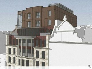
The Calton George Hotel on Glasgow’s West George Street is in line for a double storey rooftop extension following submission of plans by Leask Architects to increase the number of available bedrooms to 84.Offering additional bedroom accommodation the scheme would build on the existing 1990s scheme by stacking a further 20 rooms on top of the current building, together with a new plant level, with six of these rooms benefitting from southerly views across the city skyline.
In urging planners to accept their proposals the architects wrote: “The design with its use of materiality and form is a modern addition to a neo-classical 1990s building that still references the existing building with its emphasizing of horizontal lines, window proportions and rhythmical subdivision.”
Faced in copper coloured cladding panels the extension will be accessible via a corner glazed stairwell.
8 Comments
#1 Posted by A Local Pleb on 17 Jul 2017 at 14:26 PM
Nothing wrong with the idea of extending the building upwards but this effort is woeful. The city deserves better than this!
#2 Posted by Glen Ferguson on 17 Jul 2017 at 19:25 PM
What is this tradition? when a building wishes to expand upwards a big glass box gets stuck on top.
#3 Posted by StyleCouncil on 17 Jul 2017 at 21:27 PM
Oooft!...
#4 Posted by Dr Nina Baker on 18 Jul 2017 at 18:58 PM
When will architects stop writing as if they were desperate to get into Private Eye's "Pseuds' Corner"? The quote is the most insulting load of meaningless twaddle.
The design with its use of materiality and form is a modern addition to a neo-classical 1990s building that still references the existing building with its emphasizing of horizontal lines, window proportions and rhythmical subdivision.”
WHAT?
The design with its use of materiality and form is a modern addition to a neo-classical 1990s building that still references the existing building with its emphasizing of horizontal lines, window proportions and rhythmical subdivision.”
WHAT?
#5 Posted by Billy on 19 Jul 2017 at 00:47 AM
The original extension I liked. This just looks so out of place with what's there. Looks as no thought has been given to the rest of the hotel. Puzzled.
#6 Posted by modernish on 19 Jul 2017 at 12:10 PM
I honestly thought on first view that the copper coloured box was a building in the distance. A mass that clumsy couldn't, surely, be what was proposed. Then I had a look at the planning application drawings thinking that the image in the article must have been some initial concept model. But, hell's bells, the actual planning drawings are worse...the north elevation in particular is a work of complete thoughtlessness. The DAS is, however, pretty revealing. The initial idea was for a single storey extension (which was pretty poor, but as it was set back it was tolerable), however it is stated that, "The proposals were developed further as the economy of the project required 2 floors to justify the plant room removal". So basically the whole thing is based on the cost of shifting the plant, as has been said before...Oooft!
At least the Meshtec cladding will be somewhere nice for all the square's pigeons to enjoy.
At least the Meshtec cladding will be somewhere nice for all the square's pigeons to enjoy.
#7 Posted by David wilson on 19 Jul 2017 at 18:24 PM
. Looks like their dug did it
#8 Posted by buzzthedog on 20 Jul 2017 at 20:26 PM
If the dug did it, does that mean it has the bow-wow factor ....
Post your comments
Read previous: Kirkwood Homes to build 57 homes at Countesswells
Back to July 2017
Like us on Facebook
Become a fan and share
News Archive
Search News
Features & Reports
For more information from the industry visit our Features & Reports section.


