Mixed-use trio to adorn Edinburgh’s Exchange District
June 5 2017
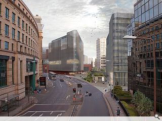
JM Architects have brought forward an application for permission in principle for the mixed-use transformation of an electricity substation in Edinburgh’s Exchange district to accommodate 4,500sq/m of office space, 550 hotel rooms, retail and leisure uses.Conceived at the behest of Scottish Power Energy Networks the scheme will constitute three separate buildings stepping up in scale from the Georgian and Victorian tenements through to the Edinburgh Conference Centre.
Each of these will rise on top of a central podium on a constricted site which is also bisected by a main line railway tunnel connecting Haymarket with Waverley.
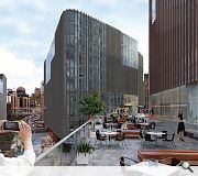
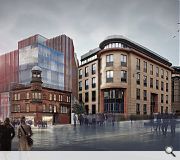
Building on an approved masterplan from PLP Architecture in 2010 this will see a row of ornate B-listed Victorian workshops along Dewar Place retained as an active frontage and hotel entrance. Behind this a series of three separate buildings will rise united by a common material and elevation treatment of perforated corten steel panels and a mix of pink, buff and silver sandstone.
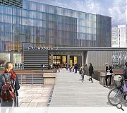
Outlining their vision the architects wrote: “Pedestrian routes and permeability are key to our vision and we will consider the spaces between buildings in order to make them attractive and welcoming. Activation of these spaces will also be considered through the day and night.
“The reduction in scale to Dewar Place will lessen the impact of the developments overall mass in relation to views from Torphichen St and Haymarket whilst the retention of the existing facade and the possible widening of the pavement to Dewar Place, giving over more space for pedestrians, will activate this area.”
A key aim for the design will be to bring about improved pedestrian access to the Exchange District, by improving circulation and introducing new building uses to encourage after hours footfall.
|
|
6 Comments
#2 Posted by Philip on 5 Jun 2017 at 18:16 PM
The St Andrews Sq super-louvre look clearly the new thang in the copycat commercial architecture world...enhanced with cool scandi hipsters of course (and kids?) rather than showing the reality of tab smoking office workers. Still, looks interesting...would be good to see a site plan as the images are quite disorientating. Is Morrison St being pedestrianised?
#3 Posted by Jacques Loussier Trio on 6 Jun 2017 at 09:53 AM
If these buildings were their clients, they'd be male.
Then using Grayson Perry's classification, they'd almost certainly be 'default' males. i.e. white middle-class suits who see all around them as other 'communities' without seeing themselves as a community and an extremely sad one at that. Such is the sterile world of Commercial architecture.
Do architects actually 'make' anything anymore? or do they just tend to hang curtains to hide their own and others paucity of thought?
#4 Posted by basho on 6 Jun 2017 at 12:57 PM
Masterplan is included in Edinburgh Council development website - https://citydev-portal.edinburgh.gov.uk/idoxpa-web/applicationDetails.do?activeTab=summary&keyVal=OQ4YYAEWL6O00
Given the relatively small site I think JM have done a pretty good job at improving access through the area - which will hopefully enliven a place that currently resembles a scene from 28 Days After.
Given the relatively small site I think JM have done a pretty good job at improving access through the area - which will hopefully enliven a place that currently resembles a scene from 28 Days After.
#5 Posted by Rationalist on 7 Jun 2017 at 09:31 AM
basho - I'm curious as to why you think no sandstone elevations anywhere is something to be grateful for in and of itself? I acknowledge there are a number of poor sandstone buildings, but similarly I would argue there are a number of extremely poor glass/sheet metal/panelised-cladding-system buildings in both Edinburgh and Glasgow. Why the hierarchy of materials? Or is it more to do with an aversion to 'windows' over a curtain wall treatment? Please elaborate.
#6 Posted by basho on 7 Jun 2017 at 14:52 PM
Rationalist - happy to elaborate.
In this particular area, and the Exchange in general, the aim has been to create a modern finance district. Presumably the aim was for something like Helsinki or Gothenburg. This has not happened.
In most cases, but not all, this has been hampered by building to an inappropriate scale - a curious midtown Denver set of proportions - and by slapping on dull, repetitive sandstone cladding panels.
My aversion isn't to sandstone itself (Edinburgh has an embarrassment of riches when it comes to wonderful buildings made from this material. Unfortunately they were all built before WW2.)
My aversion is to the almost universally lazy way it has been applied to create dull, boxy buildings with flat uninspired facades.
I'm not exactly reeling with excitement when I look at the JM designs above - but at least the proposals have a modern metropolitan ambition of scale, place-making and materiality that comes so easily to cities such as Manchester, Liverpool and Glasgow - and which Edinburgh, even outside the hallowed World Heritage Site, so singularly fails to achieve.
You're right to point out this is not the fault of sandstone, and this wonderful material was just a convenient scapegoat for my roiling frustrations at contemporary Edinburgh office design in general. I 'fess up.
Post your comments
Read previous: CALA Homes start work on Donaldson’s College conversion
Back to June 2017
Like us on Facebook
Become a fan and share
News Archive
Search News
Features & Reports
For more information from the industry visit our Features & Reports section.


However, I'm relieved to see no sandstone elevations anywhere. That's something to be grateful for.