Ambitious Dundee waterfront masterplan steps up a notch
February 24 2017
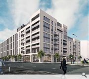
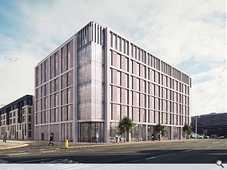
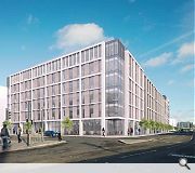
Cooper Cromar and Robertson Construction have brought forward plans for an ambitious mixed use masterplan at Dundee Waterfront, delivering a grade A office building, a hotel and homes off Riverside Esplanade.Overlooking the under construction V&A Dundee the complex has been conceived as a ‘bold landmark’ to both establish an identity for the waterfront and assist with wayfinding to and from the city centre.
As such active ground floor uses are being pursued with elevations considered as a series of ‘wall planes’ which ‘adopt a restrained, timeless yet contemporary architectural approach and thereby provide a new sense of scale, order and rigour in this specific urban context.’
In their design statement the architects said: “It is important that the design creates individual character buildings whilst using the same architectural language to ensure that as a whole, the urban block reads as one. This is achieved by using similar material palettes and tones, whilst maintaining scale and proportions. It is important, however, that each building has its own identity reflecting its varying uses and function.”
Finished in masonry cladding and glazed curtain walling each individual element will sit above transparent shop fronts with two residential blocks designed to with their commercial neighbours in terms of materials and massing.
The proposals follow on from publication of planning and design guidelines for the waterfront area in 2015.

The vacant site is bounded by Riverside Esplanade, Earl Grey Place West, South Crichton Street and South Union Street
|
15 Comments
#2 Posted by Matt on 24 Feb 2017 at 14:55 PM
Dreadful. Completely lacking in ambition and skill.
#3 Posted by Designer on 24 Feb 2017 at 15:58 PM
Very disappointing indeed.
#4 Posted by Ian on 24 Feb 2017 at 16:59 PM
Come on Dundee...you did really well getting the V&A and making sure that that museum building would be of a high quality. Don't spoil it now by allowing mediocre buildings to sprout in the vicinity. This is a once only chance to lift the city and its waterfront.
#5 Posted by Dave on 26 Feb 2017 at 01:19 AM
What a pile of horse muck! Council's across the length and breadth of Scotland have no vision to be ambitious like the bar code in Oslo.
#6 Posted by Grant on 26 Feb 2017 at 13:51 PM
An eyesore like this has just been demolished there, why replace it with another.
#7 Posted by Basho on 26 Feb 2017 at 21:49 PM
One thing I'll give Cooper Cromar credit for is consistency.
They have been churning out pretty much the same design for twenty odd years! Housing, offices, you name it.
They have been churning out pretty much the same design for twenty odd years! Housing, offices, you name it.
#8 Posted by Boab on 26 Feb 2017 at 23:03 PM
Bold landmark design? On what planet?
Seriously, they should be handing back the UNESCO City of Design accolade now if this is the best they can come up with!
Seriously, they should be handing back the UNESCO City of Design accolade now if this is the best they can come up with!
#9 Posted by Islands of sanity on 27 Feb 2017 at 11:31 AM
The adjacent V & A and new station building will be the landmark buildings. This site is crucial as setting the benchmark for continued excellence. It does not need to be a landmark building(s), but it does need to have integrity and quality. The public will perceive this as another Tayside House which took 40 years to demolish. Come on Dundee, don't undo all the good work so far.
#10 Posted by Dave on 27 Feb 2017 at 12:34 PM
Does anyone have a link for this development on the council planning website, so we can all vent our feelings towards this mound of cow mess?
#11 Posted by Dan Horsman on 27 Feb 2017 at 13:25 PM
As it happens I like it, don't like fancy show offey buildings like in London. Well done DCC and Cromar.
#12 Posted by Disco Bob on 27 Feb 2017 at 14:02 PM
Link to DCC website:
http://idoxwam.dundeecity.gov.uk/idoxpa-web/applicationDetails.do?activeTab=summary&keyVal=OLNX59GCKQ600
http://idoxwam.dundeecity.gov.uk/idoxpa-web/applicationDetails.do?activeTab=summary&keyVal=OLNX59GCKQ600
#13 Posted by Derek Wilson on 15 Mar 2017 at 20:19 PM
This is the design guide for site 6 on the masterplan. Page 8 suggests this can not be considered a serious proposal. https://www.dundeewaterfront.com/sites/default/files/docs/Site%206%20Brief.pdf
#14 Posted by Woah on 19 Mar 2017 at 15:51 PM
So here's a response to the criticism from Mike Galloway to this proposal. I'd love to read what you all think of this:
https://www.thecourier.co.uk/fp/lifestyle/design/387207/designing-dundees-waterfront/
"As the V&A and new Rail Station buildings rise up on Dundee’s waterfront and new designs are published for the neighbouring commercial developments, a debate has begun locally about the nature of architecture and how the city should plan for design quality as an inherent part of its regeneration.
To help inform that debate, I would like to share the design process I have adopted throughout the development of Dundee’s waterfront project.
A key principle of my approach has been that the discipline of ‘urban design’ is the crucial missing link between planning and architecture; when done well, it’s what creates places that are widely regarded as attractive and pleasant to be in. We all subconsciously recognise this timeless quality by regularly being drawn to visit these kinds of places, be it Bath or Barcelona or Broughty Ferry.
Get the urban design wrong and we end up with the kind of disjointed and dysfunctional places that were all too often created during the 1960s’ infatuation with modernist architecture and planning. I have spent too much of my career demolishing and rebuilding these kind of failed schemes, including the notorious Gorbals on Glasgow’s southside.
When I arrived back in Dundee in the mid 1990s, the Waterfront in Dundee had become a classic example of that 1960s modernist dream gone wrong; a mini-motorway network of roads and ramps with pedestrians shoved up onto awful overhead walkways which linked brutal buildings that had no connection to the city or its character. A truly terrible first impression for visitors as they arrived in Scotland’s up and coming fourth city.
It was against this context that the master plan for Dundee Waterfront, which I drew up over 17 years ago, was very deliberately focused on establishing a strong urban design vision for the area that introduces a grid-iron pattern of traditional streets and boulevards which connect the city to the river.
This in turn establishes a range of new urban street blocks for medium-rise, mixed-use development interspersed with major new public spaces such as the recently completed Slessor Gardens.
High profile sites in the master plan have been identified for new landmark public buildings such as the V&A Museum and the Rail Station; these together with existing landmark buildings such as the Malmaison Hotel, the Custom House and Discovery Point, create a pattern of highly visible icons interspersed amongst a deliberate context of well mannered background buildings which will form the bulk of the new waterfront developments.
Not every building in a successful place can try to grab the maximum attention; otherwise the area will become a cacophony of ‘show off’ architecture that will come across as jarring and confusing.
The key to creating well mannered background buildings in the waterfront is to shun any temptation to focus on issues of architectural style and instead look to the underlying design qualities of the surrounding historic environment. However, we should avoid attempting any historical pastiche as we will only end up with a false and shallow ‘disneyfied’ theme park; instead we need to distil and reinterpret the enduring qualities that make Dundee the place it is.
These essential urban design qualities are to do with building widths, heights and proportions, the ratios between windows and walls on their main elevations and the use of materials and the creative use of colour. In particular, the creation of active and engaging ground floor uses on the main pedestrian routes will be highly influential in achieving that timeless quality we seek to create.
Even if we achieve all of these qualities as we develop the waterfront sites, I am not naïve enough to think we will manage to please everyone. Design appreciation is still a very individual matter and depends greatly on personal taste and preference. Nevertheless, if we can match enlightened clients with talented designers and support the primacy of design as a process, then I am confident that we will get it right most of the time for most of the people.
Mike Galloway is director of city development for Dundee City Council. "
#15 Posted by D to the R on 21 Apr 2017 at 13:54 PM
I saw a guy from Dundee City Council present this last year with the aid of a fly through and it was terrifying. The streets were as wide as sunset boulevard with blocks on every corner that looked just like the next one. He also made no mention that in order for all this to be built out, Dundee would need some serious commercial and development investment .... It's Dundee ! Glasgow can't even attract the level of continuous investment this would need.
Post your comments
Back to February 2017
Like us on Facebook
Become a fan and share
News Archive
Search News
Features & Reports
For more information from the industry visit our Features & Reports section.


"Bold landmark to establish an identity"!!??...eh..i think the identity of the waterfront will be shaped by Kengo's V+A, not this banal, commercial dross Cooper Cromar
I had to stop reading after the phrase- a series of ‘wall planes’….
This proposal sets a dismal context for the gallery and waterfront….not good enough