Reiach & Hall go for student gold with bronze build
February 14 2017
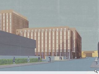
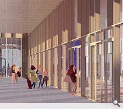
Reiach & Hall Architects and Raglan Development have advanced proposals for what is described as being a ‘new model’ of student housing on Glasgow’s Port Dundas Road, offering tenants a greater range of social and amenity space than is typically the case for standard builds.Focussed on a ground floor social space the scheme includes a foyer, café, gym, lounge and games hall which will spill over into a courtyard garden and surrounding streets.
Stretching across 18,100sq/m of gross internal floor area the build will include 444 cluster flats alongside 156 studio rooms, all of which will be made available for short-term let during the quieter summer months.
Fleshing out their approach the architects observed: “The external massing and expression comes from an analysis of the opportunities the site contains to make a place of delight. We have looked beyond the current fashion for willful shape-making and random pattern. Our proposals are intended to create a place of enduring quality, based on an understanding of the rich Glasgow tradition of rigorous and repetitive facades.”
Clad in profiled and sculpted aluminium panels with a light bronze finish, specified for their low maintenance requirements and ability to provide ventilation through perforations.
|
|
13 Comments
#1 Posted by D to the R on 14 Feb 2017 at 13:14 PM
R+H are a quality outfit - good architecture over the last few years - which makes you wonder why on earth they would release an image like this into the world? On the face of it a truly dismal proposal
#2 Posted by classarchitect on 14 Feb 2017 at 13:26 PM
Like the visual style - very cool
Design statement should read 'the site is a whole city block. Daylight requirements and the fact that no one wants to live at ground floor level led to a courtyard form and scope to fill a load of other uses at street level. Oh and student rooms are 2.5m wide so the facade looks repetitive - but ho hum, what can you do eh'
Not a dig - just a wish that architects were allowed to be a bit more honest in design statements!
#3 Posted by MoFloDoh on 14 Feb 2017 at 14:44 PM
Given the location, I'm not too upset by this design. I liked the statement - 'We have looked beyond the current fashion for willful shape-making and random pattern'. I couldn't help thinking of the horrible Beith Street development in Partick.
Port Dundas Road is beginning to look quite built up. It's a shame that Cowcaddens Road is a bit of an express way, otherwise this street could really become much more a part of the city.
Port Dundas Road is beginning to look quite built up. It's a shame that Cowcaddens Road is a bit of an express way, otherwise this street could really become much more a part of the city.
#4 Posted by Charlie_ on 14 Feb 2017 at 15:05 PM
A welcome infusion of life and urbanity to a grim part of town and probably the best looking student proposal since west village on beith street - well done Reiach.
#5 Posted by METAmatt on 14 Feb 2017 at 15:09 PM
Love the cartoon figures and overall style of the images...breath of fresh air.
Hate the crap UR title pun...I now have Henry Kelly's Going for Gold gameshow theme tune ringing in my ears. Thanks.
Hate the crap UR title pun...I now have Henry Kelly's Going for Gold gameshow theme tune ringing in my ears. Thanks.
#6 Posted by monkey9000 on 14 Feb 2017 at 16:02 PM
A brown Scottish Power?
#7 Posted by QMD on 15 Feb 2017 at 09:10 AM
I thought we are demolishing all the brutalist and modernists buildings in Glasgow? IMO this looks much brutal in our contemporary context. The visual style is nicely done to mask the blandness of the overall scheme.
#8 Posted by John Keats on 15 Feb 2017 at 10:35 AM
This pseudo watercolour rendering is an artifice to detract from the brutal design. It is a turd dressed in tissue paper. It is the equivalent to a sonnet written in 2017 in the style of William Wordsworth. This is not of its time and as such, is inauthentic. This is the trouble with irony. One can get away with blue murdur.
#9 Posted by John Keats on 15 Feb 2017 at 12:58 PM
Not to mention the reference to Philip Johnson's Kline Biology Tower.
#10 Posted by The Punmeister General on 15 Feb 2017 at 13:49 PM
Approved
#11 Posted by Gringo on 15 Feb 2017 at 17:05 PM
'We have looked beyond the current fashion for willful shape-making and random pattern' no Reiach and Hall, I think you'll find the current fashion is for dull repetitive facades like those that you do.....dull dull dull....
#12 Posted by SkyHigh on 16 Feb 2017 at 02:22 AM
This already looks old by today's standards, why are allowing crap like this to be built? Considering that some of the buildings will be part of a future Glasgow for centuries..
#13 Posted by Bob on 25 Feb 2017 at 21:49 PM
Well done getting the job , but a new model? Fairly stardard.
Post your comments
Read previous: Saltcoats expansion to deliver 24 new homes
Back to February 2017
Like us on Facebook
Become a fan and share
News Archive
Search News
Features & Reports
For more information from the industry visit our Features & Reports section.


