CDA and Hoskins mark South St Andrew Square completion
February 3 2017
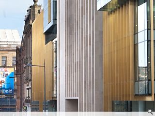
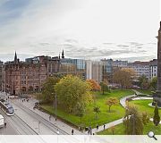
Comprehensive Design Architects and Hoskins Architects have marked official completion of their joint mixed use project fronting St Andrew Square, Edinburgh, the latest addition to the New Town world heritage site.South St Andrew Square has been brought to market by Standard Life Investments and Peveril Securities to offer 100,000sq/ft of grade A office space, 70,000sq/ft of leisure/retail and a suite of apartments. It is the culmination of a decade’s work to fill a sensitive plot opened up by the controversial demolition of the Scottish Provident building.
The design team studied historic feus to the south of the square to strike a contextual balance between projections and recesses, with a façade of metal and stone fins specified to create as open an appearance as possible when viewed head-on. This strategy also serves to maximise daylight while taking on the character of a solid masonry façade in oblique views.
Welcoming the project’s completion Nick Domminney, director of Hoskins Architects, said that it ‘… reinstates a vital part in the composition of South St Andrew Square and enriches its connections to Princes Street, the Gardens and the Old Town beyond.”
Domminney continued: “Creating a piece of architecture which works at the scale of the pavement, the street, the square and the city, whilst delivering on the exacting demands of retail and office development, has been a fascinating and daunting task.”
Offices and leisure units are currently being fitted out and are expected to be occupied by mid-2017.
7 Comments
#2 Posted by classarchitect on 3 Feb 2017 at 13:25 PM
I like the history 'feus' (views) typo myself...very avant guarde sounding
Like it though - notice the photo's above ignore the mess TK Max has already made of the facade round the corner with their dirty great big sign
Like it though - notice the photo's above ignore the mess TK Max has already made of the facade round the corner with their dirty great big sign
#3 Posted by David on 3 Feb 2017 at 13:36 PM
Fues are ownership plots #2, not views.
Beautifully detailed, wonderful materials, but ghastly. At least the previous building had an architectural rigor about it. Those involved in the decision making to demolish it should be ashamed, particularly given what has replaced it.
Beautifully detailed, wonderful materials, but ghastly. At least the previous building had an architectural rigor about it. Those involved in the decision making to demolish it should be ashamed, particularly given what has replaced it.
#4 Posted by Islands of sanity on 3 Feb 2017 at 15:38 PM
The loss of the Scottish Provident building was a travesty and ECC and HES should be ashamed. I see the images above do not include the horrendous TK Max elevation.
#5 Posted by Basho on 4 Feb 2017 at 14:59 PM
I hate to admit it, but this building is growing on me. The elevation materials look like something Del Boy would refurbish his bathroom with, but at least it has personality. Maybe it's just a sign of how fed up I've become with the endless bland sandstone shoeboxes that are springing up all around Edinburgh.
#6 Posted by Colin Cumberland on 6 Feb 2017 at 16:57 PM
Very average and the gold fins are a real shocker. It is never easy to design and build a complex building in the city centre but this surely is a missed opportunity. Maybe some people will come to love it (as they did the brutal Scottish Provident building) and try to save it when it must surely be demolished after the first rent review renders it empty and unsustainable. And what about the view all the way along Rose Street from Charlotte Square. No attempt to frame some feature or element of the building. Just the bland gold fins and of course the bright red TK Max logo to consider.
#7 Posted by Bogey on 7 Feb 2017 at 12:19 PM
The lighting on this building, much like that on the Primark building on Princes Street, is a bit of a failure - when viewed from the opposite corner of the square it shines bright enough to blind. At the least, needs tuned down a bit imo. Not saying there's no time and place for strong lighting design, but it seems every man and his dog are trying to literally outshine the Castle these days
Post your comments
Back to February 2017
Like us on Facebook
Become a fan and share
News Archive
Search News
Features & Reports
For more information from the industry visit our Features & Reports section.


" It is the culmination of a decade’s work to fill a sensitive plot opened up by the controversial demolition of the Scottish Provident building."
The demolition of the Scottish Provident building happened ~for~ this development. This wasn't an empty plot from an earlier failed scheme. The two are absolutely linked and yet this text appears to suggest otherwise.