‘Aged’ industrial-style homes on the cards for Dundee
January 4 2017
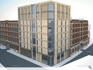
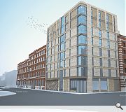
James Paul Associates have prepared plans on behalf of Seagate Ltd for the creation of 28 flats and a ground floor retail unit on the corner of Trades lane and Seagate, Dundee.The brownfield build will abut the A-listed Watson’s Bond Building opposite the city’s bus station, acknowledging the red brick warehouse with a palette of buff brick.
Articulating their design approach the architects wrote that the apartment scheme aimed to be both ‘respectful’ of its neighbor without resorting to pastiche by standing as a ‘robust’ intervention in its own right.
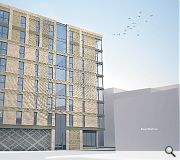
Their statement read: “The fenestration of the proposals has drawn from the neighbouring Watson’s Bond, to attribute a clear and ‘unfussy’ façade, in-keeping with the industrial context. Both key facades utilise a sparse palette of materials drawing from context immediately surrounding the site, these are predominately ‘aged’ appearance buff coloured brick and bronze coloured feature materials.
“The key facades are broken up using ordered construction details, such as the coping breaking up the floor levels and referencing the coursing bands of Watson’s Bond.”
Steel balconies will pepper the front facades with high level ‘brick piers’ used to differentiate two upper levels with an element of public art proposed at ground level created by local abstract artist Nael Hanna along the Trades Lane frontage.
|
|
5 Comments
#1 Posted by Islands of sanity on 4 Jan 2017 at 16:16 PM
Contextual references seem a bit spurious to me.
#2 Posted by CADMonkey on 4 Jan 2017 at 18:16 PM
Hmmm new years resolution is to be more positive.
So...loving the weak contextual references.
The infill panels of brick at the top level should be a different material entirely.
I'd drop the horizontal string course banding on the section of brickwork on the left of the corner in the main image, to give it a bit of oomph.
Pass a piece of cake if there is any left. Thanks.
p.s.
the old chestnut...how will the full height glass get cleaned?
#3 Posted by Designer on 4 Jan 2017 at 21:44 PM
I quite like it. Normally I am bored to death with blocks of flats built in buff brickwork but in this case it kind of works. There are shades of a Victorian warehouse refurb combined with a bit of Americana which, with its shabby palette of materials, should sit reasonably well on that site beside the bond buildings.
#4 Posted by c walker on 4 Jan 2017 at 22:24 PM
Was expecting this site to end up with another white render hub style block plonked on (with zinc of course). I like it - brick looks well and its a decent design in that part of the town.
#5 Posted by Bharat Suvarna on 8 May 2017 at 11:01 AM
I leave in Trades lane flats beside the bus station, and didnt like the Watson Bond building as they look old and like a prison cell standing beside the near apartments spoiling the look of the area. This new building will certainly make the site look more better and start showing a flow of buidlings matching the city quay, making the area more promising and not considering it a shabby place like Seagate is at the moment. Dundee certainly needs more of this make the city look and feel welcoming Likes of Edinburgh city center.
Post your comments
Read next: Dundee to receive 32 new affordable homes
Read previous: ‘Opulent’ Parkhead apartments launched
Back to January 2017
Like us on Facebook
Become a fan and share
News Archive
Search News
Features & Reports
For more information from the industry visit our Features & Reports section.


