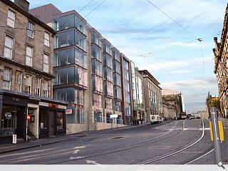
Neo-gothic Edinburgh office set for modernist makeover
December 14 2016
A neo-Gothic office block at North St Andrew Street, Edinburgh, is to be given a facelift by Knight Property Group and Comprehensive Design Architects in order to establish a unified elevation to the eastern side of St Andrews Square.To this end, Edinburgh House will be fully remodeled with new curtain walling, an upper storey and entrance porches designed to marry with those at Harvey Nichols and the Royal Bank of Scotland, whilst retaining existing sandstone.
In their design statement CDA noted: “The new curtain walling to the West Elevation emphasises one of the key elements of the building, the views. Due to its location, the building provides view to St Andrew Square and North across to the Fife Coast. This is currently restricted at the lower levels due to the small windows in place. The proposals will rectify this by providing large curtain walling elements which will ensure all levels are able to make the most of the views.”
Under the proposed works ground and lower levels will be remodeled to accommodate commercial units.
7 Comments
#1 Posted by monkey9000 on 14 Dec 2016 at 11:28 AM
Currently more Po-Mo than Neo-Gothic. If you want neo-gothic look at the National Portrait Gallery across the road.
#2 Posted by ian on 14 Dec 2016 at 11:41 AM
That means the witches hat will disappear? Great news
#3 Posted by basho on 14 Dec 2016 at 12:34 PM
Yes, it was awful - but at least it was distinctive in its confused melange of post-modern baronial gothic nonsense. The replacement is just a dull copy of so many other unremarkable office buildings dotted around Edinburgh.
#4 Posted by Bonvivant on 14 Dec 2016 at 13:23 PM
Totally agree with Basho. The current design is at least interesting and amusing. The proposal is just utterly bland; hardly a candidate for promoting World Heritage status.
#5 Posted by jobsfortheboys on 14 Dec 2016 at 14:19 PM
Same old, same old.
#6 Posted by Matt on 15 Dec 2016 at 15:20 PM
Its a pity these guys get such commissions...this is a very lazy looking scheme that says nothing of its context or site characteristics. Ground floor entrance looks abismal and the metal clad upper floor level is a shocker.... just like CDA's treatment of Harvey Nic's and the poorly executed upper floors of the 'TX max' office across the square. Edinburgh needs better firms looking at these sites...
#7 Posted by Cadmonkey on 17 Dec 2016 at 11:31 AM
Floor to ceiling glass - check
Recessed grey cladding at roof level to squeeze in more height - check
Give it an aesthetic that could literally be built anywhere - check
Express the entrance with a big frame sitting rather incongruously next to the neighbouring building - check
Oops a rather clumsy gable end condition - blame it on being a refurb - check
Attempt at a rusticated ground floor base because the boss said to do that - check
All good - that will do ... rush it in and get it lodged in time for Xmas - check.
Post your comments
Read previous: Spades in ground at West Calder High
Back to December 2016
Like us on Facebook
Become a fan and share
News Archive
Search News
Features & Reports
For more information from the industry visit our Features & Reports section.


