McAslan unveil first concept images of £66m Burrell project
October 25 2016
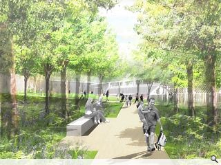
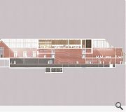
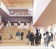
John McAslan & Partners have published the first concept design proposals for the refurbishment of Glasgow’s Burrell Collection following closure of the existing museum to allow the £66m project to proceed.The four-year project will see the current basement upgraded to form additional exhibition space with a new roof and high performance glazing installed throughout. A central vertical core will also be inserted through the building to improve access with a new ground level café, retail units and landscaped terraces opening out onto the surrounding Pollok Park.
Project architect Hannah Lawson commented: "The Burrell provides an inspiring setting for shipping magnate Sir William Burrell's vast collection of art and antiquities within a category A listed building of international significance.
"John McAslan and Partners are delighted to be leading a team dedicated to the comprehensive repair and refurbishment of this architectural masterpiece.
"By providing a new circulation core we can open up new parts of the gallery to visitors and greatly increase the display area for the collections."
This work will allow the proportion of 9,000 artefacts placed on public view at any one time to be increased from fewer than 20 per cent to 90 per cent alongside improved interpretation of exhibits.
|
|
4 Comments
#2 Posted by Craigford on 25 Oct 2016 at 15:06 PM
The video is here: https://www.youtube.com/watch?v=nUoIuYR3Iy4
#3 Posted by Stephen on 26 Oct 2016 at 10:21 AM
My abiding impression of the Burrell is of two unique and incredible atmospheres:
1. Expansive, sandstone enveloped, top lit circulation spaces.
2. The contrast of this weighty, permanent sandstone building against glazed galleries pressed hard up to the dappled light of the surrounding woods.
This is a heavy building, with stone stairs and floors, with walls of stone embellished with Burrell's collection of portals, architraves and other salvaged pieces. The red sandstone connects it to Glasgow, roots it in time (after blond sandstone) and sets it apart from generic cultural alien-landings like Holl's GSA.
In this context the hollow plasterboard bulkheads and timber stairs and flooring shown in the first image aren't good enough.
I wonder what Caruso St John might have done with this project...
#4 Posted by D to the Rq on 26 Oct 2016 at 17:29 PM
Watched the video ... still nae answer to the entrance question - good though that the images are suitably vague enough to avoid the big issue ...
Post your comments
Read previous: Glasgow Caledonian University completes £30m campus overhaul
Back to October 2016
Like us on Facebook
Become a fan and share
News Archive
Search News
Features & Reports
For more information from the industry visit our Features & Reports section.


The indication given at the consultation sessions was they were going to move it down to the area adjacent to the cafe because soundings from visitors suggest that the existing entrance was ‘hard to find’.
There was quite a bit of concern expressed about that particularly given how the current entrance is pretty obvious and clearly sets up the spatial sequence by which the visitor experiences the museum.
The response at the time was an examination of some of Barry Gasson's sketches, that had been gifted to the National Library, indicated an alternate scheme with the main entrance located to the rear of the cafe and with the terraced steps, which are currently lawns, being hard landscaped for sculpture and events instead.
That is all very well but it isn't what was built!
It would be helpful if this could be clarified…